Grab your favorite brush pen and let's draw some beautiful letters together! A handmade greeting card is a tiny stage for a big message, and with a few layout tricks, it can look clean, balanced, and wonderfully “you” even if you are just getting started.
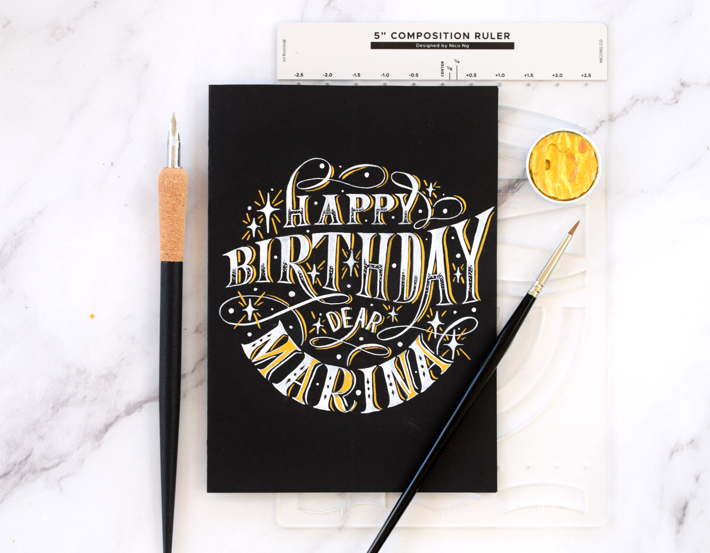
Start with the card’s bones
Professional-looking cards usually begin with three quiet decisions: card size, fold style, and a simple margin plan. Once those are set, your lettering feels much easier to place.
Pick an easy size
Quick note: the sizes below are common US card and envelope sizes. They are not the same as ISO “A” paper sizes.
- A2 (4.25 x 5.5 in): the classic. Plenty of room for a short headline and a small flourish.
- A6 (4.5 x 6.25 in): great when you want a bigger word or a centered wreath.
- Square (5 x 5 in): sweet for minimal designs, but spacing needs extra care so it does not feel cramped.
Choose a fold style
- Side fold (book fold): opens like a book. The simplest layout to plan.
- Top fold: opens upward. Feels a little gift-tag-like and is fun for vertical lettering stacks.
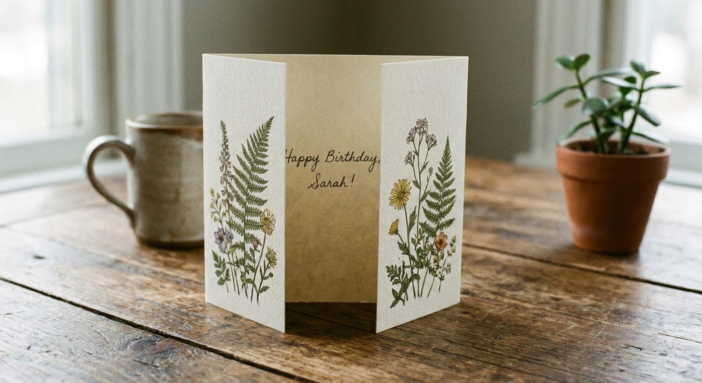
- Gate fold: two doors that open to the center. Lovely for names, announcements, and dramatic reveals.
- Z fold: playful and modern. Best with short lettering on each panel.
Score first, then fold
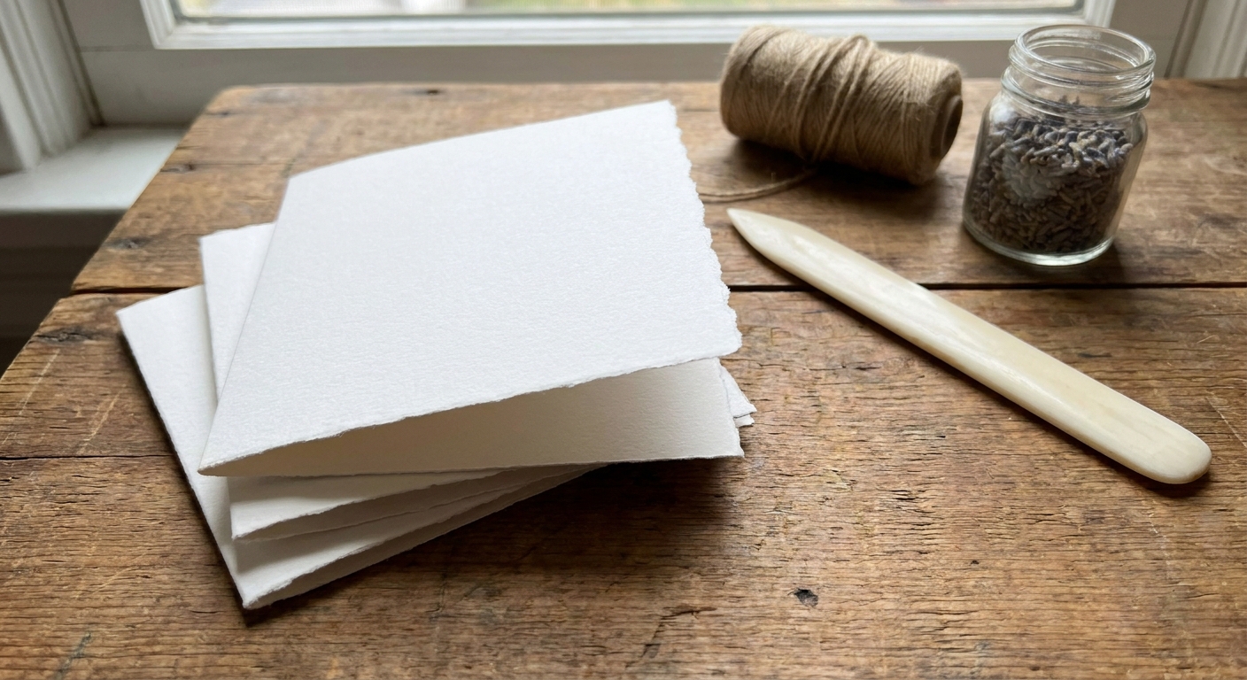
A crisp fold instantly makes a card feel store-bought in the best way. Lightly score the fold line, then fold and press along the crease.
- Scoring tools: a bone folder is perfect, but an empty ballpoint pen or a dedicated scoring stylus works well too.
- If you use a butter knife: choose a dull edge and use very light pressure so you do not bruise or tear the paper.
- Tip: score with a ruler as a guide, using light pressure so you do not tear the paper.
Special folds, simplified
If you want a fancy fold, plan it before you design. Once the panels are set, you can treat each panel like its own tiny canvas.
Gate fold
- Start with a rectangle cardstock sheet.
- Score two vertical lines so both sides fold inward to meet in the center.
- Design idea: put a single big initial or a small wreath at the meeting point, then letter the full message inside.
Z fold
- Score two vertical lines to create three panels.
- Fold the first score forward and the second score backward, forming a “Z” from the side view.
- Design idea: one word per panel, or a long word that stretches across panels when opened.
Mini card with belly band
- Fold a small card (a little smaller than your palm).
- Wrap a thin strip of paper around it like a band.
- Letter one word on the band: “Hi”, “Love”, “Cheers”.
Paper that plays nicely
Paper is the stage floor. If it buckles or feathers, even the cutest lettering can look fuzzy.
- Cardstock weight: aim for sturdy cardstock that can stand up on its own.
- Smooth vs. textured: smooth paper makes brush lettering easier. Texture can be beautiful, but it may cause fraying and shaky edges.
- Marker-friendly surfaces: if your brush tips keep splitting, the paper might be too rough. For a deeper dive: Paper That Keeps Brush Pens From Fraying.
Composition that looks polished
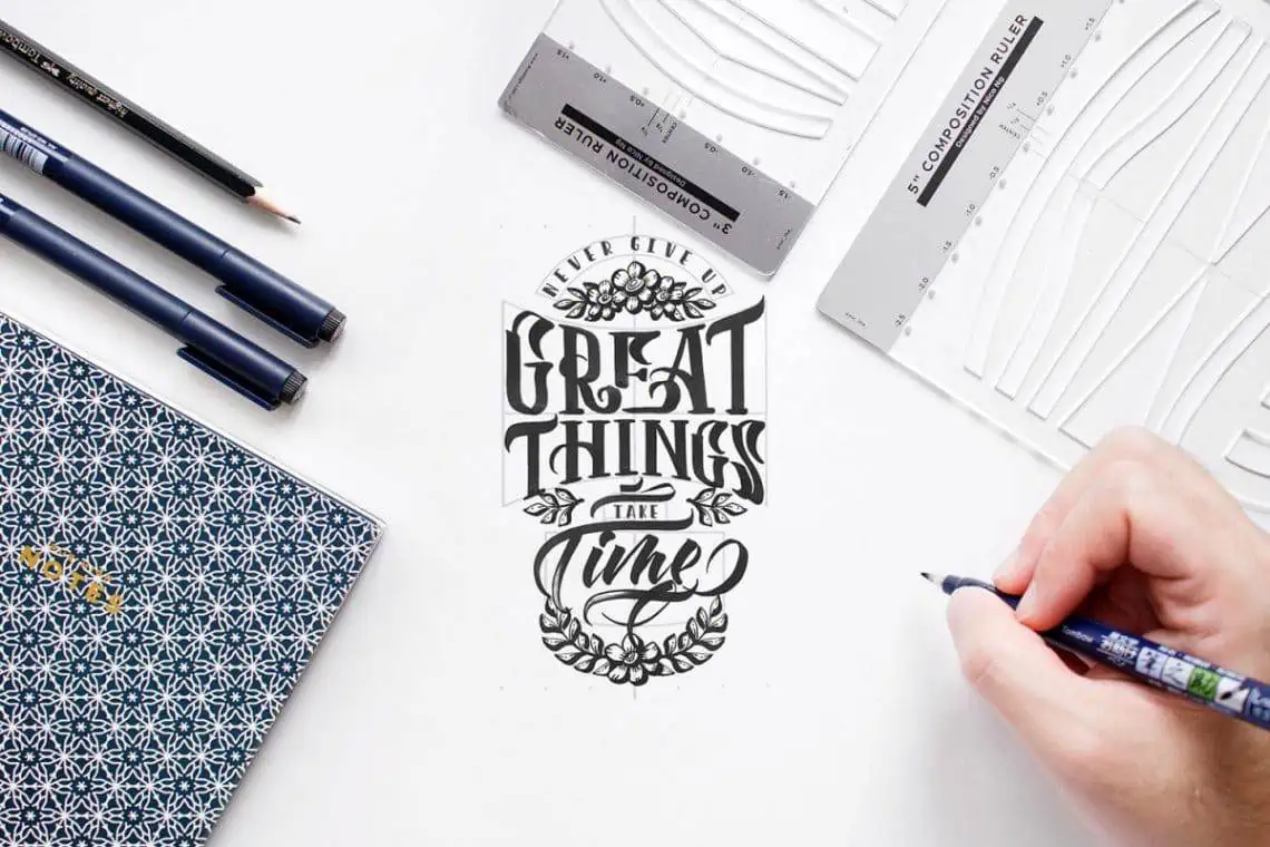
Composition is just thoughtful placing. The goal is to help the eye land on the main word first, then enjoy the supporting details.
Use the big word rule
Pick one hero word to feature. Everything else should support it.
- Hero word: “Thanks”, “Happy”, “Love”, “Congrats”, “Mom”, “Welcome”.
- Helpers: “so much”, “birthday”, “to the new home”, “from all of us”.
Build a simple hierarchy
- Size: biggest text is most important.
- Style contrast: pair brush lettering with small caps or neat print.
- Weight: bold downstrokes pull attention. Monoline lines recede and leave breathing room.
Plan margins and a safe zone
Give your design a little breathing room so it does not feel crowded near the edges.
- Quick guide: lightly pencil a border about a fingertip width from each edge.
- Extra safety: for watercolor or heavy ink, leave a bit more space so nothing warps right on the edge.
Use shapes to hold your lettering
When a card looks balanced, it is often because the lettering sits inside a simple shape.
- Oval: classic, soft, and forgiving for centering.
- Circle: perfect for wreaths and round florals.
- Rectangle: modern, great for block lettering or stacked words.
- Banner: adds instant structure. Try: How to Draw Ribbon Lettering.
Layouts that always work
Here are reliable card formulas that can be remixed with different words, colors, and little doodles.
1) Centered headline, tiny subtext
Best for: birthdays, thank you cards, sympathy cards, simple hellos.
- Write the hero word centered.
- Add a small line above or below in tidy print.
- Finish with a small sparkle, dot cluster, or mini heart.
Example wording: “Thank You” with “so very much” beneath.
2) Stacked words, mixed styles
Best for: congratulations, graduations, encouragement.
- Stack 3 to 6 short words.
- Alternate brush and print for rhythm.
- Keep the left and right edges visually even, like a tidy column.
Example wording: “YOU / DID / IT” with “did” in brush lettering.
3) Corner accent, lots of white space
Best for: modern holiday cards, minimal wedding and baby notes.
- Put the main word small, tucked in one corner.
- Add a small branch, stars, or dots to frame it.
- Let the empty space be part of the design.
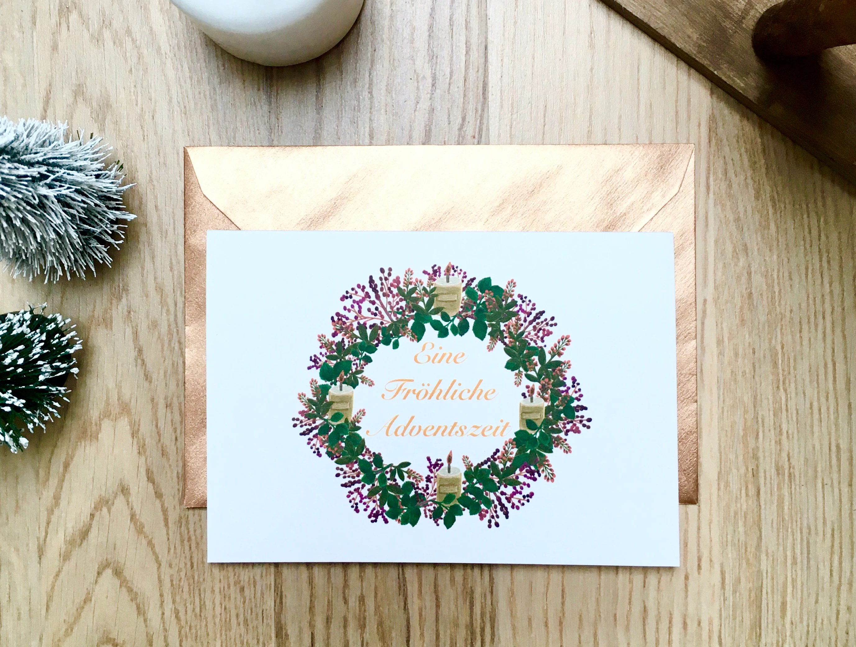
4) Wreath or frame
Best for: weddings, anniversaries, housewarmings, seasonal greetings.
- Lightly pencil a circle.
- Letter your phrase inside first.
- Add greenery or simple florals around the circle.
5) Baseline bounce
Best for: birthdays, kids’ cards, cheerful congratulations.
- Draw a light baseline.
- Let some letters dip below and pop above the line.
- Keep spacing consistent so the bounce feels intentional.
If bouncy layout feels tricky, this helps: Bouncy Calligraphy Baseline Rules.
Words by occasion
When the words are chosen well, the layout almost designs itself. Pair one hero word with a short helper line, then pick a layout from above.
Birthday
- Hero words: Happy, Celebrate, Hooray, Make a Wish
- Layout ideas: stacked words, bounce baseline, banner headline
- Easy embellishments: confetti dots, tiny candles, a simple balloon string
Thank you
- Hero words: Thanks, Thank You, Grateful
- Layout ideas: centered headline with small subtext, corner accent
- Easy embellishments: a single stem, tiny border line, subtle shadow
Congratulations
- Hero words: Congrats, You Did It, So Proud
- Layout ideas: stacked words with contrast, frame box, bold drop shadow
- Easy embellishments: starbursts, laurel leaves, simple underline swoops
New baby
- Hero words: Hello Baby, Welcome Little One
- Layout ideas: wreath, soft oval frame, minimal corner accent
- Easy embellishments: tiny moons, dots, gentle pastel ombre
Sympathy and support
- Hero words: With Sympathy, Thinking of You, Sending Love
- Layout ideas: centered headline, lots of white space, small corner message
- Easy embellishments: light botanical linework, a thin border, soft gray shadow
Holiday and seasonal
- Hero words: Joy, Peace, Merry, Thankful, Hello Spring
- Layout ideas: banner, wreath, stacked words
- Easy embellishments: pine sprigs, berries, snow dots, pumpkins, simple leaves
Tools that prevent smudges
Small cards make it easy to drag your hand through fresh ink. A few small tool choices keep everything crisp.
- Pencil: a standard HB is perfect for light guidelines.
- Eraser: a kneaded eraser (or a very soft eraser) lifts pencil without scuffing the paper.
- Hand guard: rest your hand on a clean scrap paper while you letter, especially on dark cardstock where smudges show up quickly.
- Dry time habit: erase guides only when ink is fully dry. If you are unsure, wait a little longer than you think you need.
Spacing and centering
Neat spacing is the secret sauce. These habits keep the front of the card from feeling lopsided.
Use light pencil guides
- Sketch a baseline and x-height guide for your main word.
- For centered layouts, mark the middle of the card lightly with a tiny pencil dot.
Try the envelope method
Even though this is a card, the idea is the same: measure the space you have, then build outward from the center with consistent spacing. If centering always feels slippery, these tips translate beautifully: Calligraphy Envelope Addressing Centering Tricks.
Connect letters smoothly
If your brush lettering looks wobbly, the connections are often the culprit. Gentle, consistent joins make the word feel confident. If you want extra practice: How to Connect Letters in Modern Calligraphy.
Color and finishing touches
Once the lettering is down, add one small extra that supports the mood. One extra. That is the trick.
Easy starter palettes
- Classic: black + one accent color (sage, blush, navy, or gold).
- Soft: warm gray + dusty blue (or any two gentle tones).
- Bold: deep color word (navy, forest, burgundy) + black helper text.
- Drop shadow: adds pop without adding clutter. Try a light gray shadow or a colored shadow that matches your palette. More ideas: Drop Shadows and 3D Effects for Hand Lettering.
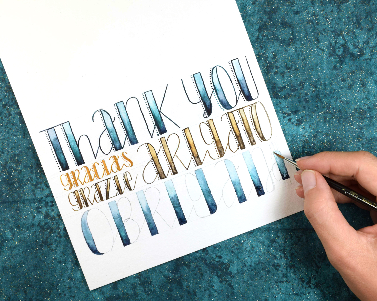
- Ombre blends: great for one hero word. See techniques: How to Blend Brush Pens.
- White gel highlights: tiny shine marks on downstrokes or around doodles can make colors sparkle, especially on dark cardstock. For tools that show up well: Best White Pens and Inks for Dark Envelopes.
- Simple border: a thin line frame, dotted border, or double-line rectangle can finish a design instantly.
Dry time note: coated and very smooth cardstocks can keep ink wet longer than you expect. Before you add a second layer (shadow, highlights, or another color), pause and let the first layer dry completely to avoid smears.
A simple workflow
- Choose the message and circle the hero word.
- Pick a layout from this article.
- Fold and score your card base first.
- Pencil guides: margins, center mark, and baselines.
- Letter in pencil lightly if you want extra control, especially for centering.
- Ink the main word slowly, then add helper text.
- Let ink dry fully before you erase or add layers.
- Erase guides gently.
- Add one finishing touch: shadow, border, or a tiny accent.
Practice drills
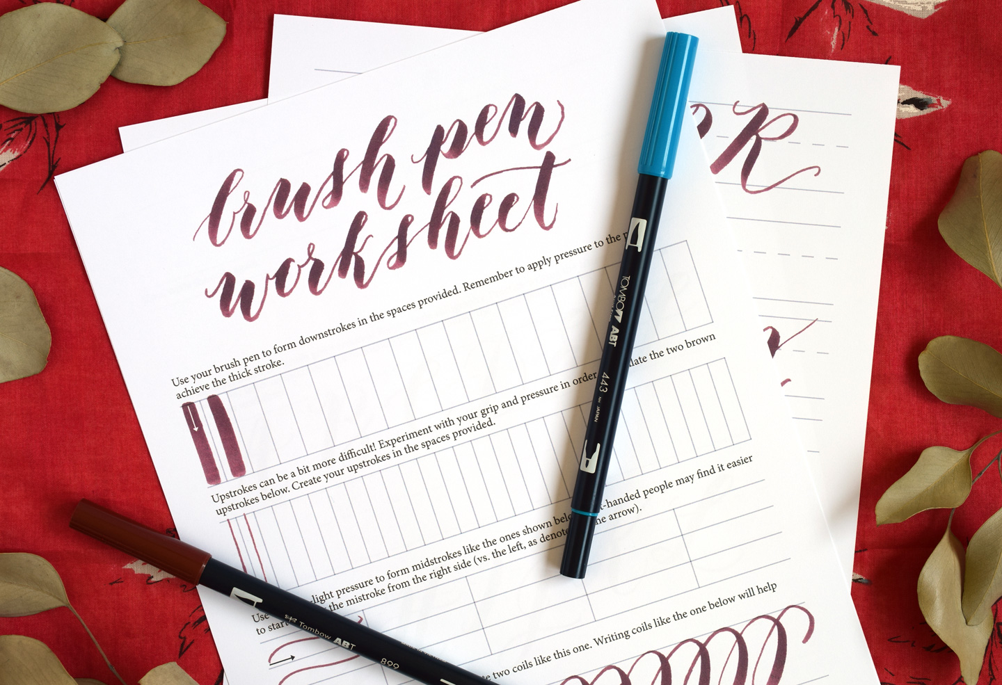
Cards are small, so steady strokes matter. A few minutes of warmups can make your lines smoother and your spacing more consistent.
- Start with these foundational movements: 8 Basic Brush Lettering Strokes.
- Then build a quick routine you can repeat anytime: 15 Minute Daily Calligraphy Drills.
- If upstrokes look shaky, small grip and speed adjustments often help: How to Fix Shaky Upstrokes.
Quick fixes
My front design looks off-center
- Check if the visual center shifted because of a flourish, shadow, or a big loop. Try moving the whole word slightly toward the heavier side.
- Use a center tick and build outward with even spacing.
Ink feathers or bleeds
- Switch to smoother cardstock and let layers dry before adding highlights.
- If your brush tip is fraying, paper texture may be the cause. Try: How to Fix Frayed Brush Pens.
My card buckles
- Use less liquid and fewer heavy layers on one side.
- Try lighter embellishments like dot clusters or line borders instead of large filled shapes.
Layout prompts
- Big word, tiny echo: write the hero word, then repeat it faintly behind in pencil-thin monoline.
- Diagonal energy: angle a short phrase slightly upward for excitement.
- Underline flourish: keep the word simple, then add one confident underline swoop.
- One-corner bouquet: cluster a few simple leaves and tuck the message nearby.
- Label shape: draw a rounded rectangle or tag shape and letter inside.
When you are ready for more style mixing, monoline is a friendly companion to brush lettering: Monoline Lettering 101.
More DIY inspiration
If cardmaking has you in a lettering mood, there are lots of other sweet surfaces to dress up with words. Browse more ideas in DIY Projects & Crafts.