Grab your favorite pen and let’s give those wedding envelopes the calm, confident look they deserve. Centering and straight lines are not magic tricks. They are tiny, repeatable steps you can set up once, then trust for every single guest name.
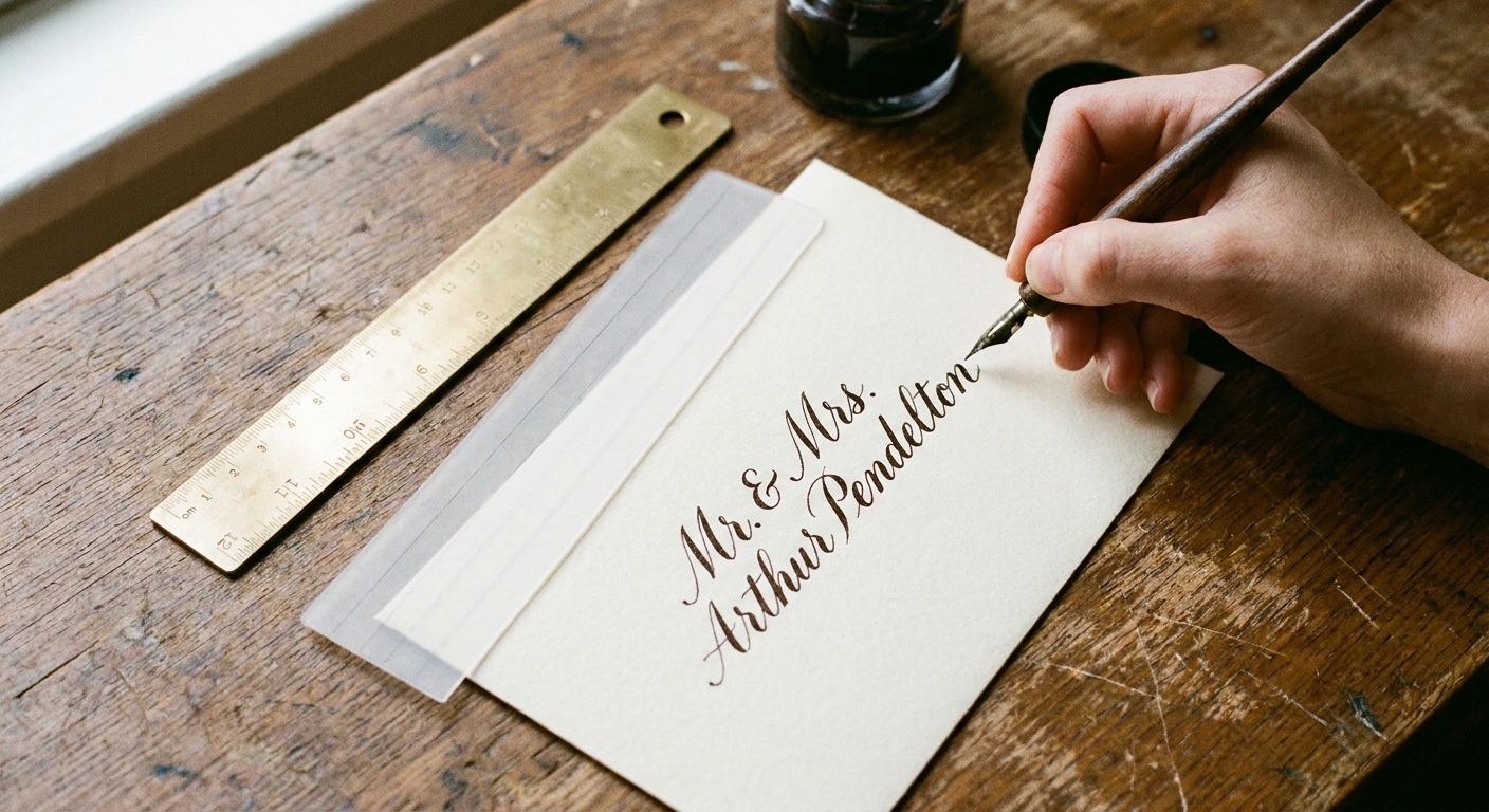
Start with a predictable layout
Before centering comes a small decision: where your address block lives and how tall it is. A steady layout reduces last-second nudging that causes crooked lines.
- Pick an address block zone: Many envelopes look balanced when the block sits a little above the true vertical center. One easy visual convention is to place the block so the last line (ZIP) lands slightly above the bottom third of the envelope. Treat this like a starting point, then adjust based on your envelope size and style.
- Decide line count early: For wedding guest addressing, common options are 3 lines (Name, Street, City State ZIP) or 4 lines (Name, Second name line, Street, City State ZIP).
- Set your line spacing: Keep it consistent. Many modern calligraphy styles look clean with baseline-to-baseline spacing around the height of your lowercase letters plus a little breathing room.
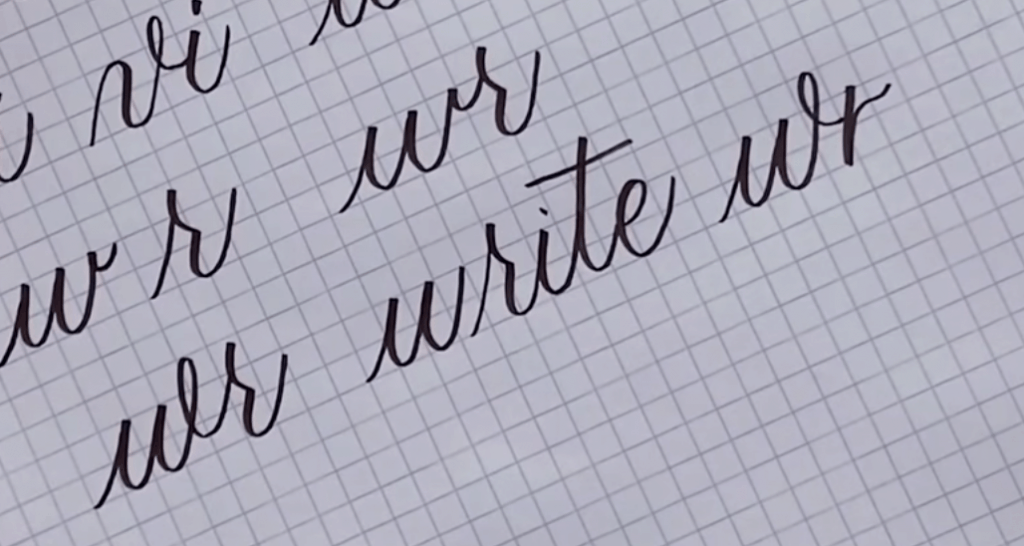
If your letter slant or spacing changes from line to line, it can look off-center even when the math is perfect. If connecting letters feels wiggly, a quick refresher on spacing helps. This guide on how to connect letters in modern calligraphy can steady your rhythm before you address the real envelopes.
The centering math that actually works
There are two reliable ways to center: measure the envelope or measure the written line. For wedding envelopes, measuring the written line is the secret sauce because guest names vary so much.
Method 1: Fold-center the envelope (fast setup)
This creates a reference you can use without drawing pencil on the face of the envelope.
- Close the envelope flap.
- Bring the left and right edges together gently to find the vertical center, then pinch a tiny crease at the center of the bottom edge only.
- Bring the top and bottom edges together gently to find the horizontal center, then pinch a tiny crease at one side edge only (not on the front writing area).
Those micro pinches can be wonderfully subtle, but on thicker cotton stock or dark envelopes they can catch the light. Test on one spare envelope first. If you are crease-shy, pinch on a side edge or the back edge instead of anywhere near the face.
Method 2: Center each line using “half-width”
This is the cleanest way to center names like “Ava Li” and “Alexandria Montgomery-Smith” with equal confidence.
- Write the line on scrap paper in the same size and style you will use on the envelope.
- Measure the full length of the written line (end of first stroke to end of last stroke).
- Divide by 2 to find the half-width.
- On the envelope, mark the center point using a removable method, such as:
- a tiny piece of low-tack tape on the back bottom edge with a center tick,
- a small sticky note tab on the back with a center mark, or
- a separate thin scrap strip held to the bottom edge with a center mark (so the envelope itself stays unmarked).
- From the center point, measure left by the half-width and place a barely-there starting tick just outside the left margin of your address block (off the writing line itself).
- Start writing from that left start point and finish naturally.
This method sounds “mathy,” but it becomes quick because you only measure the long or tricky lines. Short lines can be eyeballed once your baselines are controlled.
Quick centering shortcut: count “spaces,” not letters
If you do not want a ruler for every line, do a fast visual balance check:
- Look at the negative space on the left and right sides of your penciled or imagined line.
- Aim for equal “air,” not equal letter count.
- Remember that big round letters (O, C, D) and flourishes visually weigh more than skinny letters (I, l, t).
Perfectly straight baselines without pencil marks
Here are no-pencil approaches that still give you crisp alignment. Choose one that matches your tools and envelope paper.
Option A: A removable guideline strip (my favorite tidy trick)
Create a baseline guide you can move from envelope to envelope.
- Cut a strip of smooth paper (about 1 inch tall and wider than your envelope).
- Using a ruler, draw several parallel lines across the strip in pencil or pen. These lines never touch the envelope, so it does not matter if they are visible on the strip.
- Slide the strip under the envelope so the line you want sits exactly where your baseline should be.
- Hold the strip in place with low-tack tape on the back side only, or simply hold it steady with your non-writing hand.
This works especially well with brush pens because you can keep your hand off the envelope surface while still tracking a baseline.
Option B: A lightbox or bright window (zero marks)
If your envelope paper is not too thick, you can place a lined sheet underneath and let the light do the work.
- Use a sheet with evenly spaced lines.
- Tape the lined sheet to the table so it cannot shift.
- Align each envelope to the same top-left corner of the lined sheet for consistent placement.
Option C: A “T-square” corner using two rulers
If your lines are straight but slowly drift up or down, this method keeps you squared to the envelope edge.
- Place one ruler along the bottom edge of the envelope.
- Place a second ruler perpendicular to it along the left edge, forming an L shape.
- Use the bottom ruler as your baseline reference for each line.
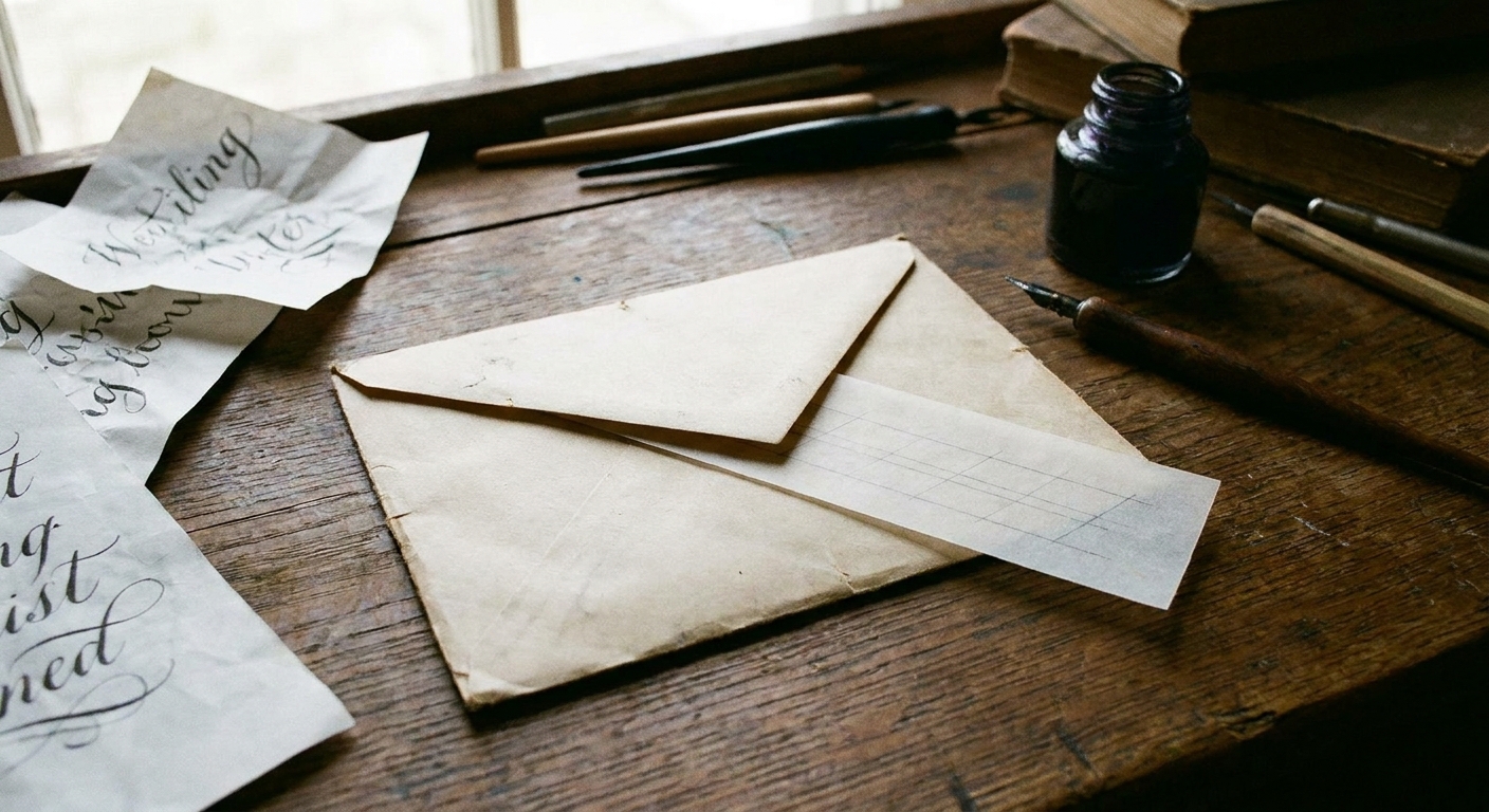
Center the whole address block
Centering each line helps, but wedding envelopes look extra polished when the entire block is visually centered as one unit.
Step 1: Decide your block height
Block height is the distance from the first baseline to the last baseline, plus any ascenders or flourishes that reach above or below.
- Write your tallest line style on scrap (include the biggest capitals you plan to use).
- Note how much your capitals rise above the baseline and how far descenders drop (like g, j, y).
Step 2: Place the middle line first
If you have 3 lines, place line 2 first. If you have 4 lines, place lines 2 and 3 first (they act like the center pair). Working outward keeps you from slowly drifting down the envelope.
Step 3: Use consistent line spacing units
Pick one spacing measurement and stick to it. For example:
- Same baseline spacing between all lines, or
- Slightly tighter spacing between name lines, slightly wider spacing before the city line.
The key is repeating the same pattern on every envelope.
Spacing fixes for long names
Sometimes centering is not the problem. The text simply does not fit. Here are gentle fixes that keep your lettering style consistent.
Use one size change, not many
If a line is too long, reduce the x-height slightly for that one line rather than squeezing spacing and shrinking capitals and changing slant all at once.
Swap a flourish for breathing room
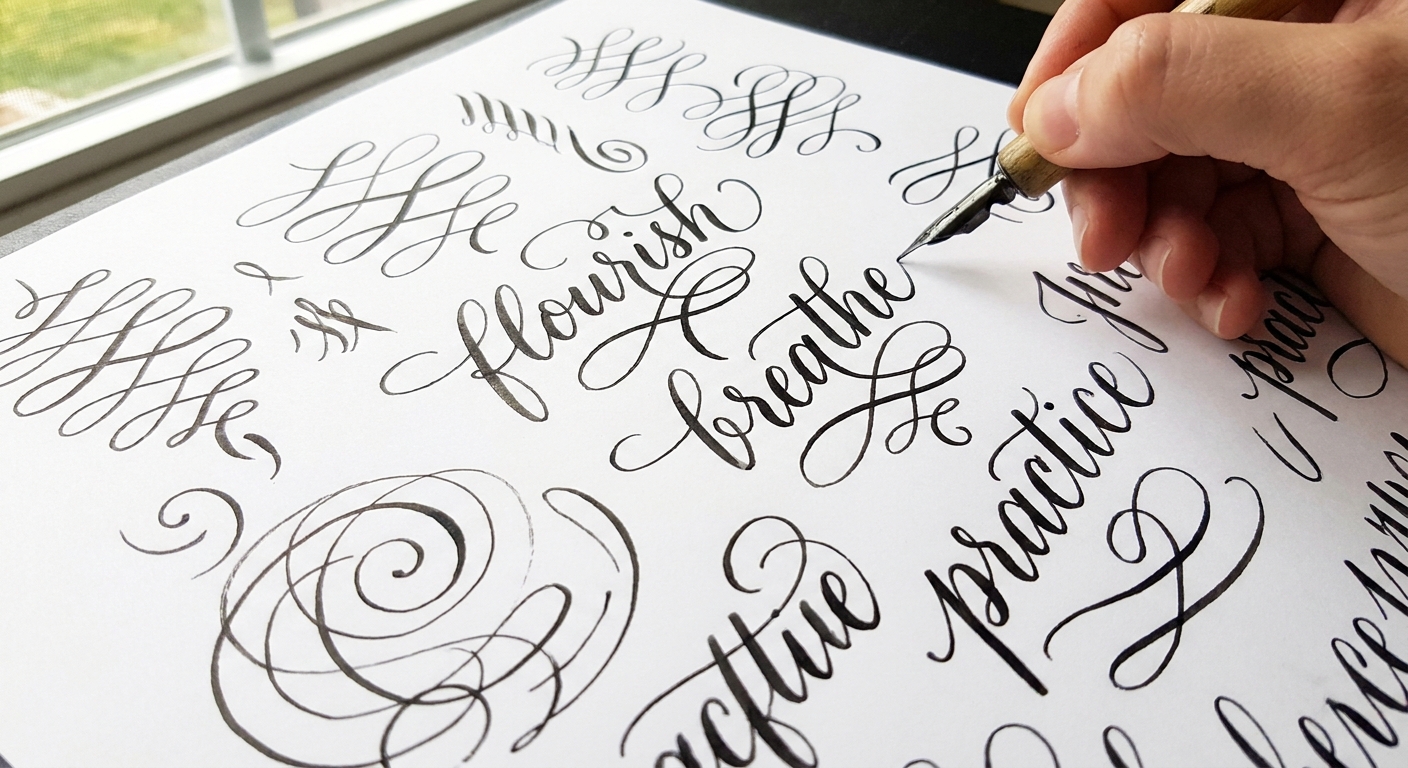
Flourishes are beautiful, but they take horizontal real estate. If a surname is long, keep capitals simple and let the elegance come from smooth stroke contrast instead. If you want flourish practice for when there is room, peek at beginner calligraphy flourishing.
Try a two-line name stack
For couples with long names, stacking often looks more formal and more centered:
- Line 1: First names (or honorific plus first names)
- Line 2: Last names
Then keep the street and city lines slightly smaller for a tidy hierarchy.
Keep it clean and readable
Wedding envelopes like to show every little oops. Here are clean habits that help you keep the front pristine, plus one gentle nod to mailability.
Skip pencil on the envelope face
Pencil can dent fibers and leave a shiny erased patch, especially on soft cotton paper. If you must use pencil, place dots outside the writing area and cover them with the address line, or use the removable guideline strip method instead.
Use a scrap “hand guard” sheet
Place a clean sheet of paper under your writing hand to prevent skin oils and accidental dragging. Move it as you work down the lines.
Left-handed smudge help
If you are left-handed, keep the hand guard slightly ahead of your writing hand and consider turning the envelope a touch clockwise so you pull strokes instead of pushing into wet ink. More smudge-free tweaks are here: left-handed calligraphy smudge-free techniques and grip adjustments.
Mind your ink and paper pairing
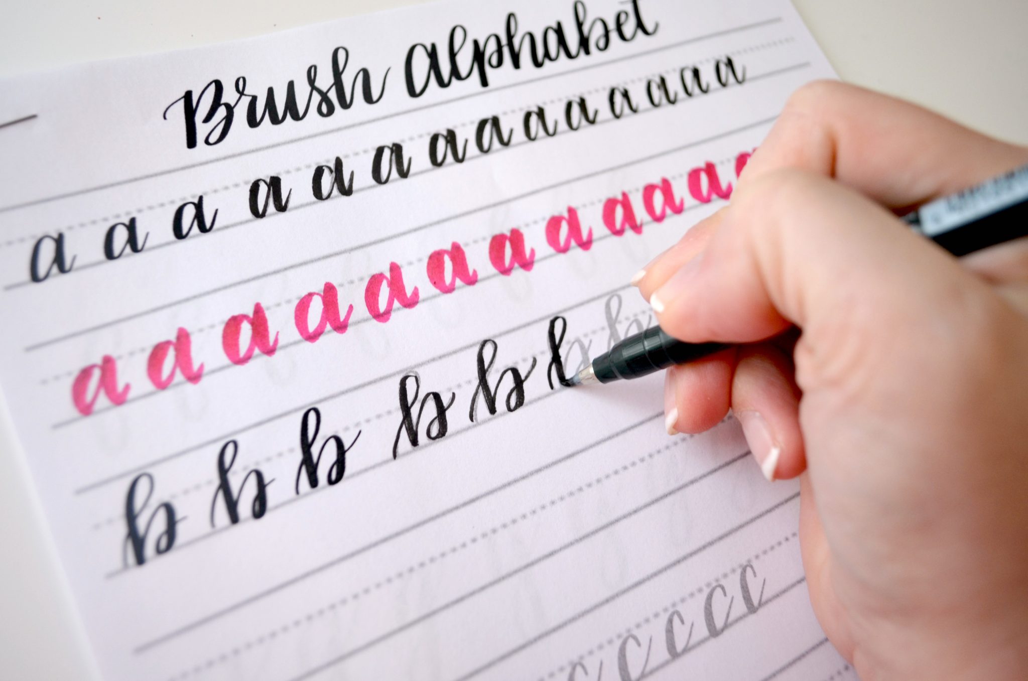
Some envelopes feather or grab ink, which can make straight lines look fuzzy. If you are using brush pens, paper matters a lot. This guide to paper that keeps brush pens from fraying can help you choose smoother options for practice and for final addressing.
Keep the last line extra legible
For a practical, mail-friendly finish, keep the city, state, and ZIP line clear and calm. This is not the place for dramatic flourishes that tangle into the numbers.
Let ink dry before stacking
Even fast-drying inks can smear when envelopes are stacked or slid into boxes. A simple system helps:
- Work in small batches.
- Lay envelopes flat until dry.
- When you do stack, rotate direction every other envelope so the pressure points vary.
Return address placement (quick note)
This post is all about the guest address block, but the return address can change how “centered” the front feels.
- Back flap: Keeps the front looking airy and formal, and it gives you more visual breathing room around the centered guest address.
- Front top-left: More traditional and easy to spot, but it adds visual weight to the upper-left corner. If you use this option, consider placing the guest block a hair lower or slightly more centered vertically so the whole front still feels balanced.
A simple workflow for a full guest list
When you have many envelopes, consistency comes from doing the same tiny steps every time.
- Prep: Sort names by length (short, medium, long) so you can stay in the same size range for a while.
- Practice once: Write the longest and the shortest name styles on scrap to set your size.
- Set guides: Use your removable guideline strip or light-through method.
- Center the tough lines: Measure half-width for the long names and street lines.
- Write in batches: Pause between batches to reset your posture and spacing.
Want a warm-up routine before you start the real stack? A short drill session helps your upstrokes behave and your baselines stay steady. Try the quick practice ideas in 15-minute daily calligraphy drills.
Troubleshooting
The line is straight, but it looks crooked
- Check the envelope edge. Some envelopes are not perfectly square.
- Align to the bottom edge consistently (not the flap) and your set will look uniform.
- Make sure your slant is consistent. A changing slant can make a baseline feel like it is drifting.
It is centered by measurement, but feels off-center
- Look for visual weight: thick downstrokes and flourishes pull the center of gravity.
- Nudge the whole line a hair toward the heavier side, often just a millimeter or two, until it looks centered to the eye.
The bottom line always ends up too low
- Place the last baseline first (ZIP line), then build upward.
- Or place the middle line first, then work outward as a block.
My upstrokes wobble and the line loses its calm look
- Slow down slightly on the light strokes, and keep pressure consistent on downstrokes.
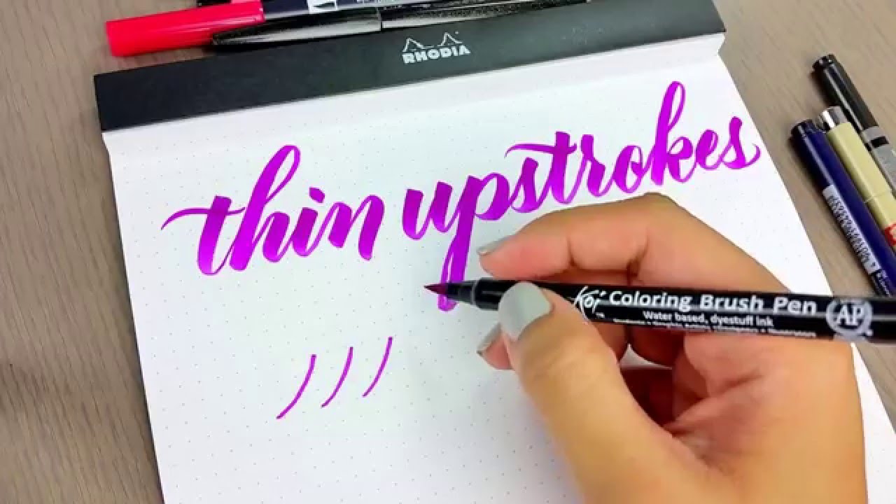
- If your upstrokes feel shaky, this guide on how to fix shaky upstrokes can help smooth the motion.
Small habits, big difference
- Start dots, not full letters: Lightly place a tiny starting point for the first letter and a tiny ending point for the last letter, then write between them.
- Use the same envelope orientation: Rotate all envelopes the same way so your arm motion matches every time.
- Keep a reference envelope: Once one envelope looks perfect, keep it nearby and match your block placement to it.
Perfect centering is really just consistent decisions, repeated gently. One swoop at a time, and soon that whole stack will look like it marched across the page in neat, happy rows.