Grab your favorite brush pen and let's draw some beautiful letters together!
If modern calligraphy feels like a whole forest of swoops and loops, the secret path is simpler than it looks: most lowercase letters are made from a small set of repeatable strokes. Practice the strokes first, and your alphabet will start to click into place.
Before you begin
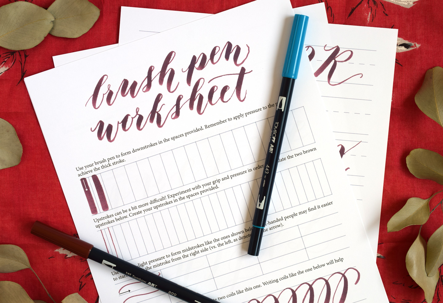
Pressure is the key
Brush lettering is built on contrast:
- Upstroke: light pressure for a thin line.
- Downstroke: heavier pressure for a thick line.
Try holding your pen at a comfortable angle and moving from your arm and shoulder, not just your fingers. Smooth comes first; speed follows.
Quick supply check
- Brush pen: any beginner-friendly brush pen works. If you are choosing your first one, visit Best Brush Pens for Calligraphy Beginners.
- Paper: smooth paper helps protect your tip and keeps lines crisp. See Paper That Keeps Brush Pens From Fraying.
If your pen tip is already looking fuzzy, that can make strokes feel scratchy. Here is help: How to Fix Frayed Brush Pens.
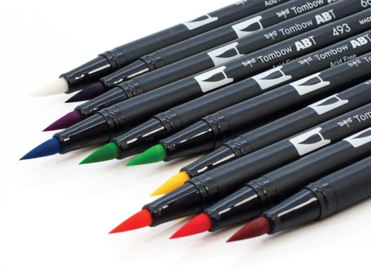
Quick note: brush pens can feel very different from each other. Felt tips often need a gentler hand, while flexible nylon tips can handle (and sometimes require) more pressure. If your strokes look “wrong,” it might be the pen, not you.
The 8 basic brush lettering strokes
Different teachers name these a little differently, but the building blocks stay the same. Practice each stroke in rows, focusing on consistent pressure changes and matching shapes.
1) Entrance stroke
This is a thin, light lead-in that starts many letters. Think of it as a gentle ramp that sets your pen in motion.
- How it looks: a thin line that rises slightly and curves into the next stroke.
- Pressure: very light.
- Common letters: i, t, u, w, p, r.
Practice: Make 2 to 3 rows of short entrance strokes, all the same height. Aim for a smooth, confident curve, not a shaky hook.
2) Underturn
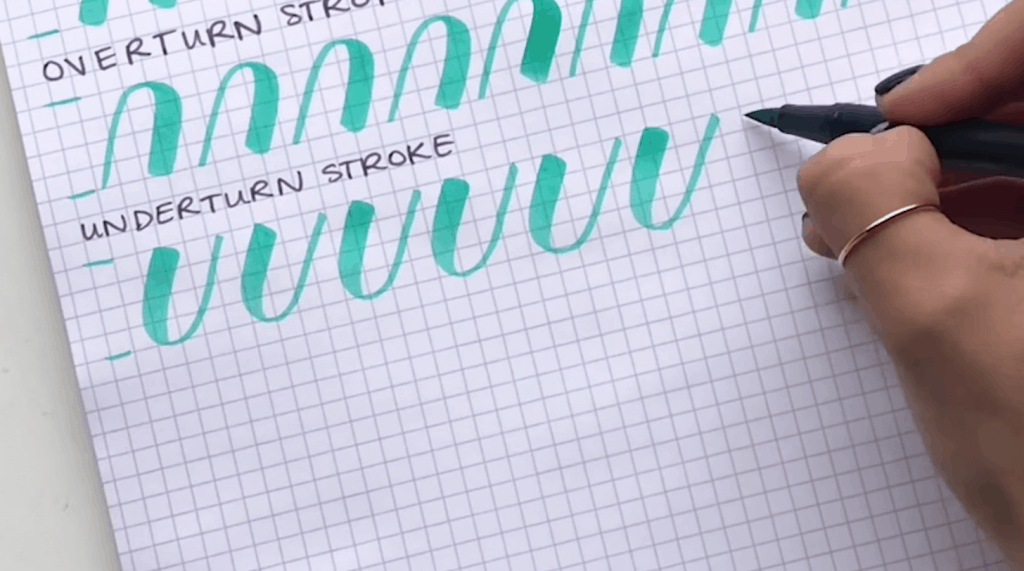
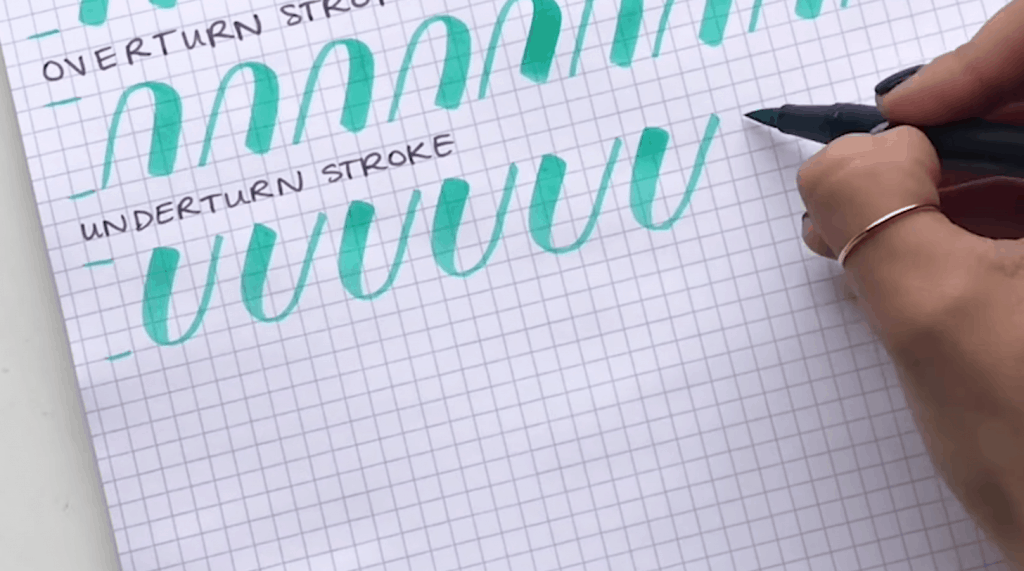
An underturn is that classic U-shape you see in letters like i, u, w, and t. It starts with a thick downstroke, curves at the bottom, and finishes with a thin upstroke.
- How it’s made: press down for a thick line, turn at the bottom, then release pressure as you come back up.
- Pressure change: heavy on the way down, light on the way up.
- Keep in mind: the bottom turn should be rounded, not pointy.
Practice: Make a row of underturns. Try to keep the bottoms at the same depth and the thick downstrokes the same width.
3) Overturn
An overturn is the arch shape that looks a bit like an upside-down U. It starts with a thin upstroke, curves at the top, and comes down thick.
- How it’s made: go up lightly, curve over at the top, then add pressure as you come down.
- Common letters: n, m, h, b.
Practice: Fill a row with overturns. Watch for leaning too far left or right. Consistent slant makes your words look tidy.
4) Compound curve
This is an overturn connected to an underturn in one flowing motion. It shows up in so many places that it is worth extra practice.
- How it’s made: thin up, thick down, thin up (arch over, then scoop back up).
- Common letters: m, n, y, h.
Practice: Write a row of compound curves slowly. Focus on even spacing between the thick downstrokes and matching the curve tops and bottoms.
5) Oval
The oval is the heart of round letters. The goal is a smooth loop with a thin upstroke on the left side and a thicker downstroke on the right side.
- How it’s made: many people like to start around the 2 o’clock position and go counterclockwise, keeping it light as you travel upward, then pressing as you come down. If it feels awkward, try starting a little higher or lower, or reverse the direction. Use the approach that gives you the cleanest thin-up, thick-down contrast.
- Common letters: a, o, d, g, q.
Practice: Make a row of ovals. Keep them the same height. If they look lopsided, slow down and check your pressure timing.
6) Ascending loop
This is the tall loop used for letters with ascenders. It is a thin upstroke that loops at the top, then returns down thick.
- How it’s made: light up into a loop, then down with pressure.
- Common letters: b, d, h, k, l.
Practice: Draw a row of ascending loops. Make sure the loop is narrow enough that it does not balloon outward.
7) Descending loop
This is the long loop that dips below the baseline. It is used in letters with descenders.
- How it’s made: thick down into the descender, then lighten as you loop back up.
- Common letters: g, j, p, q, y.
Practice: Make a row of descending loops. Keep the bottom curve rounded and consistent so your descenders match each other.
8) Connector stroke
This is the thin linking stroke that helps letters flow into each other. Without connectors, words can look choppy even if individual letters are lovely.
- How it looks: a thin exit stroke that leads into the next letter’s entrance or main stroke.
- Pressure: light.
- Where to aim: for many lowercase letters, try landing your connector back on the baseline, right where the next letter begins. For taller starts (like h or b), you may aim toward the next letter’s entry point as it rises.
Practice: Do a row of light connector strokes that rise slightly. Then practice simple pairs like ii, in, un, no, focusing on smooth transitions.
How to practice strokes
Use a simple rhythm
- Slow: write each stroke at a speed where you can control pressure.
- Repeat: 10 to 20 repetitions per stroke is plenty at first.
- Review: circle your best 2 and identify 1 thing to change on the next row.
Practice size consistency
Most “messy” lettering is really just inconsistent sizing. Pick a basic structure and stick to it:
- Waistline: top of most lowercase letters.
- Baseline: where letters sit.
- Ascender line: top of tall letters like l and h.
- Descender line: bottom of letters like g and y.
Even without guidelines, you can lightly pencil four lines and erase later.
Take tiny breaks
If your hand starts to clamp up, pause and shake it out. A relaxed grip and a loose wrist do more for your lettering than powering through tension.
If you are left-handed
Rotate your paper so your pen can pull downstrokes comfortably, and try to keep your hand below your writing line to reduce smearing. If your pen feels like it is fighting you, adjust the paper angle before you blame your technique.
Common stroke problems
My upstrokes are thick
- Use less pressure and let the brush tip barely skim the paper.
- Check your paper. Rough paper can catch the tip and force a thicker line. Try smoother options from this paper guide.
My downstrokes look shaky
- Slow down and pull the stroke toward you rather than pushing away at an awkward angle.
- Try using your arm for the motion instead of finger-only movements.
My ovals have a pointy top
- Round out the turn. Think “soft hill,” not “sharp peak.”
- Try adjusting where you start your oval and slow down through the top curve.
My loops get messy and wide
- Make the loop narrower. Tall loops look best when they are slim and controlled.
- Pause at the top of the loop for a tiny moment to redirect smoothly.
A simple 10 minute drill
If you want a routine that builds skill fast without feeling overwhelming, try this:
- 1 minute: light upstrokes (thin lines only).
- 1 minute: heavy downstrokes (thick lines only).
- 2 minutes: underturns and overturns (alternate rows).
- 2 minutes: compound curves.
- 2 minutes: ovals.
- 2 minutes: one loop type (ascending one day, descending the next).
After the drills, use the last minute to write one tiny word, like minimum (great for curves) or joy (great for a descending loop). The goal is to feel how strokes turn into real lettering.
Strokes and lowercase letters
Here is a friendly way to see the pattern. Many letters are just combinations of the same stroke families:
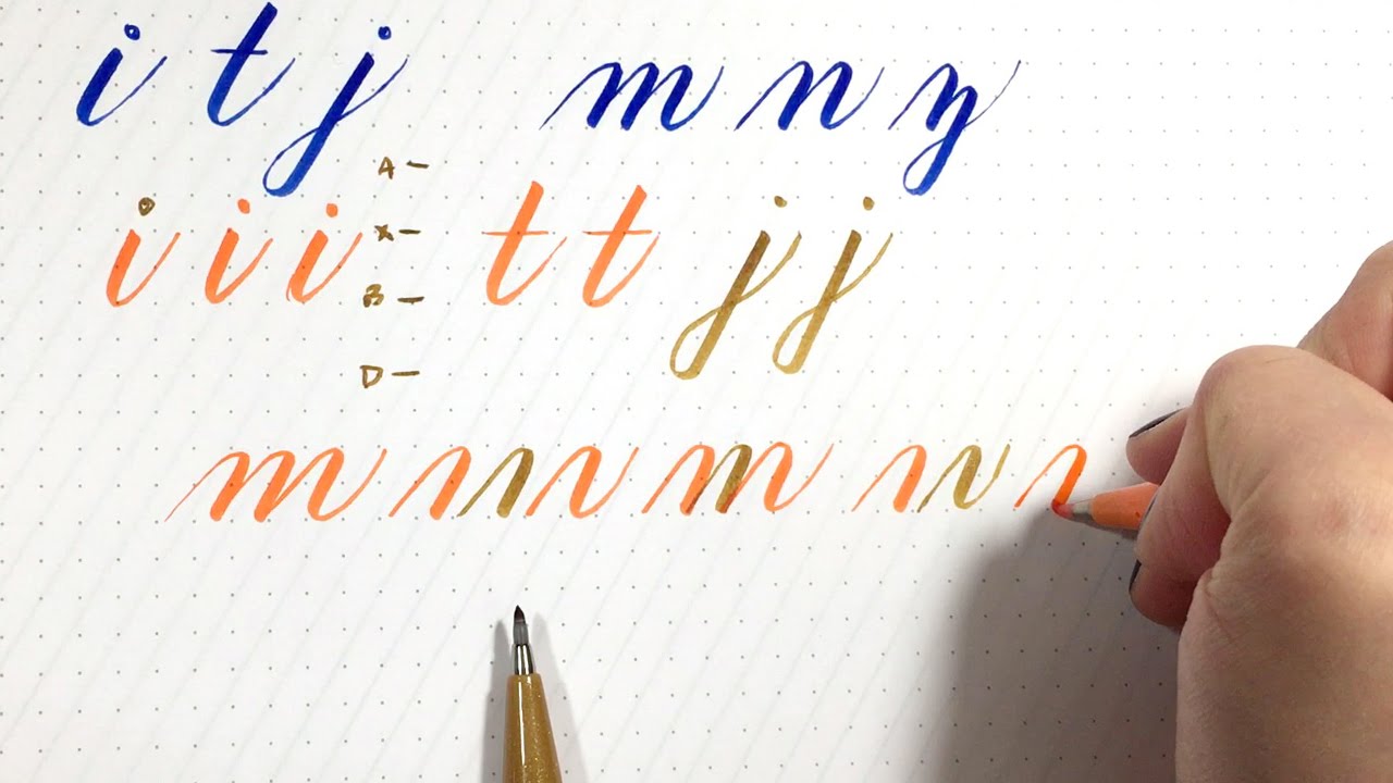
- Underturn family: i, u, w, t (plus connectors).
- Overturn and compound family: n, m, h (then add loops for b, k, l).
- Oval family: o, a, d (then add a descender for g, q).
- Descender family: y, j, p, g, q (descending loop plus a connector).
When you practice strokes, you are not just making pretty lines. You are practicing the parts that repeat in almost every word.
Keep going
Strokes are the warm-up, the workout, and the secret recipe all at once. Give your hand a little time to learn the pressure changes, and your letters will start to look more even, more confident, and more you.
If you want more practice-friendly ideas, hop over to Tutorials & Practice Drills and keep your pen dancing.