Grab your favorite brush pen and let's draw some beautiful letters together! Bouncy calligraphy looks like your words are happily hopping across the page, and the secret is simple: you break the baseline on purpose, but you do it with a plan.
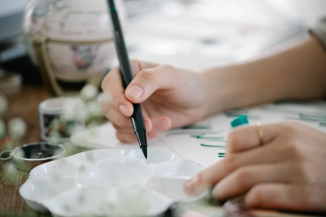
This tutorial will show you exactly where to drop letters below the baseline, how far to drop them, and how to keep the word readable while it bounces.
What breaking the baseline means
In basic modern calligraphy, most lowercase letters sit on the baseline, the imaginary line your word rests on. In bouncy calligraphy, you intentionally move parts of letters up or down so the word feels lively.
- Baseline: where most letters sit.
- x-height: the height of lowercase letters like a, e, o, n.
- Ascenders: tall strokes like b, d, h, k, l.
- Descenders: drops like g, j, p, q, y.
Bounce usually happens by lowering a letter (or part of a letter) below the baseline, raising it slightly above the baseline, or stretching entry and exit strokes so the “resting points” change. (A letter’s resting point is where it visually touches down on the baseline.)
This tutorial focuses on lowercase bounce, since uppercase bounce is a little different and easier to overdo.
If you want a refresher on keeping letters connected while you move them around, visit How to Connect Letters in Modern Calligraphy.
5 baseline rules that keep it clean
Rule 1: Pick a home base baseline
Even bouncy words need one steady reference line. Lightly draw guidelines or use dotted or grid paper. Your bounce will look intentional because the reader can still sense the line you are breaking.
Rule 2: Drop only some letters
A helpful starting pattern is to bounce about 1 out of every 2 to 3 letters. If every letter drops, the baseline disappears and your word can start to feel wobbly or hard to read.
Rule 3: Keep bounce in a beginner-friendly range
These ranges are not strict rules, but they are a helpful place to start. Your letter size, pen tip, and style will change what looks balanced.
- Small bounce: drop the letter’s resting point about 1/4 of the x-height below the baseline.
- Medium bounce: drop it about 1/2 of the x-height.
- Big bounce: drop it up to 1 full x-height, but only on a few letters.
If you go past an x-height drop too often, the word can start to look like it is sliding off the line instead of bouncing.
Rule 4: Change one thing at a time
When you are learning, do not drop a letter and stretch its shape and change its slant all at once. Choose one main bounce move:
- Move the letter down.
- Move the letter up.
- Extend the entry stroke.
- Extend the exit stroke.
Once the word looks stable, then you can add extra personality.
Rule 5: Protect spacing and counters
The counters are the enclosed spaces inside letters like a, o, p, and d. Bounce changes spacing, so keep an eye on:
- Overlaps: a dropped letter can crash into the next letter’s entry stroke.
- Gaps: bouncing up can create a floating gap that looks disconnected.
- Heavy spots: too many thick downstrokes near each other makes a dark blob.
A tiny fix that helps a lot is to slow down at connection points and keep your exit strokes narrow and tidy.
Where to drop letters
The easiest way to plan bounce is to decide which letters are allowed to sit low. Here are dependable options that keep readability strong.
Option A: Drop round letters
Round, bowl-shaped letters can drop without looking broken. Try dropping these by about 1/4 to 1/2 x-height:
- a
- c
- e
- o
- s
Option B: Drop simple pillar letters
These letters have clear main strokes that still read well when lowered:
- i (drop the main stem and keep the dot aligned with the word’s rhythm)
- l
- t
- r
Tip: When you drop a t, keep the crossbar consistent with the rest of the word. A dropped t with a random high crossbar can look accidental.
Option C: Drop a hump in m and n
Instead of lowering the whole letter, lower just one part:
- In n, let the second downstroke land below the baseline.
- In m, let the second or third downstroke land below the baseline.
This creates bounce while the letter still feels connected and recognizable.
Option D: Drop only the exit stroke
If full-letter bouncing feels scary, bounce only the exit stroke. Keep the letter sitting on the baseline, then let the exiting hairline dip below.
- Works beautifully on: a, d, h, n, m, r
- Helps prevent: weird spacing and crowded joins
What to avoid at first
Some letters can bounce, but they are more likely to look messy when dropped too early.
Be careful with descenders
Letters that already go below the baseline can turn into a tangle if you drop them further:
- g, j, p, q, y
If you want bounce on these, try shortening the descender loop instead of dropping the whole letter even lower.
Watch b, f, k
These have multiple moving parts. If you drop them too much, their loops and arms can collide with neighboring letters. A safer move is to keep them on the baseline and bounce a simpler neighbor instead.
A simple bounce recipe
Here is a sweet, reliable formula that works on most lowercase words:
- Write the word normally once on guidelines.
- Circle two letters you will drop (start with round letters like o, e, a).
- Rewrite the word and drop those circled letters by about 1/4 x-height.
- On a third pass, drop one of them by about 1/2 x-height and leave the other at 1/4.
- Fix spacing by slightly extending or shortening entry strokes so connections stay smooth.
That is it. Bounce is mostly planning and repetition.
Practice drills
Drill 1: Baseline hops
Make a row of connected u shapes (like a wave). Every third u, let the downstroke land about 1/4 x-height below the baseline. Keep the tops the same height.
Drill 2: The oooo ladder
Write oooo across the page. Drop the second o slightly, the third o a bit more, then bring the fourth back to the baseline. This teaches control, not chaos.
Drill 3: Bounce the humps
Write mmmmm. Bounce only the second hump each time. Keep everything else consistent.
Drill 4: Word sets
Pick one short word and write it 6 times, changing only one bounce choice each time:
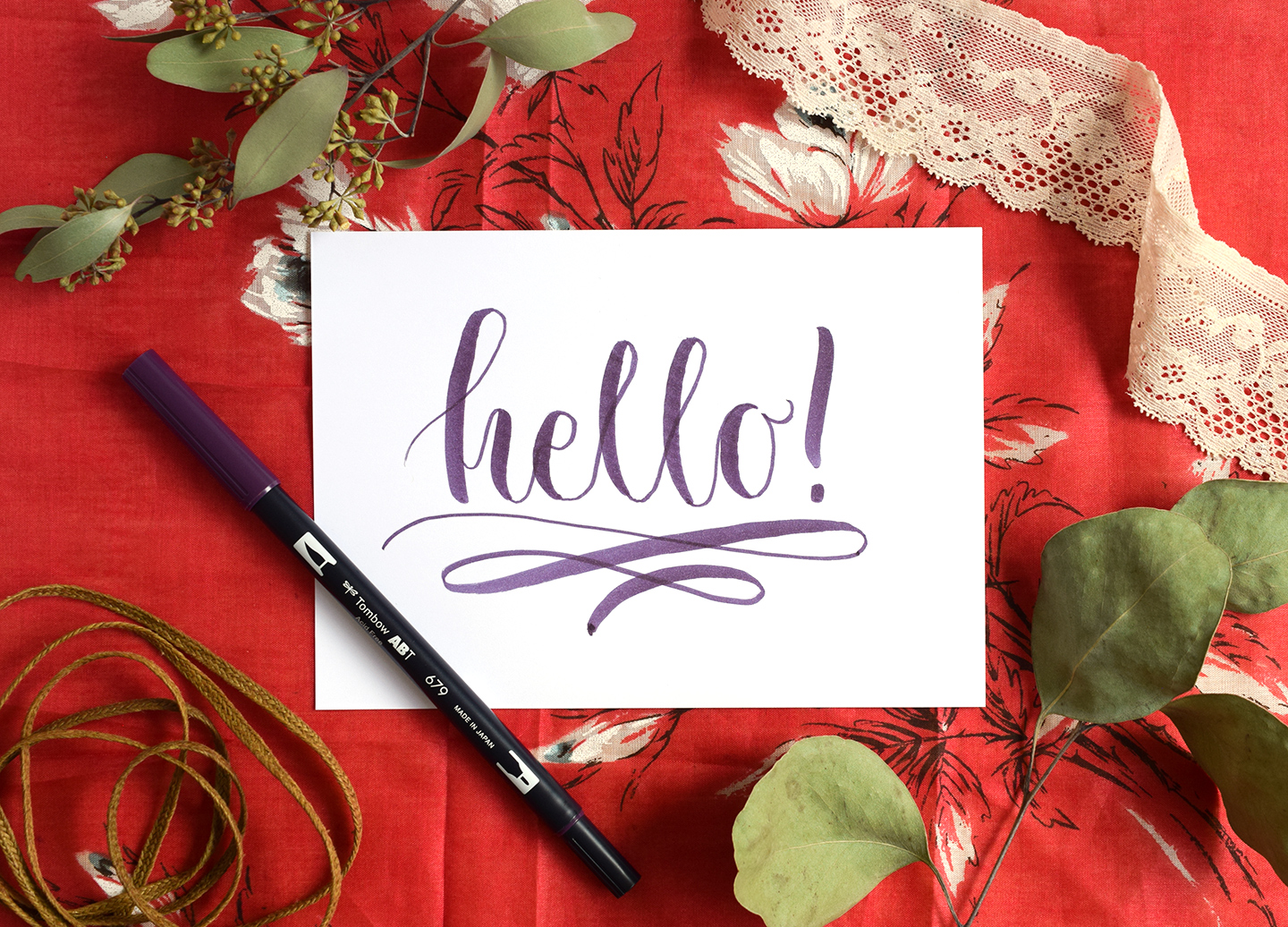
- hello (bounce e and o)
- mama (bounce the second hump in m, then bounce the last a)
- rose (bounce o, then bounce the exit stroke on s)
If you would like more structured repetition, the drills on Tutorials & Practice Drills pair nicely with bouncy practice sessions.
Keep it consistent on a page
Choose one bounce style
Mixing too many bounce styles at once can make a quote look uneven. Pick one:
- Low bounce: mostly dropping letters below baseline.
- High bounce: mostly lifting letters above baseline.
- Stroke bounce: baseline stays steady, only entry and exit strokes dip.
Repeat your bounce rhythm
Try a pattern like: normal, normal, bounce, normal, bounce. Your eye learns the rhythm, and your words look intentional.
Keep slant and pressure steady
Bounce should be the main change. If your slant and pressure change wildly too, the word can lose its style. If your brush pen is feeling scratchy or split, it may fight your smooth curves and make bounce look shaky. See How to Fix Frayed Brush Pens for gentle ways to troubleshoot.
Quick fixes
My word looks like it is sliding downhill
- Reduce the number of dropped letters.
- Limit drops to about 1/4 x-height for a few lines.
- Make sure at least one letter in each word sits firmly on the baseline.
My letters crash into each other
- Narrow your downstrokes slightly.
- Add a touch more space before the bounced letter.
- Bounce exit strokes instead of full letters.
It is bouncy but hard to read
- Stop bouncing complex letterforms (b, f, k) for now.
- Keep the x-height consistent even when you drop the baseline contact point.
- Make your ovals (a, o, e) clean and fully closed.
My bounce is random
- Decide your two bounce letters before you start.
- Use pencil dots to mark where the dropped letters should land.
- Repeat the same word 5 to 10 times to build muscle memory.
Quick checklist
- Is there a clear baseline home base you can feel under the word?
- Are only some letters dropped, not every letter?
- Are most drops around 1/4 to 1/2 x-height?
- Do your connections still flow smoothly?
- Does the word read quickly at a glance?
When all five answers are yes, your bounce is doing its job: energetic, stylish, and still easy to read.
If you want to explore more lettering looks (and pick the style that matches your project), hop over to Styles & Techniques.