Grab your favorite lettering style and let’s trade ink for heat. Wood burning calligraphy, also called pyrography lettering, uses a heated tip to “draw” your strokes into wood. If you already know brush lettering pressure and rhythm, you have a huge head start. The goal is the same: steady movement, intentional contrast (thick vs. thin), and lots of cozy practice.
Before we dive into tools, here is what you are aiming for: a good burn line feels like the tip is gliding with light contact, and it looks smooth, continuous, and evenly toned from start to finish. If you find yourself pressing, forcing, or pausing, the line usually gets rougher and darker than you meant.
How brush lettering translates to wood burning
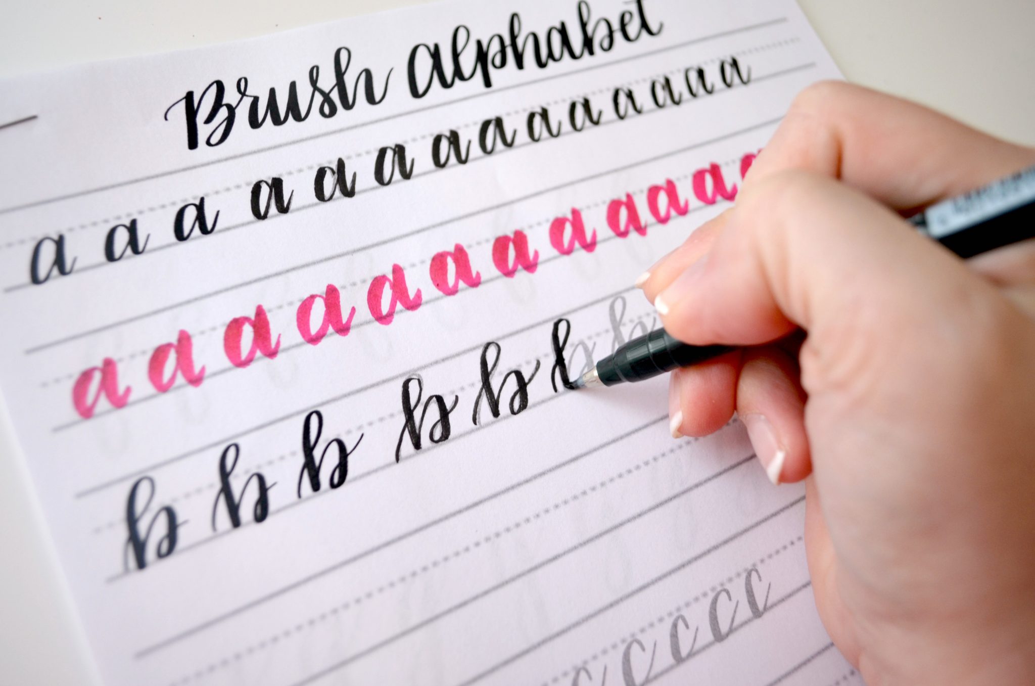
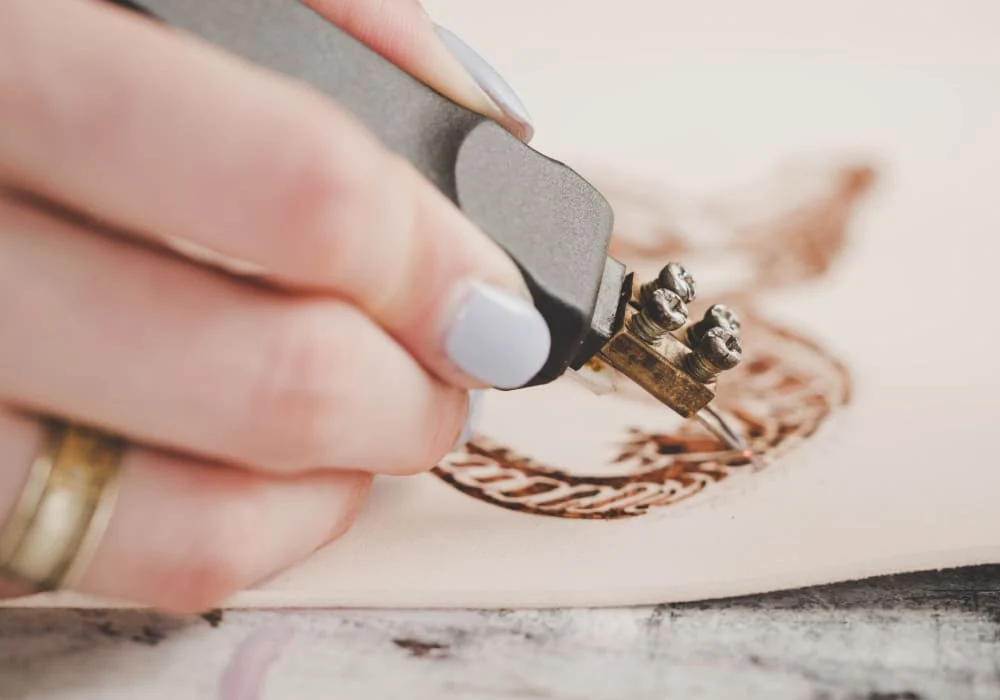
Brush lettering is all about pressure changes. Pyrography is all about speed, heat, and dwell time. Those three control how dark a line gets, and they can make a stroke appear thicker when the burn spreads. For true, reliable stroke width, though, you will lean most on tip shape and intentional overlap.
- Downstrokes: In brush lettering they are thicker because you press harder. In pyrography they look bolder because you use a broader tip, widen the stroke with a second pass, and (yes) sometimes slow down slightly to deepen the tone.
- Upstrokes: In brush lettering they are thin because you use light pressure. In pyrography they stay delicate when you move a bit faster, use a fine tip, and avoid lingering.
- Turns and loops: Instead of squeezing a brush pen, think “steer the tip.” Keep curves smooth by rotating the wood (when possible) rather than twisting your wrist into a knot.
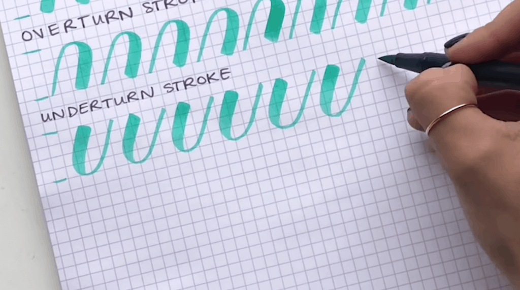
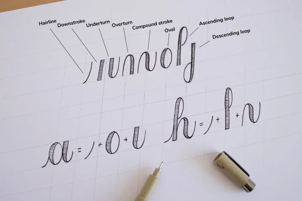
If you want a quick refresher on the stroke language your hand already knows, visit 8 Basic Brush Lettering Strokes. Those same shapes show up in pyrography, just with different controls.
Tool options (and what matters most)
Pyrography tools range from simple to studio-level. The best beginner choice is the one that feels controllable and consistent, especially in temperature stability and hand comfort (a grip that does not make you tense up).
Option 1: Solid-tip wood burning pen
- Best for: first-time pyrography, simple words, small projects
- Pros: affordable, easy to find, simple setup
- Watch for: temperature can fluctuate, and tips can feel bulky for tiny details
Option 2: Wire-nib (temperature-controlled) pyrography station
- Best for: smoother lines, more consistent tone, detailed lettering
- Pros: adjustable heat, and wire nibs can glide with less drag once you find your settings
- Watch for: higher cost and a little more setup
Nibs and tips that help lettering look crisp
- Fine point: hairlines, entry strokes, small bounce details
- Skew or shader tip: widening downstrokes, filling thick areas
- Ball tip: beginners often find it forgiving for slow curves, but it can look soft edged if you linger
Helpful extras
- Graphite pencil and soft eraser (for sketching and cleanup)
- Ruler or T-square (for guidelines)
- Low-tack tape (to hold paper patterns or stabilize a board)
- Sandpaper (fine grits for smoothing and fixing little mistakes)
- A heat-safe pen stand (always give the hot tip a home)
Wood choices for clean lettering
Wood grain is like paper texture. Smooth surfaces give smooth strokes. Busy grain tugs your line around like a stubborn little river current.
Friendly beginner woods
- Basswood: smooth and soft, great for crisp strokes
- Birch (including birch plywood): often fairly smooth and consistent, but do a quick test burn since plywood layers and glue can burn a little differently
- Maple: harder but can look beautifully clean when sanded well
Woods to save for later
- Pine: resin pockets and strong grain can cause blotchy burns
- Open-pore hardwoods (oak, ash): texture can make lettering look bumpy
Prep tip: Lightly sand your surface before you start. Think of it like choosing paper that keeps tools from snagging. Smoothness matters.
Safety first
Pyrography uses heat and produces smoke. A safe setup keeps the craft relaxing, not stressful.
- Ventilation: Work in a well-ventilated area. Avoid breathing smoke directly, and pause if you notice irritation.
- Burn bare, unfinished wood only: Avoid pressure-treated lumber, painted wood, stained wood, sealed wood, or unknown scraps. If a product has any coating or treatment, assume it is not safe to burn unless the manufacturer explicitly states it is intended for pyrography. (Even then, ventilate well.)
- Mind the cord and tip: Keep the hot tip in a stand when not in motion. Keep cords away from your working hand and any edges where they could catch.
- Heat awareness: Assume the metal is hot even during short pauses. Let tools cool fully before storing.
- Fire-safe surface: Use a heat-resistant mat or a dedicated board under your project.
- Eye and hand comfort: Good lighting reduces mistakes. Take breaks to avoid shaky lines from fatigue.
Set up your lettering
Great wood-burned calligraphy starts before the tool heats up.
1) Pick a simple word and a simple style
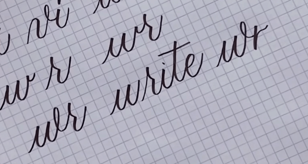
Choose short words with friendly shapes: “hello,” “joy,” “gather,” “love.” If you are still practicing consistent spacing and connections, peek at How to Connect Letters in Modern Calligraphy first. Clean joins make wood burning look polished.
2) Add guidelines
- Baseline for sitting
- X-height for consistency
- Ascender and descender limits if your word has tall or hanging parts
If you enjoy playful bounce, keep it subtle at first. A big bounce can create uneven heat marks when you stop and start frequently. For a quick baseline refresher, see Bouncy Calligraphy Baseline Rules.
3) Transfer your design
- Pencil sketch: Easiest beginner method. Use a light hand so lines erase cleanly.
- Tracing transfer: Place printed lettering over graphite paper, then trace. Useful for repeating the same design on multiple pieces.
Keep it light: Deep pencil grooves can show after burning, especially on soft woods.
Your first burns: 5 core techniques
1) Warm up on scrap wood
Before touching your real project, do 2 minutes of drills. Straight lines, gentle curves, and a few ovals. If you like structured practice, borrow the rhythm idea from 15 Minute Daily Calligraphy Drills and swap pen for burner.
2) Move your whole arm
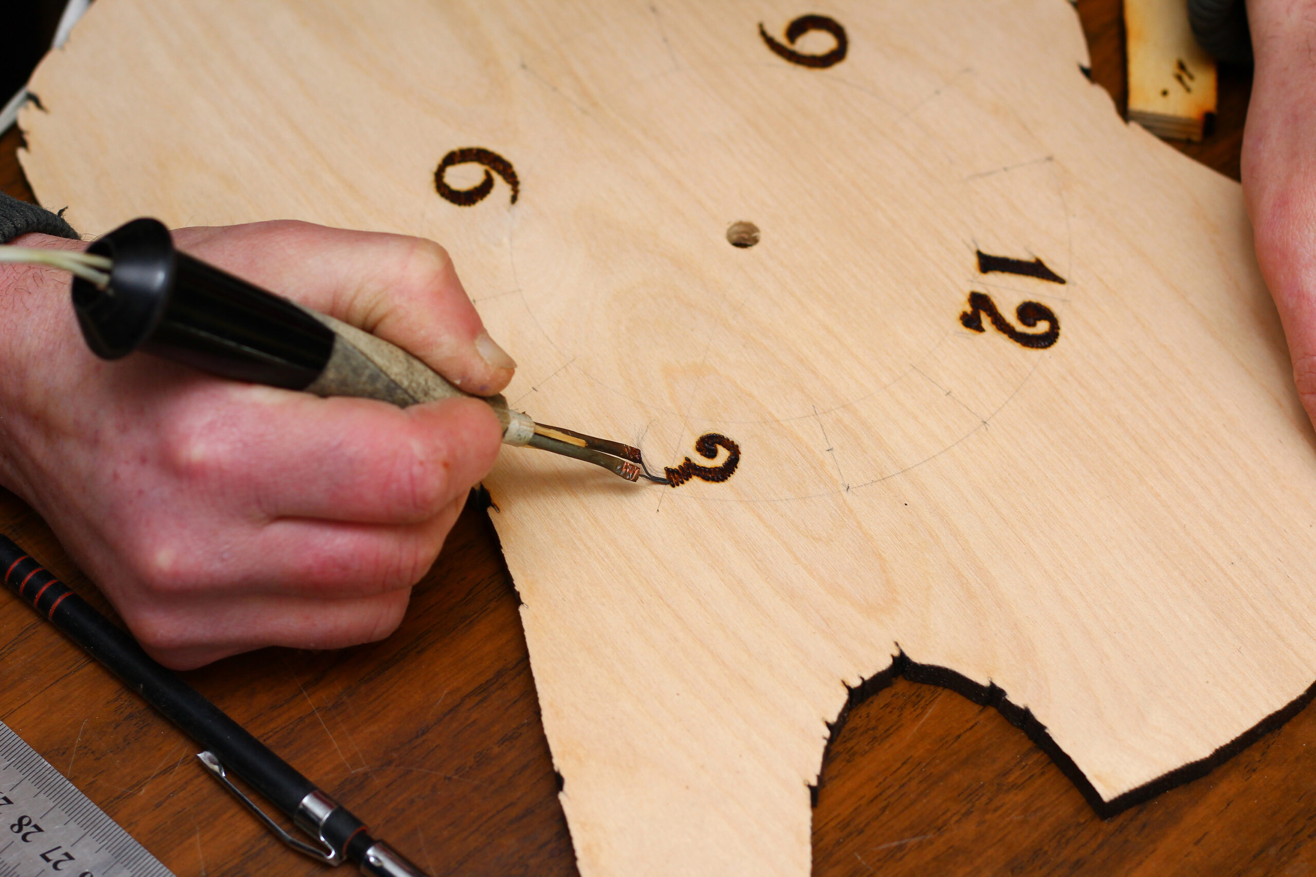
Wood burning rewards smooth, continuous motion. Try anchoring your forearm lightly and guiding the stroke with your arm and shoulder, especially for long swashes.
3) Control tone with speed and heat
- Lighter line: a bit faster movement, less time touching the wood, or slightly lower heat
- Darker line: a bit slower movement, slightly more dwell time, or slightly higher heat
A common beginner bump is stopping mid-stroke, which creates a dark “dot.” If you need to pause, lift the tip off the wood instead of freezing in place.
4) Build thickness with overlaps
Instead of forcing one heavy stroke, burn a clean centerline first, then widen the downstroke with a second pass (or two) to build the shape. This mirrors faux calligraphy logic and keeps edges neater. If you like the idea of building thickness intentionally, Faux Calligraphy Tutorial With Any Pen uses the same mindset.
5) Turn the wood to help curves
On tight loops and round letters, rotate the board so your hand keeps a comfortable direction of travel. Smooth movement makes smooth heat marks.
Smooth, even lines
Keep your tip clean
Char buildup makes scratchy, uneven lines. Always unplug and let the tool cool completely before cleaning. Then use a gentle option like a dedicated tip-cleaning pad, a soft brass brush, or the cleaning method your tool manufacturer recommends. Avoid aggressive sanding on wire nibs, since it can change their shape.
Match the heat to the wood
Too cool can cause drag and pressure marks. Too hot can scorch and widen lines unexpectedly. The sweet spot is when the tip moves with light contact and leaves a steady mark without forcing.
Avoid overworking an area
Repeated passes over the same spot can make a fuzzy halo around your stroke. If you need to darken something, do it in one intentional second pass, not lots of tiny touch-ups.
Use a light touch
Pressing harder does not usually make a prettier stroke. It dents soft wood and can create rough edges. Let heat do the work.
Left-handed and hand position tips
Pyrography is not smudge-prone like ink, but it does have its own ergonomics, especially for lefties.
- Rotate the board often: Set yourself up so you can pull strokes in a comfortable direction, rather than bending your wrist into awkward angles.
- Plan your burn order: Work from the center outward, or from one side to the other, so your hand does not hover over freshly burned areas. (They can stay warm longer than you expect.)
- Cord control: Keep the cord on your non-writing side so it does not drag across your workspace or bump your hand mid-stroke.
- Use the same “stay out of your own way” habits you use for ink: If you want a lefty mindset refresher, Left-Handed Calligraphy Smudge-Free Techniques and Grip Adjustments has great positioning tips that translate well.
Add flair without losing control
Flourishes, simplified
Flourishes look best when they are confident and clean. For beginners, use shorter flourishes and aim for one smooth motion. If you want flourish rules for balance and spacing, Beginner Calligraphy Flourishing is a helpful companion.
Shading and dimension
- Soft shading: use a shader tip with gentle, overlapping strokes, like coloring with a very patient pencil
- Drop shadow effect: burn a second, lighter outline slightly offset, then fill it softly
If you enjoy dimensional lettering in ink, the same design thinking works here. See Drop Shadows and 3D Effects for Hand Lettering for shadow placement ideas.
Finishing your piece
Erase guidelines gently
When the wood is cool, erase pencil lines carefully. If erasing smudges the burn marks, switch to a softer, cleaner eraser and lighter pressure.
Sand for cleanup
For tiny mistakes or fuzzy edges, very lightly sand the area and reburn. Use a fine grit and a gentle hand. It is better to do two light sanding passes than one heavy one.
Seal if needed
Sealers can deepen contrast and protect the surface. Before you seal, gently wipe away dust and loose char so it does not get trapped or smear. Choose a finish that suits the final use of the item and follow label directions for drying time and ventilation. Always test on a scrap piece first because some finishes darken burn marks more than expected, and some can grab leftover graphite if you did not erase thoroughly.
Beginner project ideas
- Name tags on thin wood slices: simple monoline names look charming and forgiving
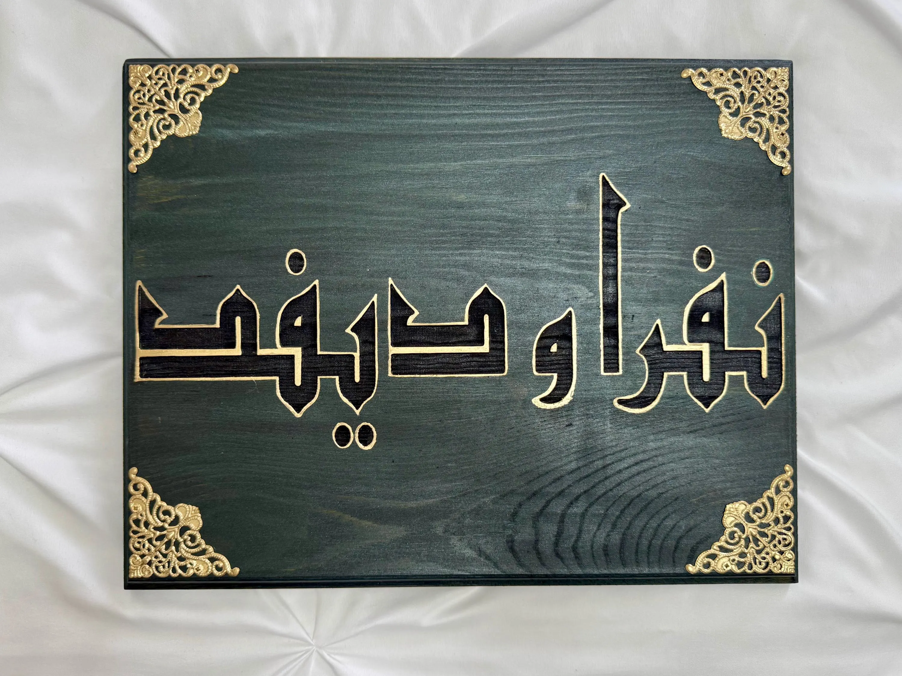
- A quote on a small plaque: keep the phrase short and add lots of breathing room
- Recipe box labels: burn one word per piece, like “Soup,” “Dessert,” “Bread”
- Ornaments: a single word plus a tiny flourish is plenty
For other cozy craft inspiration, browse DIY Projects & Crafts.
Troubleshooting
My lines look blotchy
- Try a smoother wood and sand before burning.
- Adjust heat and focus on steady speed for consistent tone.
- Clean tip buildup.
I keep getting dark dots at the start and end
- Touch down and lift off while moving, like a tiny airplane landing and taking off.
- Do not pause with the tip touching the wood.
My thick downstrokes look wobbly
- Burn a thin centerline first, then widen with a second pass.
- Use a broader tip for fills, not a fine tip forced to act “fat.”
The wood looks fuzzy or scorched around the stroke
- Lower heat or move a bit faster.
- Use fewer repeated touch-ups.
- Try sanding lightly and reburning with a cleaner pass.
A simple practice plan
- Day 1: straight lines and gentle curves, 10 minutes
- Day 2: ovals and loops, 10 minutes
- Day 3: one word in monoline, focus on even tone
- Day 4: same word with thickened downstrokes using a second pass
- Day 5: two short words, add one small flourish
Wood burning rewards calm repetition. Each pass teaches your hand how fast “light” feels and how slow “dark” feels. That is your new pressure control, just with heat instead of ink.