Grab your favorite pen and let’s give your letters a little glow up. Drop shadows and 3D effects look fancy, but they are really just two things working together: a consistent light source and patient, repeatable steps. Once those click, your shadows start behaving like well-trained little mice in a tidy line.
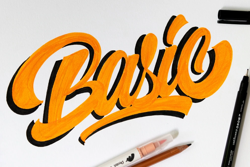
Start with one rule: pick a light source
Every believable shadow starts with the same question: Where is the light coming from? Choose a direction and stick with it for the whole word, quote, or layout.
- Light from top left is a friendly classic. Shadows usually fall down and right.
- Light from top right makes shadows fall down and left.
- Light from straight above creates a shadow mostly directly underneath, which can look bold and poster-like.
Nitty-gritty but helpful: For a simple drawn drop shadow, you can treat the shadow like your letterform shifted away from the light source by a small, even amount. Real-life cast shadows can get more complicated, but this tidy “consistent offset” approach is exactly what makes hand-lettered shadows look clean.
Tools that make shadows easier
You can create shadows with almost any writing tool. The main goal is control and consistent color.
- Main lettering tool: brush pen, marker, or any pen you like.
- Shadow tool: a smaller tip marker, fineliner, colored pencil, or a light gray brush pen for softer shadows.
- Paper: smooth paper helps your shadow lines stay crisp and prevents brush tips from fraying. See paper that keeps brush pens from fraying.
If you are choosing pens for the first time, this guide can help you pick a comfy starter: best brush pens for calligraphy beginners.
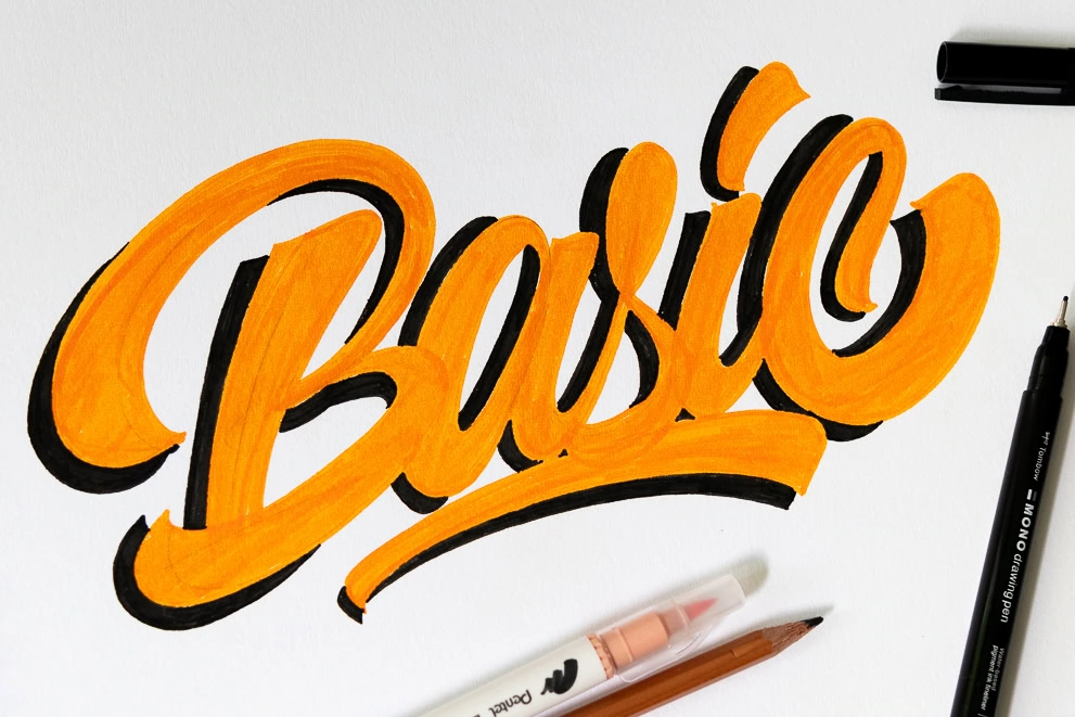
How far should the shadow offset be?
Think of your offset like seasoning. A little goes a long way, and the right amount depends on your lettering size.
- Small words (journals, cards): a tiny offset, about 1 to 3 mm, keeps things crisp.
- Larger pieces (posters, big headings): a bigger offset looks intentional and easier to read from a distance.
The key is not the exact measurement, it is the same offset width throughout.
Hard vs soft shadows
A hard shadow has a crisp edge and reads bold and graphic. A soft shadow has a gentler edge and feels more dreamy. Hard shadows are great for clean modern pieces. Soft shadows are lovely for cozy quotes, watercolor vibes, or anything you want to feel a little less “poster.”
How to draw a clean drop shadow
This method is super dependable because you are building the shadow shape with lines first, then filling it in.
Step 1: Letter first, then pause
Write your word normally. Let ink dry if it smudges easily.
Step 2: Choose your shadow direction
Pick one direction, like down and right. Stay loyal to it everywhere.
Step 3: Trace only the shadow edges
Imagine your letters duplicated and nudged down-right by a tiny, even amount. Now draw only the parts of that duplicate that would be visible behind your original letters.
- Work letter by letter.
- Focus on the outside edges of the shadow, not the whole outline of the letter.
- Keep the offset distance the same. Small offsets look neat and modern.
Step 4: Connect the gaps
Where your original letter and the shadow outline are close, you will see little “side walls.” Connect them with short lines so the shadow becomes one solid shape.
Step 5: Fill the shadow
Color in the shape smoothly. For a softer look, fill with a lighter color, or use gentle pressure with a brush pen and slightly feather the edge.
Quick note on inner counters
Those enclosed spaces inside letters like o, a, e, b are called counters. You can shadow them, but you do not have to. If your word starts getting busy, leave counters clean for legibility, especially on small lettering.
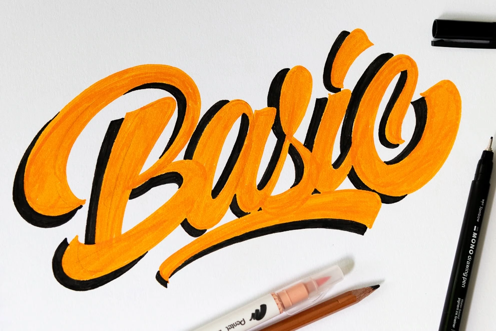
Fast drop shadows
If you want a quick, sketchy and cute shadow, try this. It works best on chunky letters and casual styles.
- Pick a light source, for example top left.
- On the shadow side of each stroke, draw a parallel line a tiny distance away.
- Only add the line where a shadow would show. Do not outline the entire letter.
This style looks playful, especially in colored shadows.
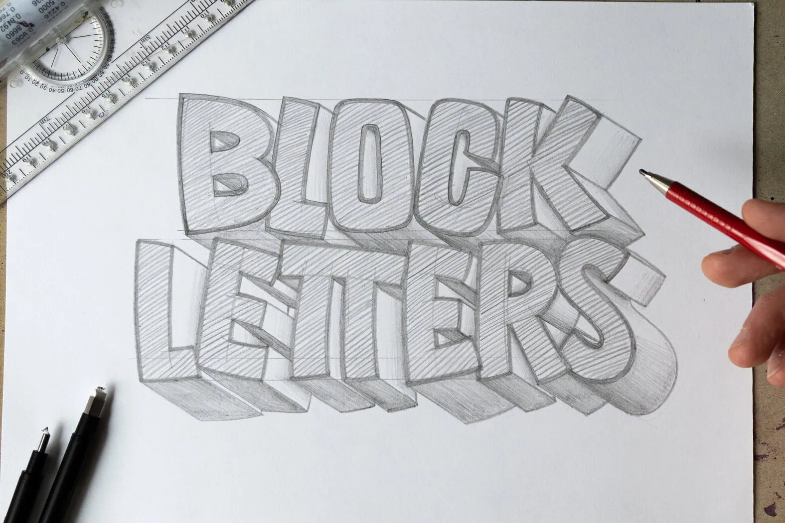
Turn a shadow into simple 3D
3D lettering is just a shadow that gets promoted into a solid object. Instead of a flat shadow shape, you build depth with “side faces.”
Step 1: Draw your letters
Thicker, simpler letterforms are easiest for your first 3D attempt.
Step 2: Choose a depth direction
This is like your shadow direction, usually down-right or down-left. Keep it consistent.
Step 3: Add extrusion lines
From key corners and endpoints, draw short lines going in the depth direction. Think of them as little ramps heading away from your letter. Keep these lines parallel so your 3D does not start twisting.
Step 4: Connect the ends
Connect those short lines to create the back edge of the letter. Now your letter has sides.
Step 5: Shade the faces
Instead of memorizing “top is light, bottom is dark,” use this simple rule: the face pointing most toward the light is lightest, and the face turned away is darkest. The remaining face lands in the middle.
Even two values (light and dark) can be enough for a strong 3D look.
Highlights: the shiny partner of shadows
If shadows show where light is blocked, highlights show where light hits most. Highlights are optional, but they make letters look polished and a bit glossy.
Where to place highlights
- Put highlights on the light-facing side of the letter. If your light is top left, highlights belong near the top left edges.
- Keep placement consistent across every letter.
- A little goes a long way. A few short highlight marks can be plenty.
What to use for highlights
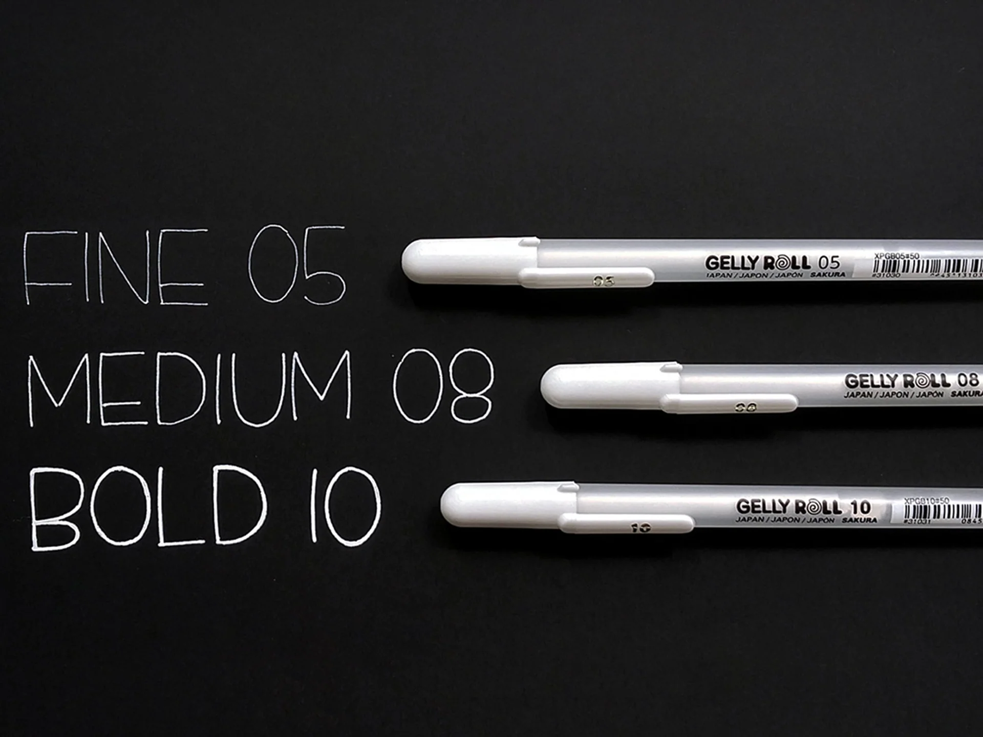
- White gel pen or white paint pen on dark letters.
- A lighter tint of your letter color on light backgrounds.
For dark envelopes and deep colored paper, these options help: best white pens and inks for dark envelopes.
Inline details that look intentional
An inline is a line drawn inside the letterform, usually near an edge. It is not a shadow, but it pairs beautifully with shadows and 3D effects because it adds structure and style.
How to place an inline
- Pick one side to hug, usually the light side (the same side you would highlight).
- Keep spacing even. Aim for a consistent gap between the inline and the outer edge.
- Lift your pen at tight curves if needed. Clean segments look better than wobbly lines.
If your upstrokes feel shaky while you add details, this practice helps: how to fix shaky upstrokes.
A quick consistency check
Before you declare your masterpiece done, do this tiny inspection. It catches almost every shadow mistake.
- Direction check: Do all shadows fall the same way?
- Distance check: Is your offset mostly the same width throughout?
- Overlap check: Are you accidentally drawing shadow lines on the light side?
- Value check: Are darker areas grouped together (shadow side) and lighter areas grouped together (light side)?
Common shadow hiccups
My shadow looks like it is floating away
Your offset may be changing. Try a smaller, more consistent shift. It also helps to add shadows in a slow pass: sketch the shadow edges lightly across the whole word first, then fill.
My shadow is accidentally outlining the whole letter
Only draw the visible shadow edges, not a complete second letter. If the shadow would be hidden behind the letter, skip that line.
My 3D looks twisted
Some extrusion lines are drifting in different directions. Pick one depth direction and keep those short lines parallel.
My highlights look random
Highlights must match the same light source as the shadow. Use fewer highlight marks and scoot them to the light-facing edge.
Practice drill: one word, three effects
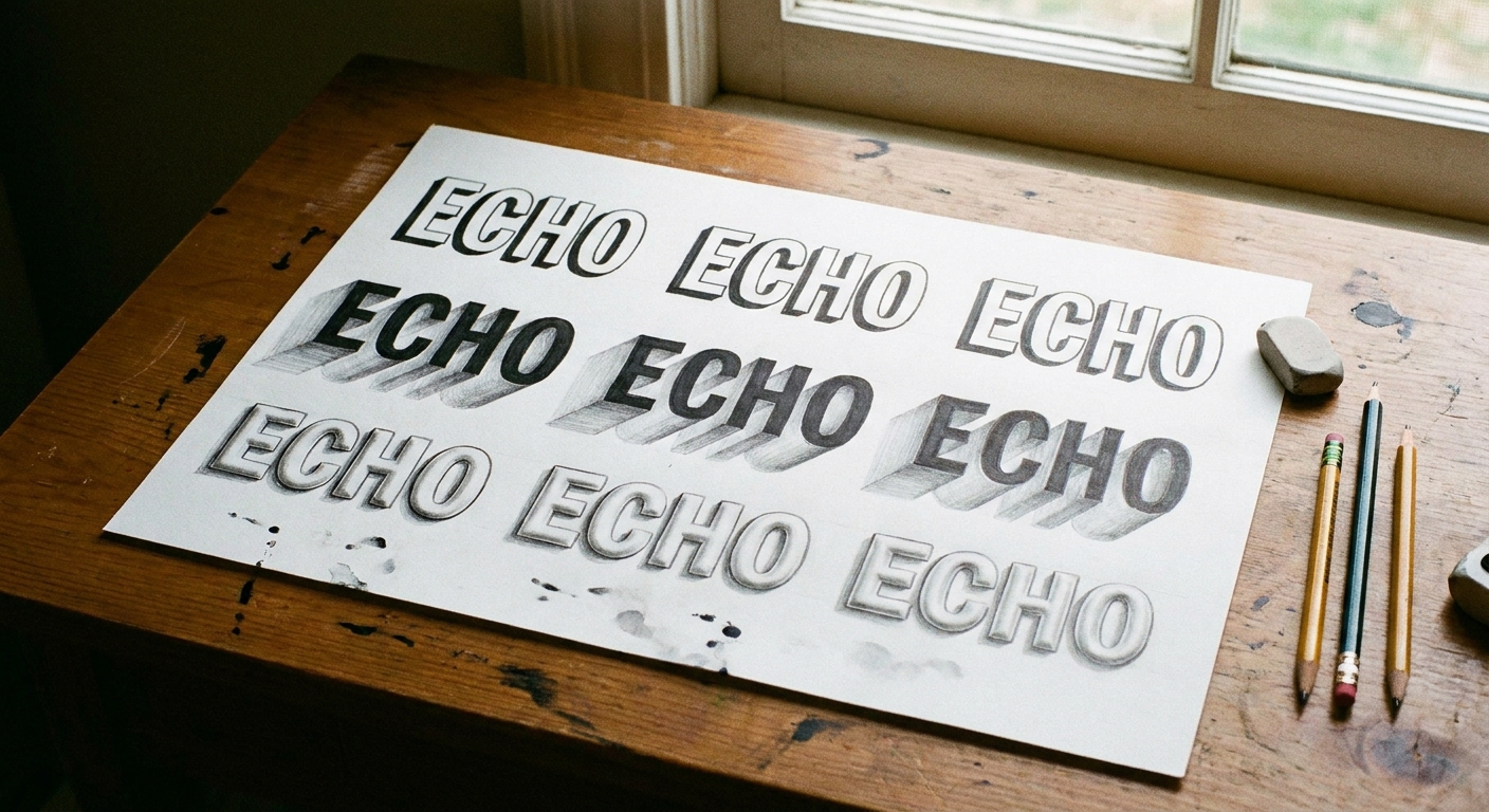
This is a cozy little drill that teaches control fast. Choose a short word like “hi,” “joy,” or “bloom.”
- Write the word once in your normal style.
- Add a clean filled drop shadow using the outline method.
- Write it again and add a single-line shadow.
- Write it a third time as simple 3D with two-tone shading.
If you want more bite-sized practice sessions like this, tuck this into your routine: 15-minute daily calligraphy drills.
FAQ
Should the shadow be darker than the letters?
Usually the shadow is darker or more muted than the background, but it does not have to be darker than the letters. A lighter gray shadow behind black letters is common. Colored shadows can be bright and still read as shadow if the direction and offset are consistent. Just make sure you still have enough value contrast with the background so the word stays easy to read.
Can I add shadows to brush lettering and faux calligraphy?
Yes to both. Faux calligraphy is especially friendly for shadows because the shapes are very clear. If you are building letters without a brush pen, this pairs nicely: faux calligraphy tutorial with any pen.
What if my letters have lots of loops and flourishes?
Keep your light source the same, and simplify. Shadow the main letter shapes first, then add shadows to a few flourish sections that have enough space to stay readable. If you love flourishing, you might enjoy: beginner calligraphy flourishing.
One last squeak of encouragement
Shadows look impressive because they add depth fast, but the secret is wonderfully small: choose one light source and stay loyal to it. Give your letters that steady, consistent nudge, and they will start popping off the page like they are ready for a tiny curtain call.