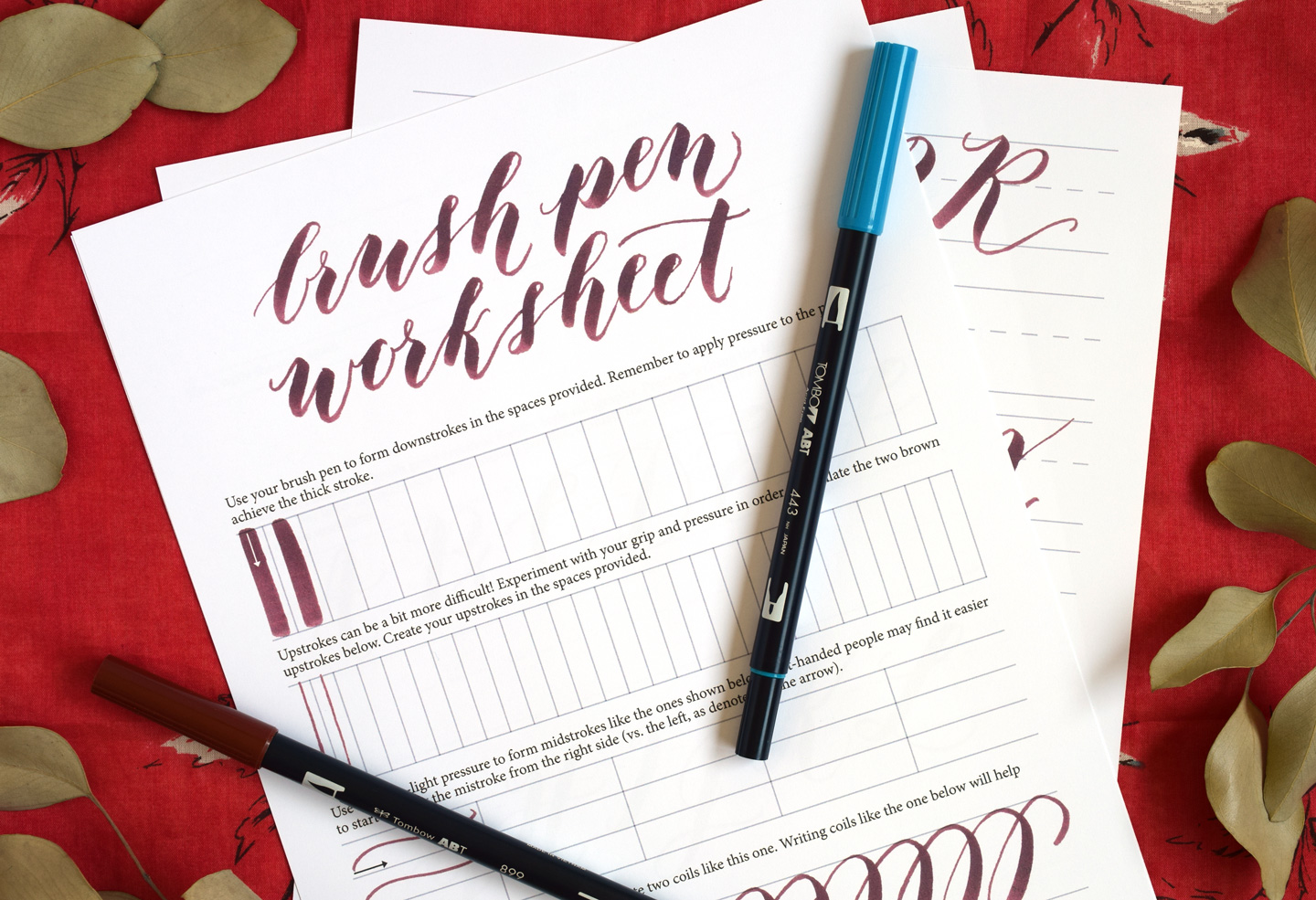
Grab your favorite brush pen and let's draw some beautiful letters together! Connecting letters in modern calligraphy looks like magic, but it is really a set of friendly, repeatable moves: an exit stroke, a tiny bit of spacing, and an entry stroke that knows exactly where to land.
The two strokes that do the work
In most beginner-friendly modern brush lettering styles, clean connections come from understanding two parts of a letter:
- Exit stroke: the stroke that leaves the letter (often a light upstroke that heads into the next letter).
- Entry stroke: the stroke that begins the next letter (often a light lead-in that sets up the first downstroke).
When words look bumpy, tangled, or too wide, one of these is usually happening:
- The exit stroke ends too high or too low for the next letter’s entry.
- The spacing between letters is inconsistent.
- The next letter starts too soon, so the downstroke runs into the previous letter.
Set up your baseline
Connections get easier when your letters share the same structure.
- Baseline: where most letters sit.
- X-height: the height of a lowercase “x.” Most lowercase bodies live here.
- Ascenders: tall strokes in letters like b, d, h, k, l.
- Descenders: strokes that dip below the baseline in g, j, p, q, y.
If you are practicing on blank paper, lightly pencil two guide lines: baseline and x-height. If you prefer ready-made guides, practice on any smooth, brush-pen-friendly sheet so your upstrokes stay crisp. If fraying or drag is making connections harder, pop over to paper that keeps brush pens from fraying and how to fix frayed brush pens.
The usual rule: light to light
Most of the time, modern calligraphy connections are thin-to-thin (or more accurately, light-pressure to light-pressure) connections. That means:
- You finish the first letter with a light upstroke.
- You begin the next letter with a light entry stroke.
Then the next downstroke can be bold and confident without bumping into the previous letter.
Micro-drill: two-stroke bridges
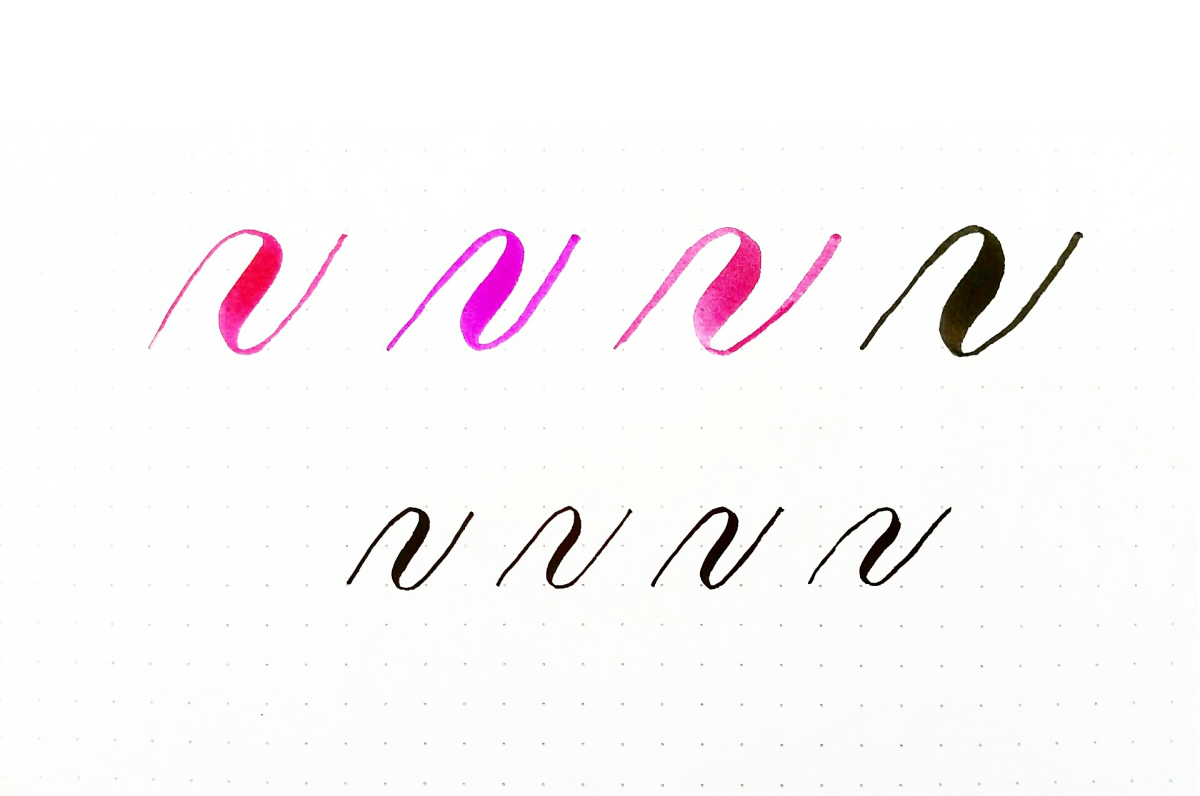
- Draw a light upstroke that ends around the mid-to-upper x-height.
- Keep the motion continuous (do not lift far off the page), glide into another light upstroke, then add a thick downstroke.
This drill teaches your hand the feeling of “glide, glide, press.”
Connect any two lowercase letters
Use this little routine anytime a join feels tricky.
Step 1: Finish on purpose
Do not let the exit stroke happen by accident. Aim it like a tiny ramp pointing toward the next letter.
- Keep pressure light so it stays thin.
- Aim to end around the middle to upper part of the x-height unless the next letter needs a different landing.
Step 2: Leave breathing room
A connection is not a smash. Leave a hairline gap so the word stays readable, especially near the baseline before a tall downstroke.
- If your word looks crowded, widen the space slightly between letters.
- If your word looks broken, shorten the exit stroke or start the next entry stroke a tiny bit sooner.
Step 3: Start with a light entry
Many lowercase letters like an entry stroke that begins on or just above the baseline and climbs gently into the first downstroke.
- Keep pressure light on the entry.
- Match the slant of your word.
Step 4: Commit to the downstroke
Once the entry is placed, the downstroke should be steady and full. Hesitation here often creates shaky joins.
Starter letters to watch
If you only learn one “connection hack,” make it this: adjust your exit stroke based on the next letter’s first shape. These two starter groups fix a lot of wobbles fast.
Oval starters
Letters that begin with an oval or bowl, like a, o, d, g, q, usually look best when you give them a little room to open.
- Let your exit stroke land around mid x-height.
- Start the oval entry lightly and give it a clean curve before you press into the downstroke.
Underturn starters
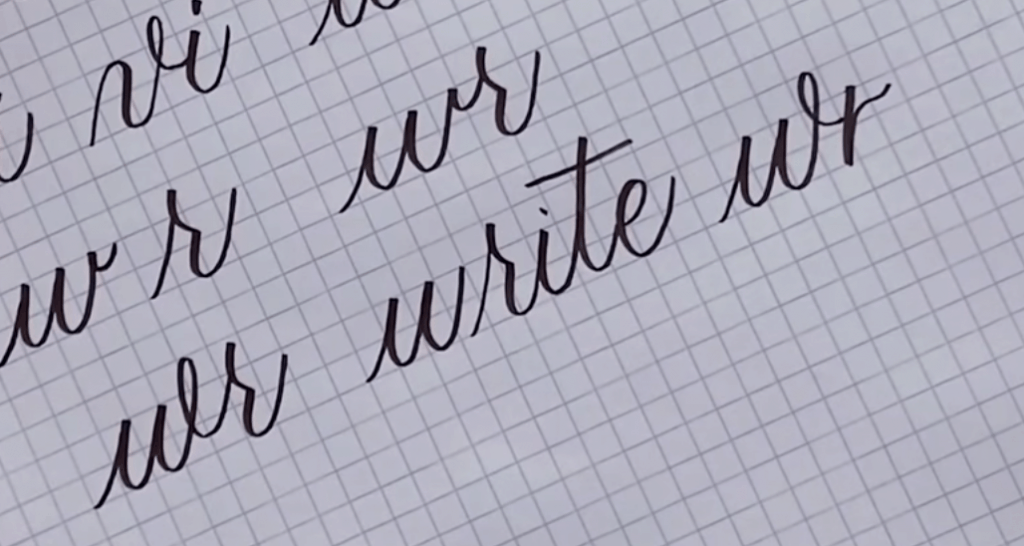
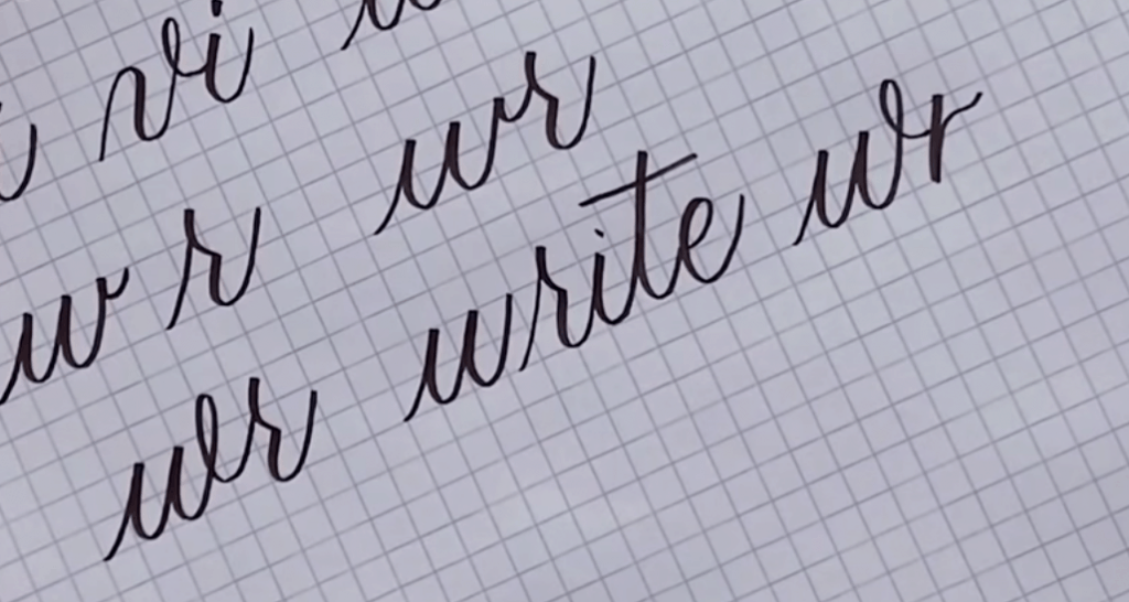
Letters that begin with an underturn, like i, u, w, can look pinched if you start them too soon.
- Make your connector a touch longer and keep it narrow.
- Begin the underturn from the baseline with a gentle, light entry.
Connection families
Instead of memorizing every pair, group letters by the kind of exits and entries they often use. Exact strokes vary by alphabet style, but these categories are a helpful starting point.
Family A: Arc exits
These letters often finish with a gentle exit that naturally wants to keep moving: a, c, e, i, m, n, o, r, u, v, w. (Depending on your alphabet, d and s may act like this too.)
How to connect them: keep the exit light and aim it toward the x-height. Start the next entry from the baseline with a matching slant.
Family B: After a tall stem
Letters with tall stems, like b, h, k, l, can tempt you to exit higher than you meant to, especially if you finish with a flourish.
How to connect them: guide the exit back down toward the x-height before you begin the next letter. If you exit too high, the next letter may start floating.
Family C: Loop and dip
Descenders like g, j, p, q, y can tangle if the loop swings too wide.
How to connect them: keep descender loops narrow, then return to the baseline cleanly before you exit into the next letter.
Family D: Short exits
Letters like t (before the cross) and sometimes x can leave a shorter exit.
How to connect them: add a slightly longer, light connector so the next letter does not look pinched.
Common tricky joins
“o” into “v” or “w” looks like a wobble
Why it happens: the exit from o ends too low, so the next letter’s entry has nowhere to climb.
Fix: finish the o with a slightly higher exit, then begin v or w with a clear, light entry from the baseline.
“r” into “e” turns into a blob
Why it happens: the r shoulder ends with too much pressure, so the connector thickens.
Fix: lighten pressure as you leave the r. Think “whisper stroke” into the e.
“m” or “n” into “i” looks too tight
Why it happens: repeated humps reduce spacing.
Fix: widen the tiny gap after the last hump of m or n, then make a clear i entry. Dot the i after the whole word so your rhythm stays smooth.
“e” into “l” feels like it jumps
Why it happens: the l starts too far away or with a steep entry angle.
Fix: bring the l a touch closer and match the slant. Start l with a gentle, light entry stroke that flows into the tall downstroke.
Spacing makes it seamless
If your connections are technically correct but the word still looks off, spacing is usually the reason. Try this simple check:
- Look at the white shapes between letters, not the ink. Aim for similar-sized gaps through the word.
- Keep connectors narrow. Wide connectors make words look stretched.
- Do not force perfect touching. In modern calligraphy, a connector can be delicate and still feel connected if spacing is consistent.
Mini practice plan
Short drills build muscle memory fast. Here is a gentle routine you can repeat any day.
Minute 1 to 2: pressure warm-up
- Row of light upstrokes
- Row of thick downstrokes
- Row of light-to-thick transitions
Minute 3 to 6: connector chains
Write these slowly, aiming for consistent spacing:
- iiiiii (light entries, steady downstrokes)
- nnnnn (even humps, narrow connectors)
- ooooo (smooth exits around x-height)
Minute 7 to 10: real words
Pick two or three short words and write each one three times:
- one time slow
- one time normal
- one time focusing only on spacing
Helpful rhythm tip: cross your t’s after you finish the word, just like dotting i’s. It keeps your hand moving smoothly through the joins.
If you would like more structured stroke practice, the drills in Tutorials & Practice Drills fit perfectly alongside connection work.
Brush pen vs dip pen
The connection ideas stay the same, but the tools change the feel.
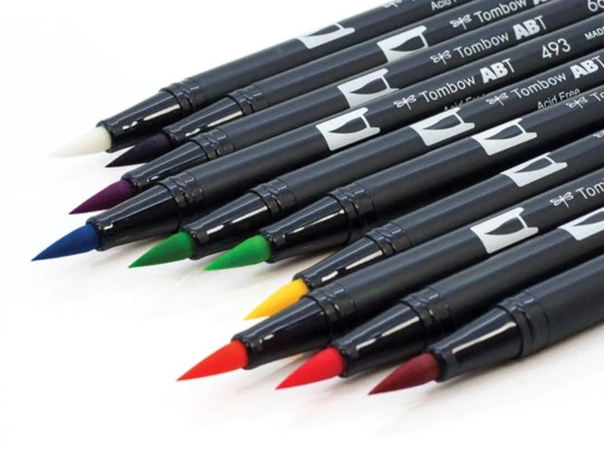
Brush pen
- Use light pressure on connectors so they stay thin.
- Slow down slightly at turns to prevent accidental thickness.
Dip pen
- Keep pressure minimal on the connector to avoid ink blobs.
- If ink flow is causing heavy joins, adjusting ink choice can help. Learn the basics in Sumi, India, or walnut dip pen ink basics.
Troubleshooting checklist
- My connections look thick: lighten pressure on the exit and entry strokes, and slow down at the join.
- My words look shaky: check your grip and posture, then practice connector chains with fewer letters at a steady pace. If your hand gets tense, try moving from your forearm more and twisting your wrist less.
- My letters run into each other: add a hair more spacing, especially before a tall downstroke.
- My pen is fraying and ruining thin strokes: try smoother paper and review how to fix frayed brush pens.
- My slant changes mid-word: pause and reset your wrist, then match the angle of your last downstroke.
Frequently asked questions
Do letters always have to connect?
No. Many modern styles use intentional breaks for readability or a playful look. The goal is a word that feels intentional, not a word that is glued together.
Should I lift my pen between letters?
You can, especially while learning. Write the first letter, lift, then place the entry stroke for the next letter carefully. As your control grows, many joins will become naturally continuous.
How do I connect letters without losing bounce or personality?
Keep the same entry and exit ideas, then vary height and spacing on purpose. Bouncy styles often use the same connector logic, just with shifting baseline placement.
What if my brush pen feels too soft to control?
A firmer small brush pen can make connectors easier at first. The Brush Letter has a helpful starting list in best brush pens for calligraphy beginners.
A cheerful last tip
When a connection misbehaves, do not wrestle it. Shrink the problem down to two strokes: a light exit and a light entry. Practice that join five times in a row, then tuck it back into a real word. Smooth connections love calm, consistent repetition.
If you want to explore different looks once your joins feel steady, wander through Styles & Techniques for more modern calligraphy ideas.