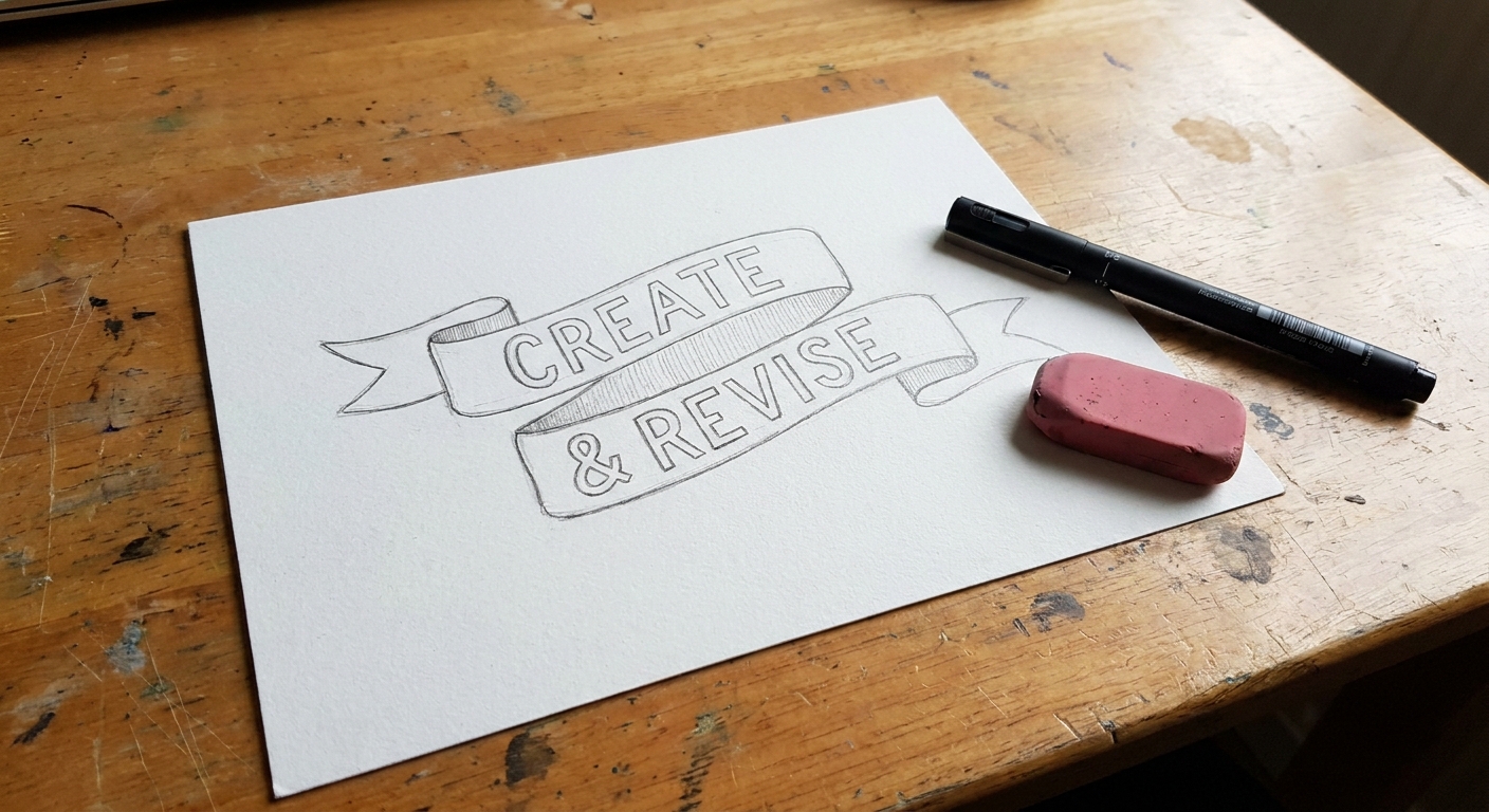
Grab your favorite pen and let’s turn plain letters into a swoopy little ribbon banner. Ribbon lettering looks fancy, but it follows a few friendly rules: ribbons overlap, they fold, and the light makes some parts darker than others. Once those three ideas click, you can build 3D ribbon text for cards, headers, labels, and posters.
What makes ribbon lettering look real
Ribbon lettering is not just “letters with a shadow.” It is a strip of material that moves through space. When you draw it, aim for these structural cues:
- Two edges: keep track of the same two ribbon edges (think top edge and bottom edge) as the strip travels across your word.
- Consistent width: the ribbon stays the same width as it curves, unless you intentionally draw a twist (we will keep this tutorial twist-free).
- Overlaps: at crossings, one section clearly sits on top of another.
- Folds and returns: wherever the ribbon turns sharply, you will see a folded corner and a “back side.”
- Value changes: the back side and tucked areas are darker.
If you want extra dimension tricks later, pair ribbon lettering with the shadow ideas in Drop Shadows and 3D Effects for Hand Lettering.
Supplies (keep it simple)
- Pencil and eraser
- Ruler (optional, but helpful for keeping ribbon width steady)
- Fineliner or gel pen for outlines
- One marker or brush pen for shading (optional)
If you are choosing your first brush pen for shading, peek at Best Brush Pens for Calligraphy Beginners. For the letterforms underneath the ribbon, clean block letters work beautifully. If you want a quick refresher, visit Serif and Sans Serif Block Letters for Calligraphy.
Step-by-step: 3D ribbon banner lettering
This method builds a ribbon around your word. Start with a short word like “HI,” “JOY,” or “THANKS” so you can focus on folds instead of fitting a novel onto the page.
Step 1: Write simple letters first
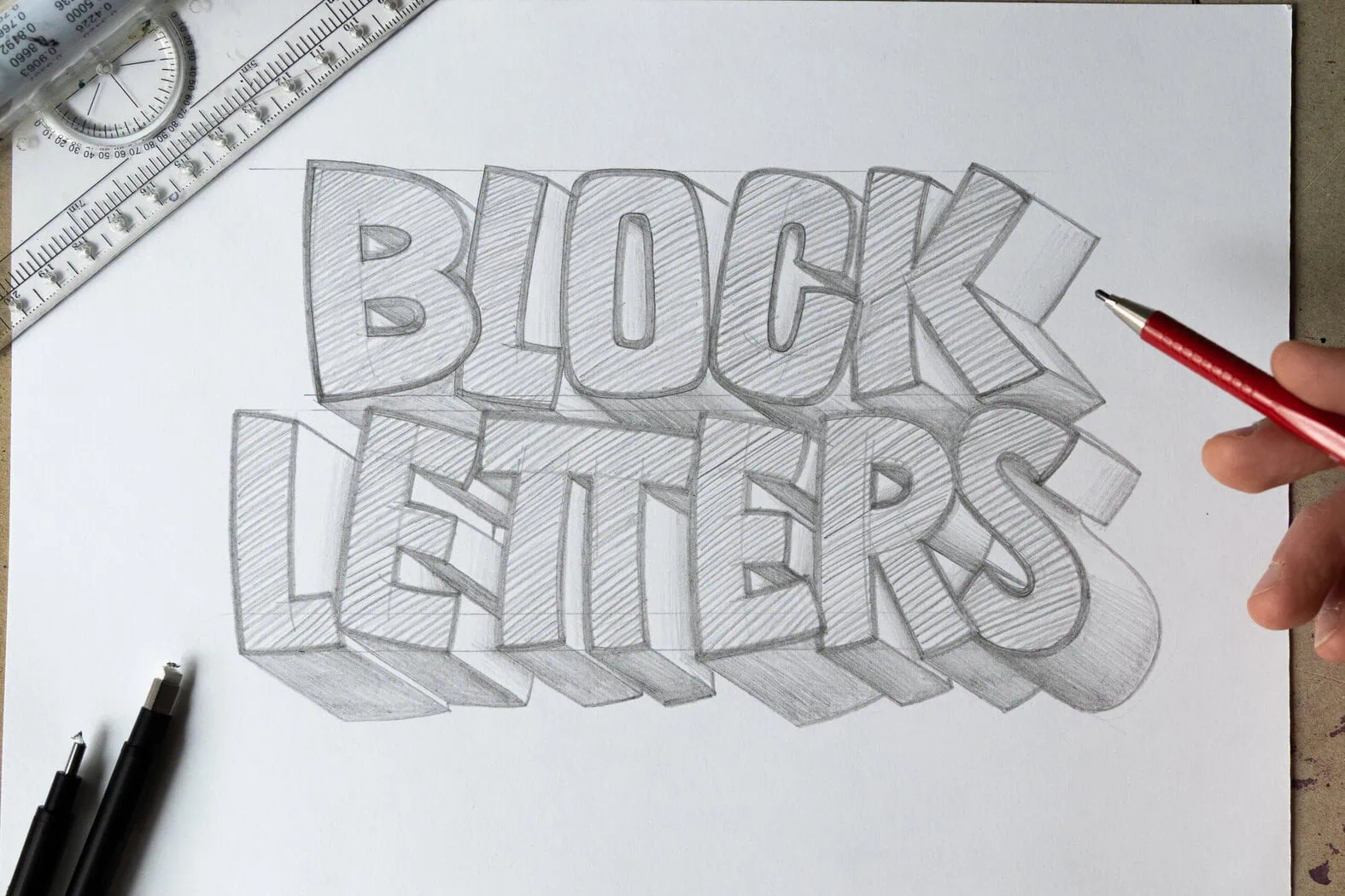
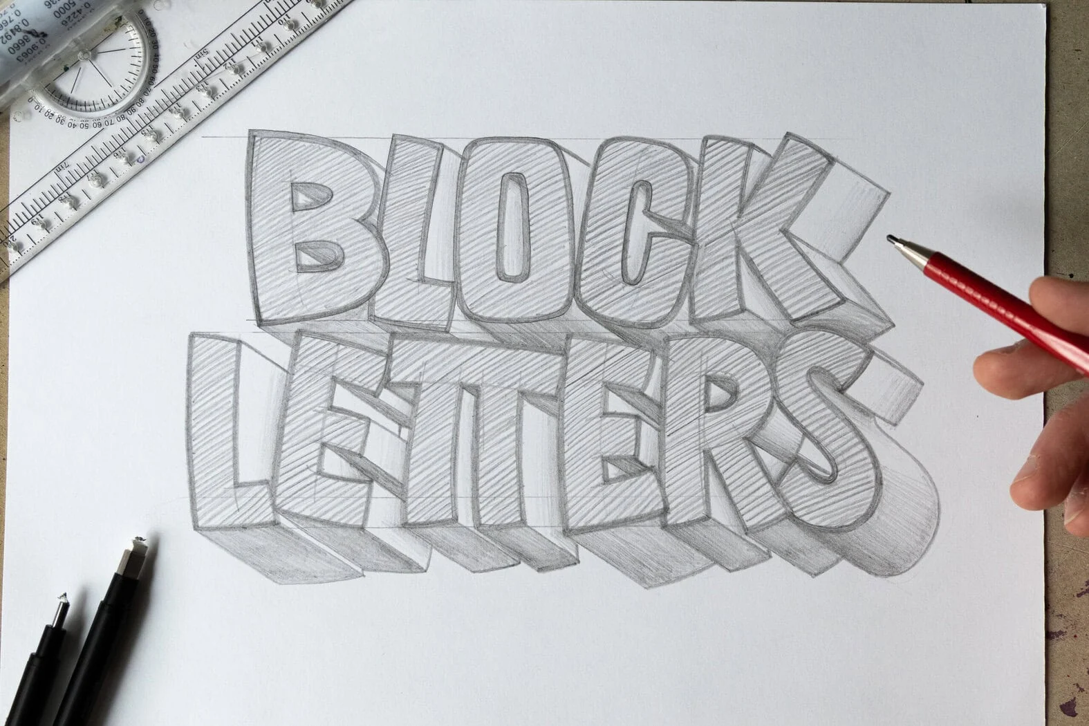
Lightly pencil your word in basic block letters. Keep them a little chunky. Skinny letters leave less room for the ribbon to feel like it wraps.
Letter choice tip: Simple all-caps with open shapes are the easiest (think H, I, O, E, A). Super condensed letters and tiny counters (like a cramped B or R) can get crowded fast once the ribbon starts crossing.
Step 2: Plan the ribbon path
Now imagine a ribbon snaking behind and in front of the letters. With a very light pencil line, draw a single flowing path that crosses the word. Keep the path smooth and avoid tight zigzags.
- Try to cross the word two to four times. Two is plenty for your first try, and each extra crossing adds more fold decisions.
- Make sure the path has breathing room between crossings so folds do not crowd each other.
- Decide which sections are front (on top of letters) and which are back (behind letters).
Step 3: Choose a ribbon width
Pick a ribbon width, then draw a second line running parallel to your path, the same distance away the whole time. This creates the two edges of the ribbon.
Proportion tip: For a balanced look, make the ribbon about one-third to one-half the thickness of your block letter strokes. Too thin looks stringy, and too thick can swallow the word.
Nib tip: If your parallel line wobbles, that is okay. Go slow, and use a ruler on straighter stretches. Keeping the width consistent is what sells the “strip of material” illusion.
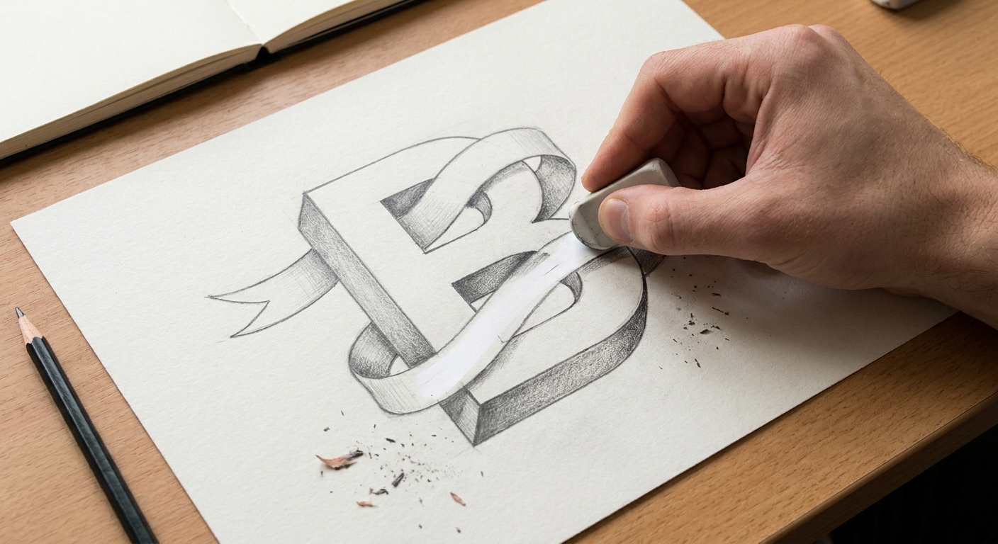
Step 4: Define overlaps at every crossing
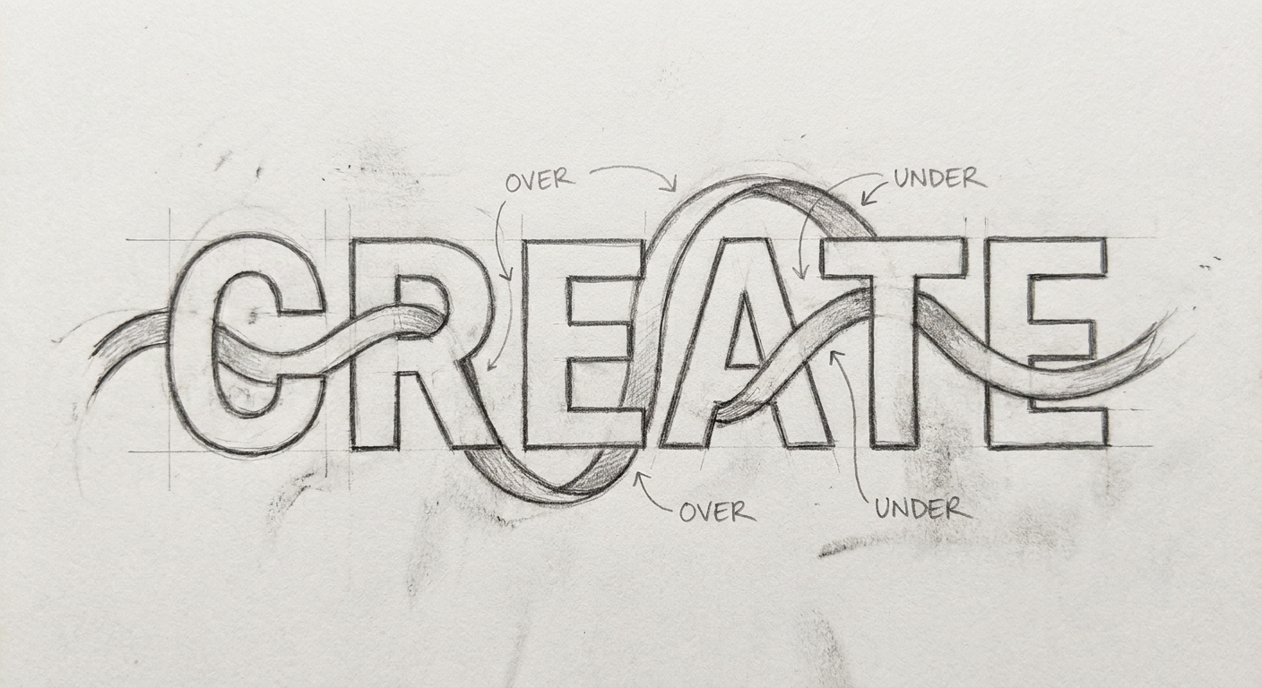
At each place the ribbon crosses a letter or crosses itself, you need a clear “who is on top” decision.
- If the ribbon goes behind a letter: erase the ribbon lines where the letter sits in front.
- If the ribbon goes in front of a letter: erase the letter lines hidden under the ribbon.
- If ribbon crosses ribbon: erase a small gap in the under layer so the top layer looks uninterrupted.
Erase only what you need for clarity: just enough that the under layer clearly breaks. Do not widen the ribbon by accident.
Step 5: Add folded ends
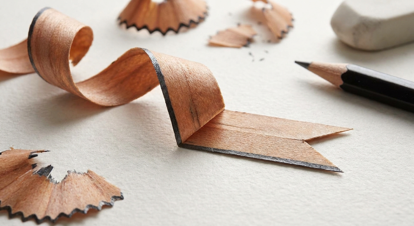
To turn your wrap into a banner, give the ribbon ends a classic folded tail.
- At an end of the ribbon, draw a short rectangle extension.
- Angle it slightly downward (or upward) so it feels like it is hanging.
- Add a small fold shape at the end to show the ribbon turning back. This “back side” is usually a little triangle or skinny parallelogram.
- Erase any lines that would be hidden by the fold.
Keep the fold angles consistent across both ends so the banner feels like one piece.
Step 6: Ink the clean outline
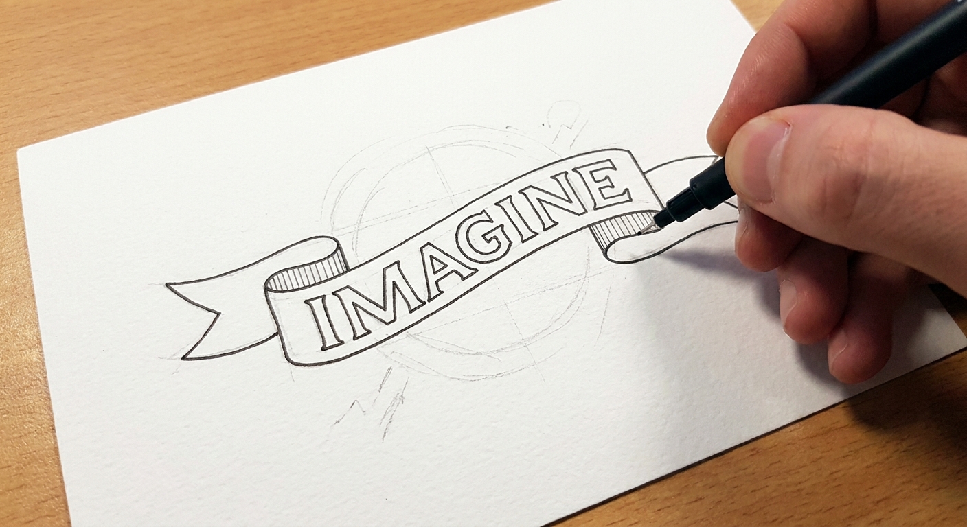
Once the structure looks right, trace your final edges with a fineliner. Ink the ribbon edges first, then the visible letter edges.
- Do not ink the lines you erased for overlaps.
- Let ink dry, then erase remaining pencil.
Step 7: Shade the back sides
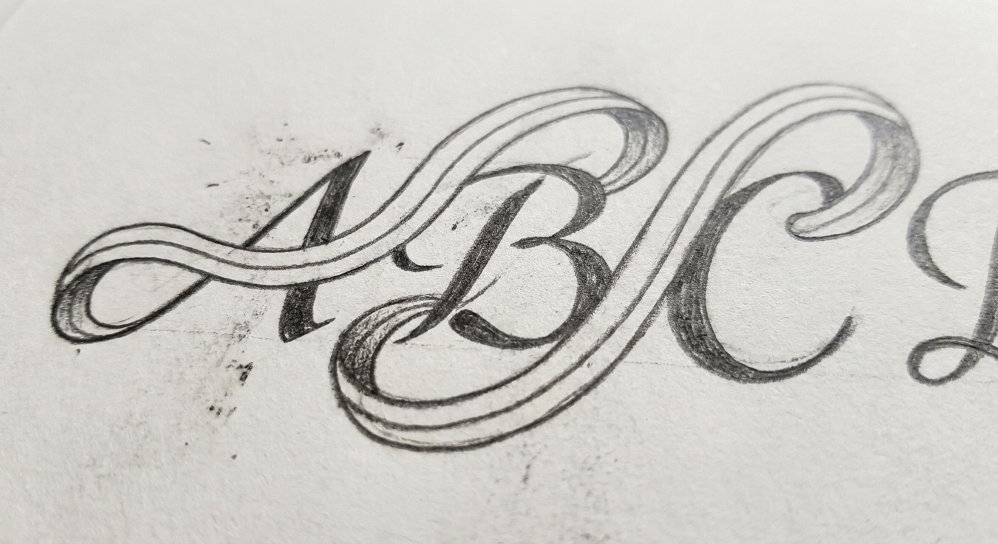
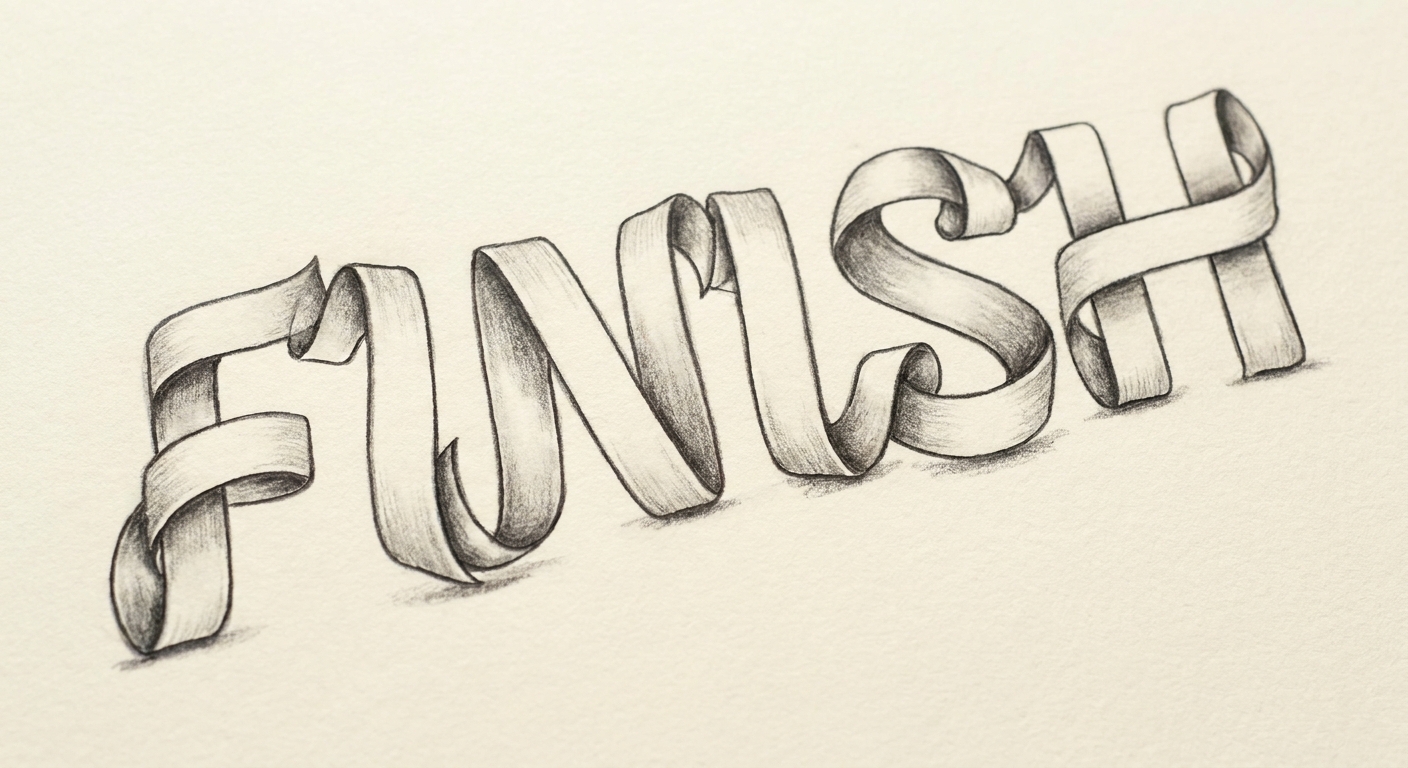
Pick a light direction. A common default is light from the top left. Whatever you choose, keep it consistent across the whole banner.
- Shade the underside of the ribbon where it tucks behind letters.
- Shade the back face of folds (the part that turns away from the light).
- Add a thin shadow line on the letters where the ribbon sits on top.
Use one color for soft shading, or hatch with your fineliner for a classic sketch look. You can also fill the ribbon with flat color and leave the outline crisp, or go two-tone for extra pop. If you love brush pen blends, you can add an ombré ribbon using the techniques in How to Blend Brush Pens.
Structural rules
Rule 1: Every fold needs a corner
If the ribbon changes direction sharply, show a corner or crease line. Without it, the ribbon looks like it melted instead of folded.
Rule 2: Do not cross your edges
Even without a twist, the ribbon may turn toward or away from you, so what feels like the “top” edge can look closer or farther in places. The key is that your two edges should not accidentally cross each other. If they cross, the ribbon will look tangled unless you meant to show a twist.
Rule 3: Overlaps must be decisive
At crossings, avoid “see-through” lines. One layer must be uninterrupted, and the other must break.
Rule 4: Dark areas sit under or behind
Shadows belong where the ribbon goes under something, or where a fold turns away from the light.
Three ribbon styles to try
- Wrapped center ribbon: ribbon crosses the middle of tall block letters like a gift wrap band.
- Top banner word: letters sit on top of a banner with tails on both ends, great for titles.
- Script plus ribbon: write a simple monoline script, then tuck a ribbon behind the downstrokes for a playful layered look. For friendly monoline shapes, see Monoline Lettering 101.
Common fixes
“My ribbon width changes when it curves.”
Choose a width and lightly mark it at a few points along the path, like tiny tick marks. Then connect them. This keeps the spacing steady.
“The overlaps look messy.”
Before inking, do a quick cleanup pass: at every crossing, erase the hidden layer fully. Clean gaps look more 3D than extra lines.
“My folds look flat.”
Add two things: a crisp crease line at the fold, and a darker value on the back face. Even a little shading makes the fold pop.
“The letters are hard to read.”
Use thicker block letters, and avoid covering the same letter with ribbon more than once. If you want extra legibility, add a subtle shadow to the letters only. The 3D guide at Drop Shadows and 3D Effects for Hand Lettering helps with that balance.
Quick practice drill
Want a tiny warmup before drawing a full word? Fill a row of your page with just ribbon folds.
- Draw a short ribbon strip (two parallel lines).
- End it with a folded tail.
- Add a second strip crossing under it.
- Erase the hidden parts and shade the underside.
Do three little folds in a row and your hands will start to remember the pattern. If you enjoy short daily drills, you might also like 15 Minute Daily Calligraphy Drills.
Ribbon lettering FAQ
Do I need a brush pen for ribbon lettering?
Nope. A pencil and fineliner are enough. Brush pens are optional for color fills or soft shading.
Can ribbon lettering work with faux calligraphy?
Yes. Faux calligraphy pairs nicely with banners because the letters stay bold and readable. If you want to build thicker strokes with any pen, see Faux Calligraphy Tutorial With Any Pen.
What is the easiest light direction?
Top left is a common starting point in illustration because it is easy to keep consistent. Any direction works as long as you commit to it across the whole banner.
If your ribbon banner is feeling a little shy at first, that is completely normal. Build it like a paper craft: edges first, overlaps second, shading last. One swoop at a time, and your letters will start wearing ribbons like they were born for it.