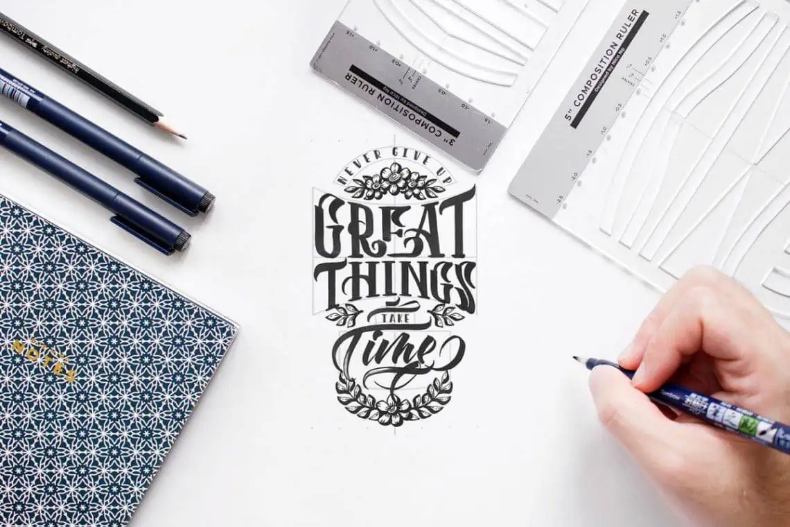
Grab your favorite brush pen and let's draw some beautiful letters together! Before the big swoops and finishing touches, there is one tiny secret that makes quote lettering look polished: a simple plan. A few quick thumbnails, a gentle grid, and some shape blocking can turn a busy sentence into a balanced design that feels easy to read and satisfying to look at.
Start with the goal, not the pen
Composition is just a fancy word for planning where everything goes. Before you letter, decide three things:
- Where will it live? An 8x10 print, a journal page, a card front, a phone wallpaper, or an envelope all need different spacing.
- What should readers notice first? Pick 1 to 3 words that carry the meaning. Those are your headline words.
- What mood fits the quote? Calm quotes often look best with gentle spacing and steady baselines. Energetic quotes can handle bouncy baselines and more contrast.
This workflow works whether you are doing brush lettering, faux calligraphy, or a mixed-style quote with both script and print.
If bouncy baselines are part of your style, it helps to decide that up front because it changes how you build your grid. This guide to bouncy calligraphy baseline rules can help you choose consistent bounce without losing readability.
Thumbnail sketches
Thumbnails are tiny rough sketches, often about 1 to 2 inches tall. They are meant to be quick, messy, and plentiful. The goal is not pretty letters. The goal is exploring options.
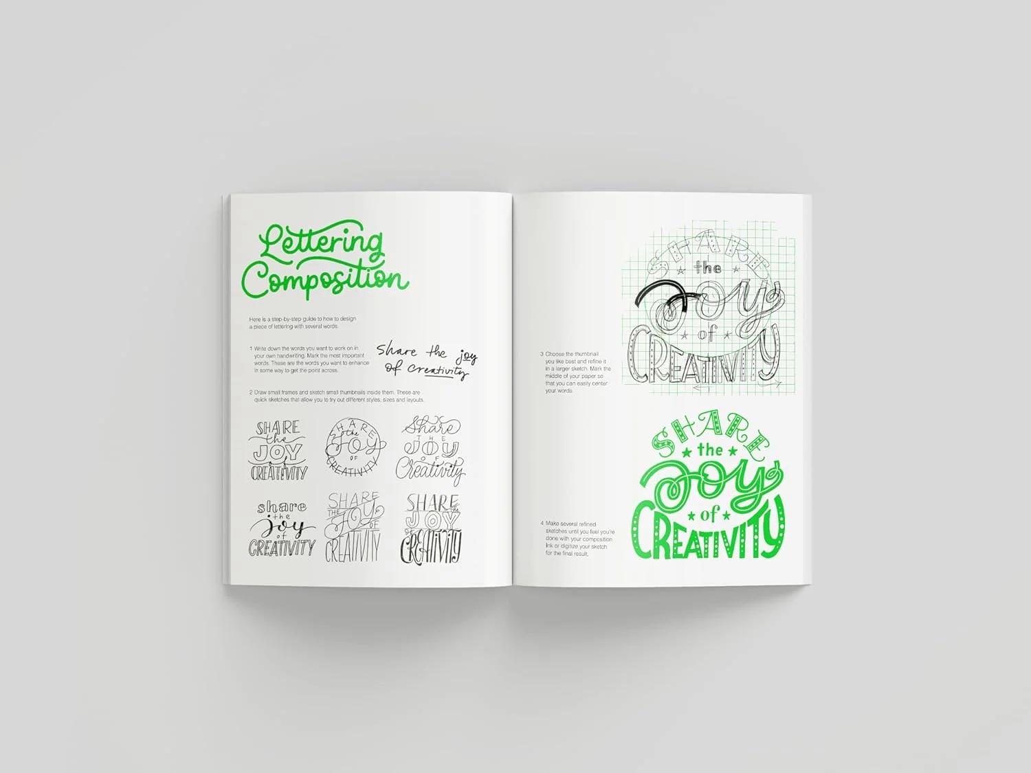
How to make thumbnails in 5 minutes
- Draw 6 to 12 small rectangles. Match your final format. If your piece is tall, make tall thumbnails.
- Write the quote once, then split it. Separate it into meaningful chunks, like phrases.
- Use lines and boxes, not real lettering. A thick box can stand for bold script. Thin lines can stand for small sans-serif.
- Try different emphasis choices. In one thumbnail, make the first phrase biggest. In another, make the last word huge.
- Circle your top two. Pick the ones that feel clear and balanced at a glance.
Thumbnail layout ideas
- Stacked center: Everything centered, with one large word in the middle.
- Top anchor: A bold first line, then smaller lines stepping down.
- Big ending: Small lead-in words, then a dramatic final word.
- Ribbon feel: Alternating long and short lines to create a gentle wave shape.
- Badge shape: Lettering arranged to fit an oval or circle.
Tiny tip: if you cannot read the structure when the thumbnail is very small, the final piece may also feel confusing from across the room.
Hierarchy
Hierarchy is the order your eyes read things. In a quote design, hierarchy usually comes from size, style contrast, and spacing.
A simple hierarchy recipe
- Level 1 (headline): 1 to 3 key words in your boldest style or largest size.
- Level 2 (support): Main message words, medium size, usually simpler to read quickly.
- Level 3 (connectors): Small words like “and,” “to,” “the,” “of.” Keep them calm and consistent.
Easy contrast that stays clean
- Mix script and print. Script for emotion, print for clarity. If you want help keeping connections neat, see how to connect letters in modern calligraphy.
- Change weight, not everything. Try bold script for Level 1 and the same script in smaller size for Level 2, instead of switching to three different styles.
- Use spacing as volume. More space around a word makes it feel important, even if it is not enormous.
Quick style pairings
- Bold script + simple all-caps print: Classic, readable, and very forgiving.
- Monoline script + chunky sans: Sweet and modern, especially with generous spacing.
- All-caps print + a single script highlight: Great for long quotes when you need maximum clarity.
Build a simple grid
A grid is a set of invisible guides that keeps your quote looking intentional. For lettering, the most helpful grids are made of margins, rows, and a center line or alignment edge.
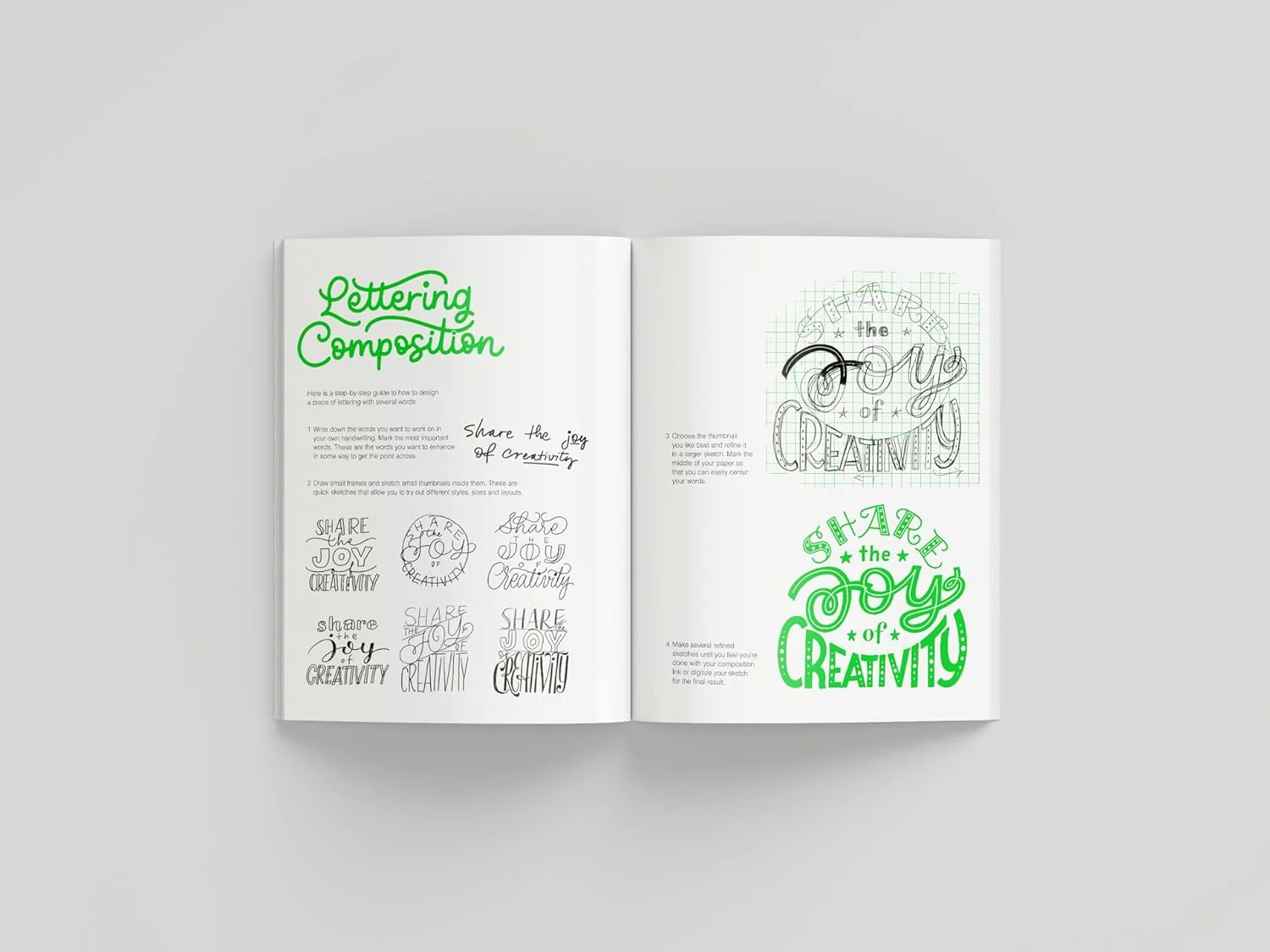
Step by step
- Set margins first. Lightly pencil a border all around so you do not letter too close to the edge.
- Choose alignment. Centered is forgiving. Left aligned feels modern and clean. Right aligned is trickier but stylish when done on purpose.
- Decide line count. Based on your best thumbnail, lightly mark where each line sits. Think of them as parking spaces.
- Assign size zones. Give your Level 1 words a taller row, and your Level 3 words shorter rows.
- Plan for descenders and bounce. Leave extra room when a line has letters like g, j, p, q, y, or big bouncy dips so they do not crash into the line below.
- Keep consistent gaps. Even spacing between lines is what makes a busy quote feel calm.
Grid options for different shapes
- Rectangle grid: Best for posters and journal pages.
- Oval grid: Great for wreath-like quote shapes. Increase line length in the middle, shorten near top and bottom.
- Triangle grid: Fun for emphasis. Either wide top to narrow bottom, or the reverse for a big finish.
If you are lettering digitally (like in Procreate), the same steps apply. Use one layer for the grid, one for blocking, and one for your final lettering so you can adjust spacing without panic.
Shape blocking
Shape blocking means turning your quote into simple blocks before you commit to letterforms. It helps you spot problems early, like awkward gaps, tangents, or a design that feels top-heavy.
How to shape block in under 3 minutes
- Write your phrase chunks. Separate the quote into short lines or groups.
- Draw a block for each chunk. Wide blocks for long phrases, tall blocks for big words.
- Adjust until the outer silhouette looks pleasing. The outside shape should feel intentional, like a strong sticker shape.
- Add tiny notes. Mark “script,” “caps,” “small,” “bounce,” or “flourish” near each block.
What a good silhouette looks like
- Balanced weight: Not all the big elements shoved at the top.
- Fewer holes: Large empty gaps can make a piece feel unfinished.
- Purposeful edges: Either mostly straight (clean, modern) or gently curved (soft, friendly).
Draft from pencil to ink
Once your thumbnail, grid, and blocks agree with each other, it is time to draft. Pencil first keeps the pressure off, especially with long quotes.
Pencil drafting steps
- Letter the biggest words first. These are the hardest to fit, so give them the best space.
- Add medium words next. Aim for even rhythm across the design.
- Drop in the tiny connector words last. These can be tucked into gaps like little stepping stones.
- Check spacing before inking. Step back. Squint. If one area looks darker, loosen it with more space or smaller weight.
Inking without surprises
- Ink in layers. Do one style at a time, like all print first, then all script.
- Turn the page. Rotate your paper so downstrokes feel natural and smooth.
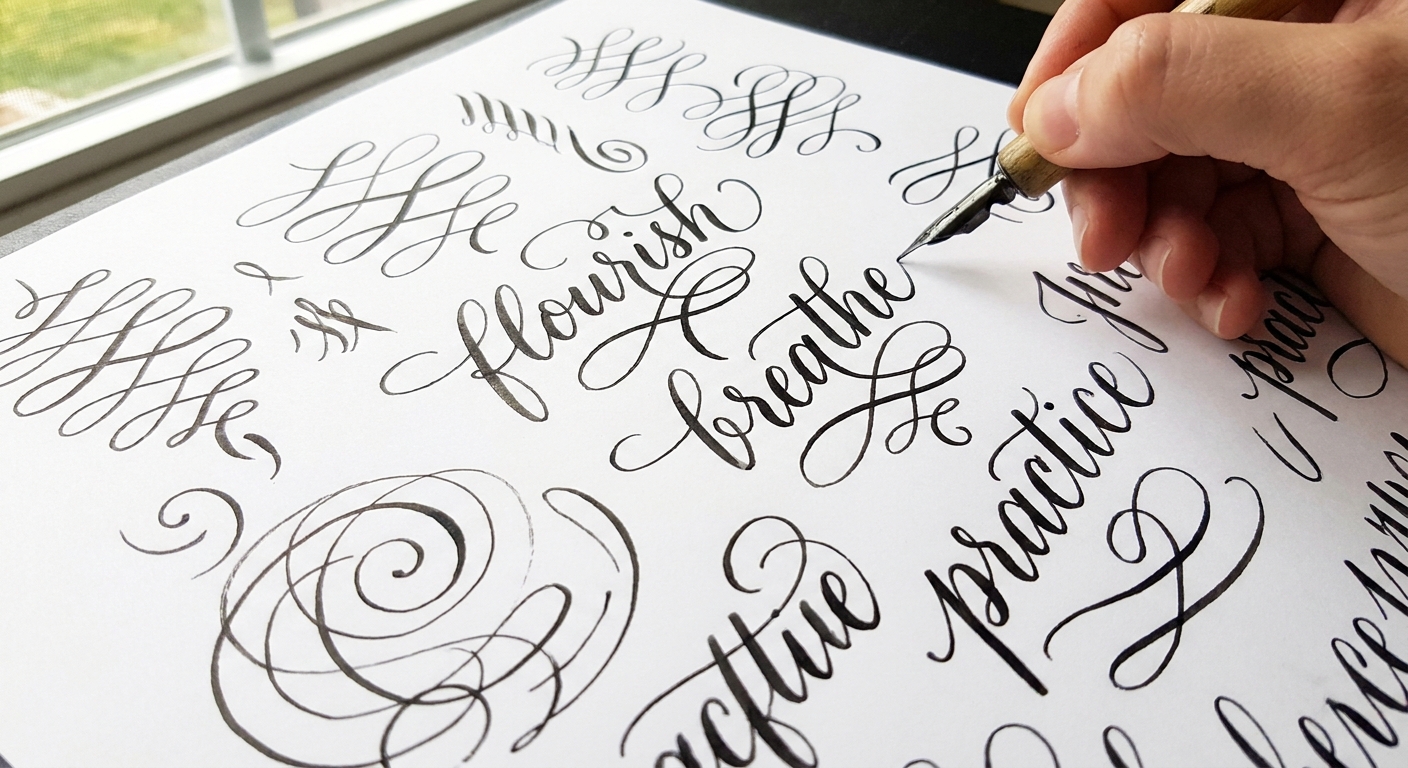
- Pause before adding flourishes. Flourishes are decorations, not lifeboats. Add them only after the words read clearly.
If flourishes are calling your name, keep them structured with the tips in beginner calligraphy flourishing.
Balance checks
Before you commit to your final ink pass, run through these quick checks:
- Readability check: Rule of thumb: can someone read it in about 2 seconds?
- Contrast check: Do the important words stand out without shouting?
- Spacing check: Are line gaps mostly consistent?
- Edge check: Are margins even? Are any loops or flourishes kissing the border?
- Shape check: Does the overall silhouette look intentional?
Common layout problems
Problem: The last line looks lonely
- Make the last line shorter on purpose, then echo that shortness at the top to create symmetry.
- Add a small supporting word or a simple underline flourish, only if it helps the composition.
Problem: The middle feels too tight
- Split one phrase into two lines.
- Reduce the size of a Level 2 line so your Level 1 word can breathe.
Problem: The quote is long and everything becomes tiny
- Choose fewer Level 1 words, then let Level 2 do more work.
- Use a simple print style for most lines and reserve script for a single featured word.
- Consider faux calligraphy for quick, consistent thick and thin when space is tight. This tutorial can help: faux calligraphy with any pen.
Problem: It looks wobbly even with neat letters
- Revisit your baselines. A subtle baseline guide for each line can instantly calm the page.
- Reduce style switching. Two styles often look cleaner than four.
A simple daily drill
Composition gets easier when the planning becomes a habit. Here is a quick drill that builds layout instincts fast:
- Pick one short quote, 6 to 12 words.
- Draw 10 thumbnail boxes.
- Make 10 different hierarchies and line breaks.
- Circle the best 2 and redraw one of them larger with shape blocking.
Want a steady routine to pair with layout practice? These 15-minute daily calligraphy drills fit nicely beside thumbnail sketching.
FAQ
How do I choose which words to make big?
Pick the words that carry the meaning if someone only reads three words. Often that is a strong verb, a key noun, or the emotional payoff at the end.
Should I center everything?
Centered layouts are the most forgiving, especially for beginners. Left aligned layouts feel modern and crisp, but they require more careful line length control. Try both in thumbnails, then choose the one that reads fastest.
Do I need a ruler and perfect measurements?
Nope. Light pencil guidelines and consistent spacing matter more than exact numbers. A ruler can help with margins, but the layout can stay soft and hand-made.
When should I add flourishes?
After the words are finished and readable. Flourishes should fill intentional space, not rescue a cramped layout. If your design needs rescuing, adjust line breaks or hierarchy first.
One last bit of encouragement
Beautiful quote designs are not about getting it perfect on the first try. They are about giving your letters a cozy place to live on the page. A handful of thumbnails, a simple grid, and clear shape blocks will make your final lettering feel confident and balanced before you ever touch the fancy pen.