Grab a fineliner or gel pen and let’s make some smooth, even-weight script together. Monoline lettering is a clean, modern style where every stroke stays the same thickness. No pressure changes required, just steady rhythm, simple shapes, and a few friendly rules that keep your words looking polished.
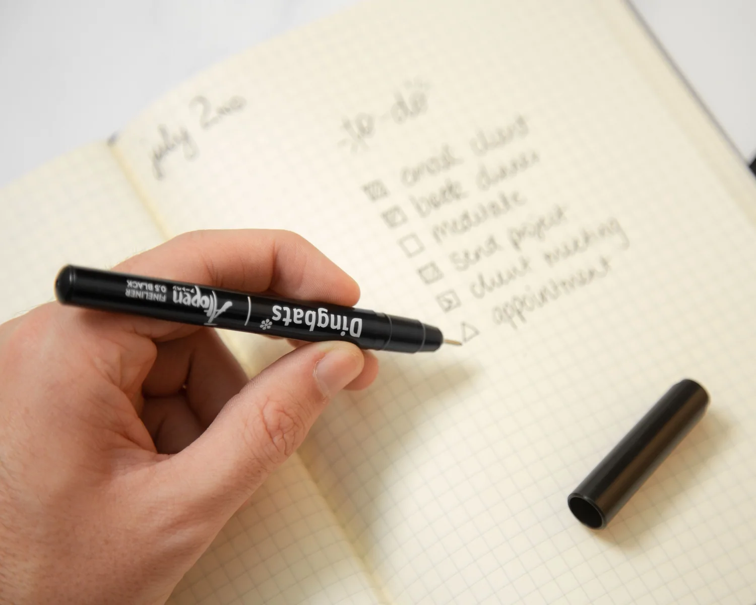
What monoline lettering is
Monoline means your lines stay one consistent weight. Instead of thick downstrokes and thin upstrokes like brush calligraphy, you build your script from:
- steady line width
- clear letter shapes
- consistent spacing and slant
- smooth curves guided by your shoulder and forearm, not just fingertips
This style is perfect when you want lettering that looks crisp on greeting cards, labels, notes, and quote pages. It also pairs beautifully with add-ons like color fills, shadows, and little flourishes because the base word stays clean and readable.
Tools: fineliners and gel pens
You do not need flexible brush tips for monoline. Look for pens that make a consistent line and feel comfortable as you repeat strokes.
Fineliners
- Tip sizes: 0.3 to 0.5 is a sweet spot for practice. 0.8 to 1.0 feels bolder for signs and headers.
- Ink flow: smoother flow usually means fewer skips on curves.
- Paper matters: rough paper can make fineliners feel scratchy and cause feathering.
Gel pens
- Great for: a slightly softer look than fineliner lines, plus shiny accents.
- On dark paper: opaque gel pens (especially white or metallic) can show up beautifully, while standard colors often look muted.
- Watch for: smudging, especially on coated paper or if your hand rests on fresh ink.
If you are also curious about brush pen basics for contrast, the foundational pressure strokes live here: 8 Basic Brush Lettering Strokes.
Set up your page
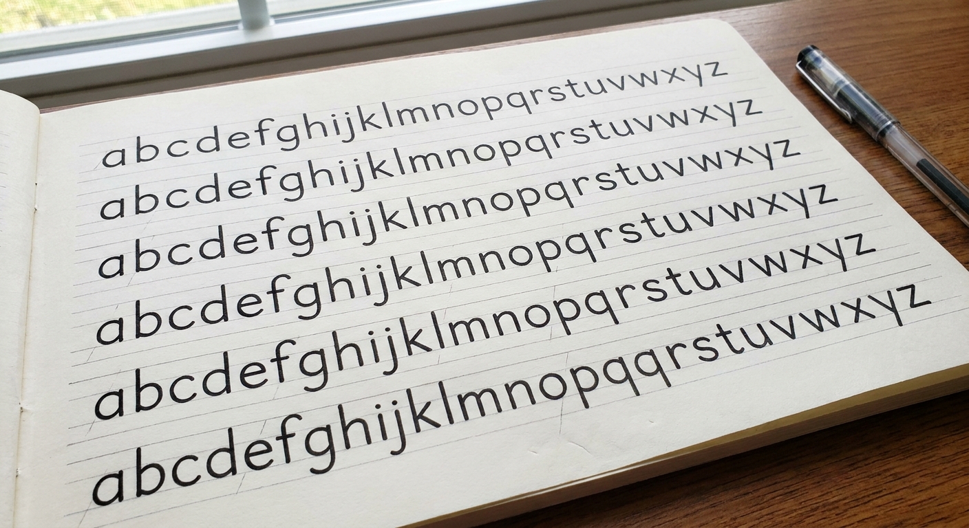
Monoline script looks best when the invisible structure stays consistent. A tiny setup makes a huge difference.
Use guidelines
- Baseline: where most letters sit
- X-height: the height of a, e, o, n
- Ascenders: b, d, h, k, l rise above x-height
- Descenders: g, j, p, q, y dip below the baseline
Even if the guidelines are faint pencil, they help your script look calm and intentional.
Pick a slant
Choose a gentle right slant (or upright if you love a tidy look). Consistent slant makes your word feel cohesive, even when the letters are simple.
Relax your grip
Hold the pen lightly and let your forearm guide curves. A tight pinch grip often creates wobbly lines and sharp corners where you wanted soft loops.
Build monoline script
Instead of thinking “draw a pretty word,” think “repeat a few friendly shapes.” Here’s a simple progression that keeps letters smooth.
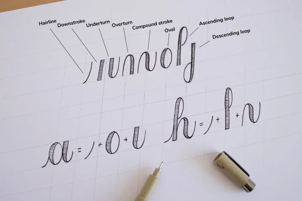
1) Start with easy shapes
- Underturns: u, i, w beginnings
- Overturns: n, m, h beginnings
- Ovals: o, a, d, g cores
- Loops: l, e, f personality
Want a practice routine that pairs nicely with this? These sessions were built for steady repetition: 15-Minute Daily Calligraphy Drills.
2) Draw slower than you think
Monoline is all about smoothness. If curves look shaky, slow down and aim for one continuous motion instead of many tiny corrections.
3) Lift the pen on purpose
You are allowed to lift. In monoline, clean joins matter more than never lifting. Helpful lift points:
- after completing an oval (o, a)
- before a tight loop that tends to kink (e, f)
- between letters if the connection keeps getting crowded
4) Keep counters open
The counter is the little inside space in letters like a, e, o. If those spaces close up, the word gets harder to read. Give loops and ovals room to breathe.
Spacing that looks natural
If your letters look fine alone but the word still feels off, spacing is usually the culprit. Two quick rules make a big difference:
- Match the negative space: aim for similar-looking gaps between letters, not identical measured gaps.
- Give round letters a touch more room: connections around ovals (o, a, d, g) can look crowded faster than straight shapes, so leave a hair more breathing space.
For word spacing, a simple check is this: the space between words should look about the width of a lowercase o (adjust slightly depending on your size and style).
Clean connections
Most “something feels off” moments in monoline come from connections. The fix is usually one of these:
- Match exit and entry height: the line leaving one letter should meet the next letter at the same level.
- Avoid sharp angles: soften corners into curves, especially at the bottom of u and n shapes.
- Watch spacing at joins: too tight makes blobs, too wide makes the word feel broken.
If connecting letters is a struggle across styles, this guide can help you spot common joining patterns: How to Connect Letters in Modern Calligraphy.
Common problems
Wobbly lines
- Slow down and use your forearm more than your fingers.
- Make curves in one motion. Avoid sketchy, hairy lines.
- Warm up with basic strokes before writing words.
Even though it is written for calligraphy strokes, the steadiness tips here still apply to monoline practice: How to Fix Shaky Upstrokes.
Inconsistent letter height
- Add guidelines, even rough ones.
- Practice a single row of minimum letters like i, u, n, o and match their size.
Ink skips on curves
- Try a lighter writing angle and avoid pressing hard. Many fineliners skip when the angle is too steep.
- Rotate the pen slightly if one edge of the tip is catching on texture.
- Test smoother paper or a different pen. Toothy paper and a drying tip are common culprits.
Paper choice makes a big difference for marker-style tools, and many of the same texture tips help fineliners too: Paper That Keeps Brush Pens From Fraying.
Smudging
- Pause a beat before resting your hand on fresh letters.
- Work left to right if you are right-handed, or angle your page to keep your hand below your writing line.
Left-handed friends can borrow these anti-smudge strategies too: Left-Handed Calligraphy: Smudge-Free Techniques and Grip Adjustments.
Practice drills
Monoline gets smoother through repetition, and drills keep repetition fun. Try this tiny routine when you want quick progress without overwhelm.
5-minute warm-up
- One row of light-touch straight lines
- One row of underturns
- One row of ovals
5-minute letter families
- i family: i, u, w, t
- n family: n, m, h, r
- o family: o, a, d, g, q
5-minute words
Choose short words that repeat shapes:
- minimum
- little
- hello
- mama
- today
Keep your goal simple: consistent size, smooth connections, and open counters.
Style monoline
Monoline is a wonderful base layer. Once the word looks smooth, styling becomes playful.
Add bounce
Bouncy lettering is all about playful baseline shifts, not thick and thin strokes. If bounce is calling your name, these baseline rules make it feel intentional: Bouncy Calligraphy Baseline Rules.
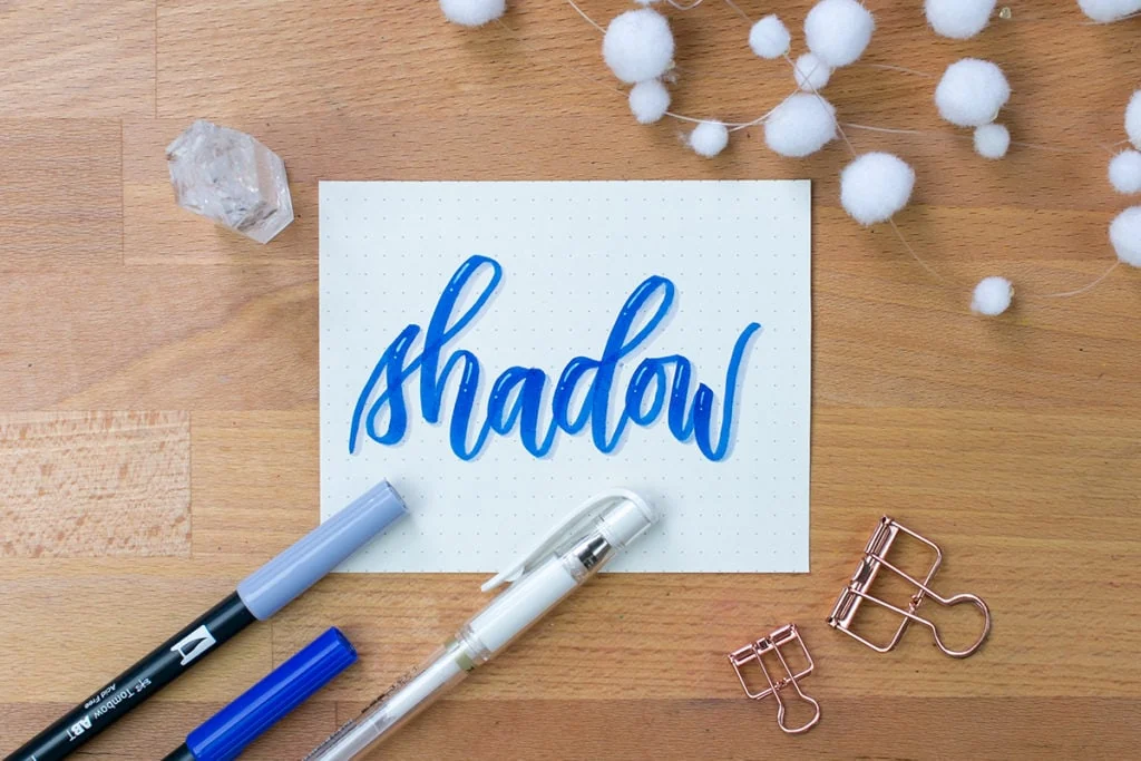
Add a shadow
A simple drop shadow can make monoline pop while keeping the script readable. Keep the shadow direction consistent across the whole word.
For step-by-step shadow ideas: Drop Shadows and 3D Effects for Hand Lettering.
Add a flourish
Flourishes look best when they support the word, not tangle it. Keep them out of the counters and leave breathing room around letter joins.
More flourish guidance lives here: Beginner Calligraphy Flourishing.
Monoline vs faux vs brush
These three styles are close cousins, and it helps to know which one you are building.
- Monoline: one line weight everywhere. Best for clean, modern scripts.
- Faux calligraphy: you draw a second line to fake thick downstrokes. Great when you want contrast using any pen.
- Brush calligraphy: pressure creates natural thick and thin strokes using a flexible tip.
If you want to explore faux thick and thin while keeping your same pen, this tutorial is a helpful next hop: Faux Calligraphy Tutorial With Any Pen.
Mini FAQ
What tip size should beginners start with?
A 0.4 or 0.5 fineliner is a friendly starting point. It is thick enough to see your shapes clearly, but not so thick that counters close up fast.
Do monoline letters have to be cursive?
Nope. Monoline looks great in print, in a loopy script, or in a neat hybrid. The mono part is about consistent weight, not the alphabet style.
How do you fix a messy word without starting over?
Try one of these quick rescues:
- Turn a shaky curve into a slightly larger curve by smoothing the outside edge.
- Open a cramped counter by carefully widening the inner space with a tiny correction line.
- Hide a rough join with a small flourish or a dot detail, as long as it does not reduce readability.
Why do my letters look uneven even when the line weight is consistent?
Usually it is spacing. Check three spots: space between letters, space inside ovals, and consistency of x-height. Guidelines and slower connections fix most of it.
Next steps
Monoline lettering loves steady, joyful repetition. Pick one pen, one guideline height, and one short word, then practice it until it feels like a friendly dance instead of a challenge.
When you are ready to explore more styles, hop over to Styles & Techniques for more lettering adventures.