Grab your favorite pen and let’s make tiny lettering feel roomy. Small-scale brush lettering is all about control: a steady grip, a slower rhythm, and just enough pressure contrast to keep your words clean and readable inside those petite dot grids.
This applies whether you call it a planner, a bullet journal, or that little notebook you swear you will keep tidy this week.
Start with a size target
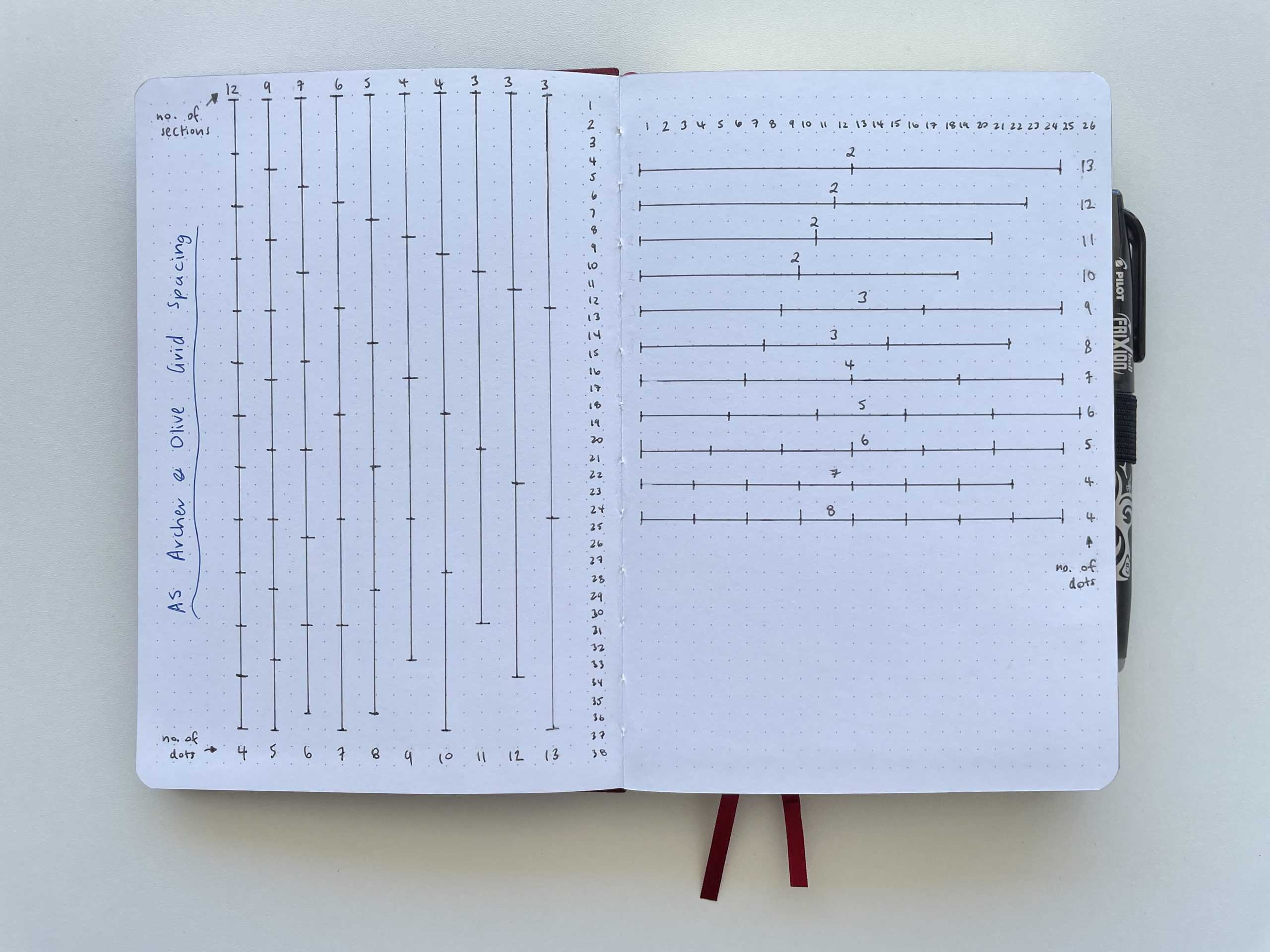
Before choosing a pen or practicing strokes, decide how tall your letters need to be. Dot spacing and pen tips vary, so think of these as a practical starting point you can tweak:
- Small headers: 2 to 3 dots tall (great for weekdays or habit trackers)
- Section titles: 4 to 6 dots tall (still compact, but easier to add style)
- Big titles: 7+ dots tall (use sparingly so the page stays functional)
If you are struggling with neatness, bump your letter height up by just one dot. That tiny change gives your brush tip more room to transition between thin and thick strokes.
Grip for tiny lettering
Small lettering asks for a smaller range of motion. The goal is to reduce wobble and keep your downstrokes consistent.
Try a “shorter pen” hold
- Move your fingers closer to the tip than you would for big practice sheets.
- Keep the pen at a comfortable angle so you are pulling downstrokes rather than pushing.
- Rest the side of your hand lightly on the page to stabilize, especially for short words like dates.
This increases control, but it can feel a little cramped at first. Give it a few lines before you decide you hate it.
Use finger motion, not arm motion
For large brush calligraphy, your arm can help create smooth curves. In a planner, most strokes are only a few millimeters long, so let your fingers lead and keep your wrist relaxed.
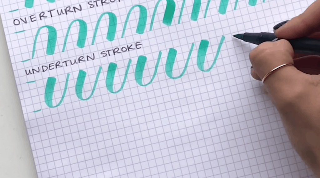
If you want a refresher on the core shapes that build letters, hop over to 8 basic brush lettering strokes. Mini lettering is still those same strokes, just on a smaller stage.
Slow down and lighten up
When letters get tiny, two things cause the most mess: moving too fast and pressing too hard. The fix is simple, but it takes a few focused lines of practice.
Small-scale rhythm
- Slow your downstrokes slightly so the tip has time to spread evenly.
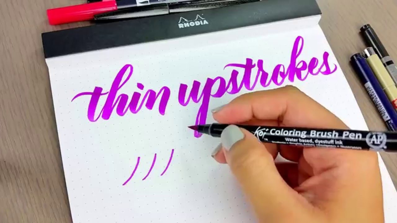
- On upstrokes, glide with a lighter, quicker touch so they stay hairline thin (think: light pressure first, speed second).
- Pause briefly at turns (like the bottom of an u) to avoid accidental blobs.
Pressure contrast, mini edition
In a planner, your thick strokes do not need to be very thick. Aim for downstrokes that are just a bit thicker than your upstrokes, roughly around 1.5 to 2 times as wide. That keeps words readable and helps prevent letters from filling in.
If your upstrokes look shaky when you slow down, this guide can help: how to fix shaky upstrokes.
Best pens for tight grids
The best planner pen is the one that makes thin strokes easy. Big brush tips can be used, but they often feel like painting a postage stamp.
What to look for
- Small, firm brush tip for crisp edges
- Reliable snap-back so thin upstrokes stay thin
- Ink that dries quickly for smudge-free daily use
If you are stocking up or deciding between types, see best brush pens for calligraphy beginners. For ultra-tiny writing, you may also enjoy mixing brush lettering with a clean monoline style. This pairs nicely with planners: Monoline lettering 101.
Make tiny letters readable
In a planner, pretty is lovely, but readable is the goal. These tweaks keep your minis from turning into mystery squiggles.
Open your counters
“Counters” are the enclosed spaces in letters like a, o, e, and d. In small lettering, they close up fast. Fix it by:
- Making your o slightly more oval than round
- Keeping the entry stroke into a lighter and narrower
- Leaving a tiny gap where strokes nearly meet, especially in e
Give letters a little breathing room
- Increase letter spacing a hair before you increase stroke thickness. Crowding is usually the culprit.
- Keep similar shapes from touching, like m next to n, or o next to e.
- Use a clear word space. In tiny headers, a word space that is about the width of one thin upstroke is a good visual cue.
Simplify bounce and flourishes
Bouncy baselines and loops can be adorable, but at planner scale they can crowd your lines. Use bounce as a whisper, not a shout:
- Limit bounce to one or two letters per word
- Keep ascenders and descenders short so they do not crash into the next line
- Skip flourishes on weekday headers and save them for bigger titles
If you love bounce, keep it tidy with the rules here: bouncy calligraphy baseline rules. For flourishing that stays controlled, visit beginner calligraphy flourishing.
Paper and smudges
Planner paper can be thin, coated, textured, or all three, so expect your results to change from notebook to notebook.
- If ink feathers (fuzzy edges), use a lighter touch, a firmer tip, or switch to monoline for the smallest words.
- If you get ghosting (seeing ink on the back), keep headers lighter and avoid heavy layering or repeated strokes.
- If your tips fray, rough paper may be wearing them down. This guide can help: paper that keeps brush pens from fraying.
Left-handed? Smudging is extra common in planners because your hand is always chasing yesterday’s ink. These adjustments help a lot: left-handed calligraphy smudge-free techniques and grip adjustments.
Two mini styles
1) Faux pressure
If your brush tip feels too juicy in small spaces, try faux calligraphy: write the word in monoline, then add thickness only where you want it. It is slower, but very readable.
Steps:
- Write the word in a neat monoline script.
- Add a second line alongside each downstroke.
- Fill in the added space carefully.
More detail is here: faux calligraphy tutorial with any pen.
2) Mini brush caps
This is a small-scale trick: instead of pressing a full downstroke, add a gentle “cap” of pressure at the start of a downstroke, then immediately lighten up.
- Begin the downstroke with a small press for 2 to 3 millimeters.
- Release pressure and finish the stroke thin.
- Repeat on the most important downstrokes only.
It reads as brush lettering, but whether it stays crisp at 2 to 3 dots tall depends on your pen, ink flow, and paper. If it starts to blob, make the cap shorter and lighter.
Micro drills
Planners are busy, so practice needs to be bite-sized. These drills take about a minute or two and build the control you need.
Drill A: 10 tiny downstrokes
- Make each downstroke exactly 2 dots tall.
- Press lightly, then release cleanly at the end.
- Focus on matching thickness across all ten.
Drill B: Mini “un” row
- Write u u u u then n n n n.
- Keep the turns narrow, and do not let the bottoms pool with ink.
Drill C: The weekday test
Write Mon Tue Wed Thu Fri in one line. Aim for consistent x-height and spacing. When those five look tidy, most planner words will behave too.
For a longer warm-up routine you can scale down to planner size, see 15-minute daily calligraphy drills.
Common problems
My letters look bold and crowded
- Use less pressure on downstrokes.
- Increase letter height by one dot.
- Increase spacing slightly before you add more thickness.
- Switch to a firmer, smaller brush tip or use faux calligraphy for headers.
My strokes look scratchy or frayed
- Check your paper. Some planner papers are rough and can wear tips down.
- Use a lighter touch and avoid scrubbing motions.
- Store pens properly so tips do not bend in a pouch.
Helpful reads: paper that keeps brush pens from fraying, how to store calligraphy pens and markers, and how to fix frayed brush pens.
My words slant all over the place
- Choose a slant direction and stick to it for one line.
- Use the dot grid as a gentle guide and keep your downstrokes parallel.
- Write slower on curves and turns.
Keep it cute and functional
The most planner-friendly lettering is the kind you can repeat day after day without fuss. A simple recipe that stays readable:
- Monoline for body text
- Mini brush lettering for section headers
- One special word per spread with a little extra flair
And if you want your spreads to feel designed, not crowded, composition helps even on small pages. This guide is a helpful friend: hand lettering composition for quotes.
Now scoot those letters into their tiny homes, little mouse-sized strokes and all. Small spaces can still hold big charm.