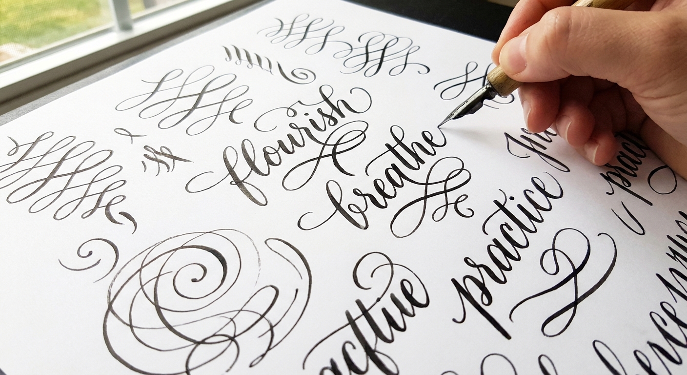
Grab your favorite brush pen and let's write some beautiful letters together! Flourishes can look fancy, but the secret is simple: a flourish is just a stroke that leaves the letter and returns gracefully, like a little ribbon of ink. In this guide, you will learn the parts of a flourish, the rules that keep it elegant, and beginner-friendly drills for adding loops to ascenders and descenders without turning your word into a tangled nest.
What flourishing is and what it is not
Flourishing is any decorative extension added to a letterform, usually made from the entry stroke, exit stroke, or a modified ascender or descender. It should still feel connected to the rhythm of the word.
- It is: controlled, intentional, and planned to support the word.
- It is not: random loops added everywhere, or a decoration that hides the letters.
If your reader has to squint to figure out what the word says, the flourish is doing too much. Pretty and readable can absolutely share the page.
The basic anatomy of a flourish
Knowing what you are drawing makes it much easier to keep things tidy. Most flourishes can be described using four simple parts.
1) The entrance
This is where the flourish leaves the main letter stroke. The cleanest flourishes start from an existing stroke direction, rather than suddenly turning sharply.
2) The loop (or oval)
Most beginner flourishes look best when they are built from an oval shape. Think of it as drawing a gentle, slanted egg. Ovals create smooth turns, which helps your ink look confident instead of shaky.
3) The return
A flourish usually comes back toward the word. This return stroke is where many tangles happen, so plan where it will land before you draw it.
4) The ending
Finish with a light taper. A flourish that ends in a blunt stop can feel heavy. If you are using a brush pen, ease up on pressure at the end to create a hairline finish.
The 5 balance rules that prevent clutter
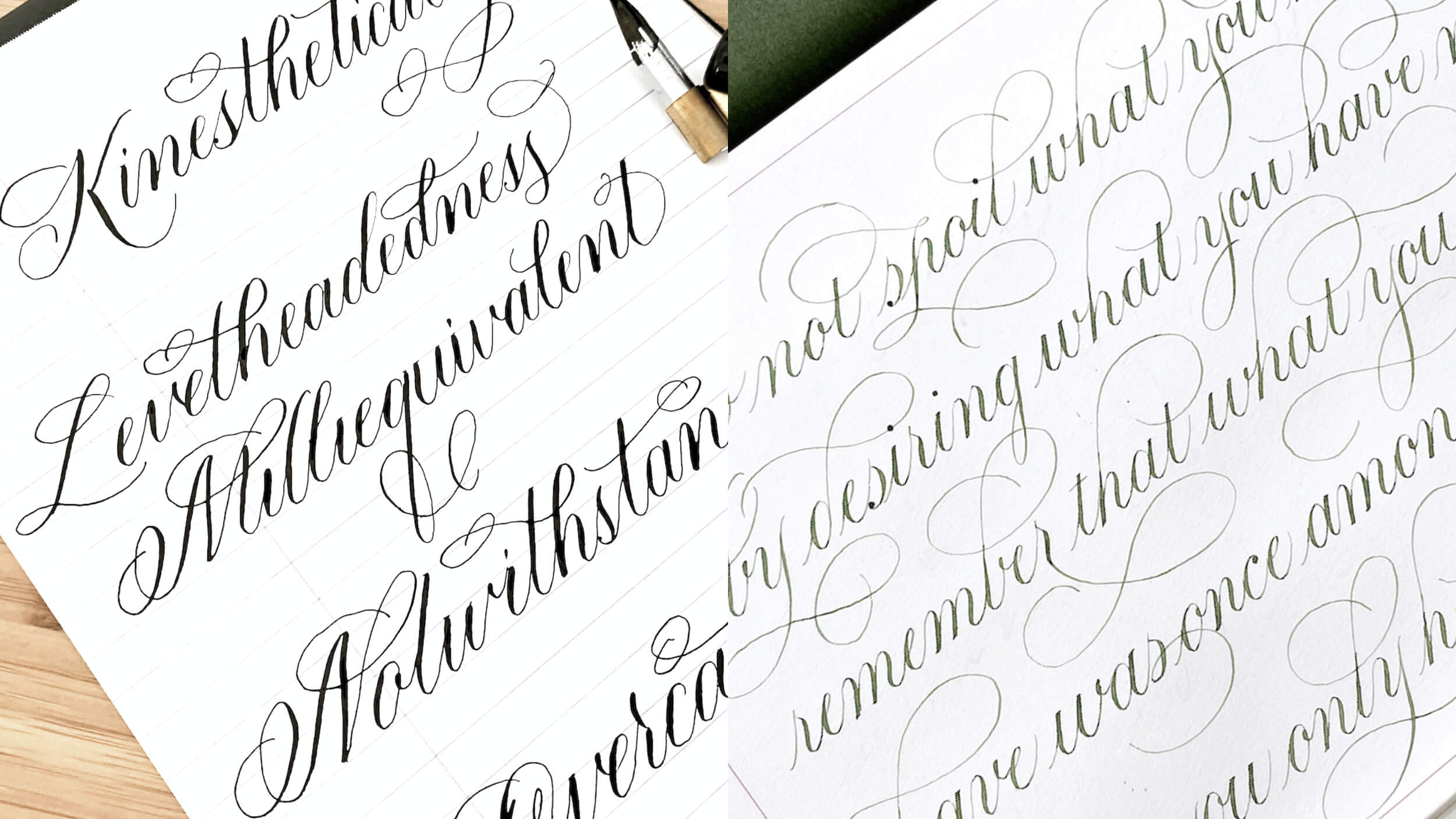
These are the little guardrails that keep flourishing elegant. Try following them on purpose for a while. After that, they start to feel natural.
Keep flourishes in the white space
Look for open areas around your word. Add flourishes where there is room, not where the letters are already busy.
Match the slant and rhythm
If your script leans right, let your flourish lean right too. A flourish that leans the opposite way can look like it belongs to a different word.
One hero flourish per word
When everything is decorated, nothing is special. Pick one main flourish, then keep the rest minimal.
Avoid crossing through the word
Crossing can be beautiful, but it is a more advanced skill. For beginner flourishing, aim to keep loops around the word rather than through it.
Repeat shapes for harmony
If you add one oval loop, add another oval somewhere else, not a sudden spiral. Repeated shapes feel intentional and calm.
If you enjoy playful movement in letterforms, you might also like the baseline tips in Bouncy Calligraphy Baseline Rules. Bouncy styles and flourishes can be best friends when the spacing stays tidy.
Warm-up drills that make flourishes smoother
Flourishing gets easier when your hand already knows the motion. Do these drills on scrap paper for 2 to 3 minutes before adding flourishes to real words.
Drill A: The oval ladder
- Draw a row of light, slanted ovals, all the same size.
- Keep the ovals evenly spaced so none of them touch.
- Repeat with smaller ovals, then larger ovals.
Drill B: The loop and return
- Start with a thin upstroke, curve into an oval loop, and return back down.
- Focus on a smooth turn at the top of the loop.
- End with a taper.
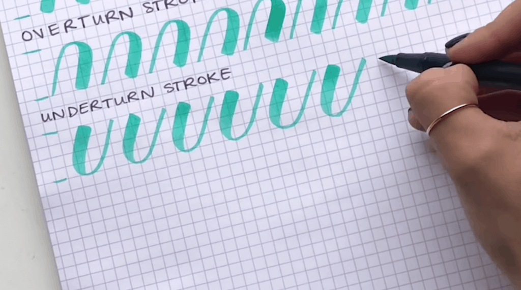
Drill C: Pressure control on curves
- On a curved downstroke, add just a touch of pressure.
- On curves going upward, use light pressure.
- Try to keep thick strokes thick for only a short section so the flourish stays airy.
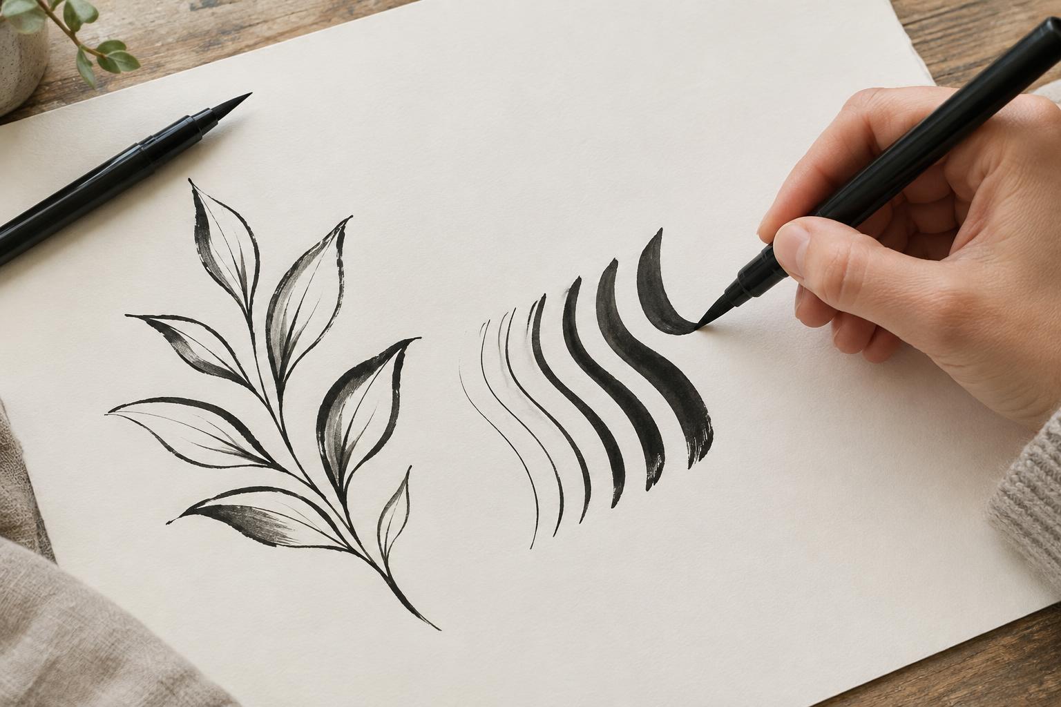
Quick contrast tip: Flourishes usually look best when they follow the same contrast as your script: thicker on downstrokes, lighter on upstrokes. If your flourish changes direction, just watch for accidental pressure on the upstroke sections, since that is where flourishes can start to look heavy.
If your pen is fighting you or making fuzzy edges, it may be the paper. A smooth sheet helps flourishes look clean. See Paper That Keeps Brush Pens From Fraying for practical options and what to avoid.
Beginner flourish practice: ascenders
Ascenders are the tall strokes on letters like b, d, f, h, k, l, and t. Ascender flourishes look best when they feel like a gentle extension of the upward motion you already have.
Exercise 1: Looping an l
- Write a row of lowercase l in your normal style.
- On the next row, add a small oval loop near the top of the ascender.
- Keep the loop away from the next letter space. Leave breathing room.
Exercise 2: The h exit flourish
- Write a row of lowercase h.
- On the final exit stroke, add a small loop that curves up and then returns to finish with a taper.
- Practice with only one loop. Resist adding a second loop right away.
Exercise 3: The t crossbar flourish (tiny version)
This is a beginner-friendly flourish because it stays small.
- Write a row of t letters.
- Cross each t with a slightly curved stroke that lifts at the end.
- Keep it short so it does not collide with neighboring letters.
When you are ready to connect flourished letters into words, How to Connect Letters in Modern Calligraphy can help you keep spacing consistent.
Beginner flourish practice: descenders
Descenders dip below the baseline on letters like g, j, p, q, y, and z. Descender flourishes often have the most room to shine because they can live below the word, where there is usually more empty space.
Exercise 1: A simple y loop
- Write a row of lowercase y letters.
- On the next row, extend the descender into a gentle oval loop below the baseline.
- Return upward and finish with a thin taper that points away from the next letter.
Exercise 2: The g underloop
- Write a row of lowercase g.
- Extend the descender and draw one oval loop below the baseline.
- Keep the loop open. If the inside space disappears, the flourish will look heavy.
Exercise 3: The word-end swoop
This one is great for names and short words.
- Write a simple word like joy, hey, or yay.
- On the final letter, extend the exit stroke into a long, light curve.
- Make the ending taper thin and delicate.
How to place a flourish
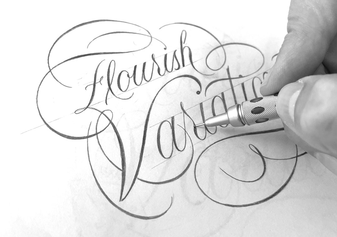
When you are staring at a word and wondering, where do I add the flourish, use this quick method.
Step 1: Circle the open space
Look above, below, and to the sides of the word. The biggest open area is usually the safest place for a first flourish.
Step 2: Pick one letter as your anchor
Great flourish anchors are:
- a first capital letter
- a tall ascender near the beginning
- a final letter with a long exit stroke
- a descender near the end
Step 3: Sketch the motion with your finger
Trace the flourish path in the air or on the paper without ink. If the motion feels awkward, simplify it into one oval and one taper.
Fixes for common beginner problems
Problem: My flourish looks shaky
- Slow down slightly on curves, and keep straight strokes steady.
- Warm up with ovals first.
- Use smoother paper so the pen glides.
Problem: My flourish takes over the word
- Make the loop smaller, then make the return longer and lighter.
- Use one flourish per word.
- Leave more space between letters if you plan to flourish.
Problem: My pen frays and the hairlines look fuzzy
- Switch to smoother paper and lighter pressure.
- Try a quick pen cleanup and reshaping routine from How to Fix Frayed Brush Pens.
- Store pens horizontally when you can, and if you store them upright, follow the maker's guidance. How to Store Calligraphy Pens and Markers can help your tips stay crisp.
Problem: My flourish crashes into the next letter
- Shorten the flourish.
- Move it to the end of the word.
- Increase spacing between letters slightly before you add the flourish.
Problem: I keep fixing it and now the ink is blotchy
- Try to aim for one confident stroke instead of going back over hairlines again and again.
- If a flourish truly needs help, it is often cleaner to rewrite the word than to keep patching the same spot.
- Let ink dry before you judge it. Wet ink can look heavier than it will once it settles.
A simple 10-minute routine
Want a tiny plan that keeps improvement steady and stress-free? Here is a gentle routine to repeat a few times a week.
- 2 minutes: ovals, small to large.
- 3 minutes: loop and return drill, focusing on smooth turns.
- 3 minutes: one ascender flourish row (l or h).
- 2 minutes: one descender flourish row (y or g).
End by writing one short word and adding one flourish in the biggest white space. One neat flourish beats five crowded ones every time.
Flourishing FAQ
Do flourishes have to be thin?
Not always, but beginners usually get the prettiest results with lighter pressure. Thick flourishes can look heavy quickly, especially on small words.
Can I flourish with Crayola markers?
Yes. The main idea is smooth ovals and clean tapers, no matter the tool. If you are using broad line markers, keep flourishes large enough that the curves do not fill in. This pairs nicely with Crayola Calligraphy With Broad Line Markers.
Should I flourish capitals first or lowercase first?
Lowercase first is often easier because the strokes are simpler and more repeatable. Once your ovals feel smooth, you can start adding small flourishes to capitals.
What if I love flourishes but my words get messy?
For now, try choosing one main playful element at a time. You can practice bounce on one page and flourishes on another, then combine them later once spacing feels natural. If you are working on bounce already, keep flourishes minimal until your letter spacing feels steady.
Keep it elegant, keep it you
Flourishing is not about adding as many loops as possible. It is about giving your letters room to dance. Start with ovals, keep one flourish as the star, and let white space be part of the design. With a little practice, your swoops will feel less like decoration and more like a natural finish to your writing rhythm.
If you want more guided practice, you can explore the rest of Tutorials & Practice Drills anytime.