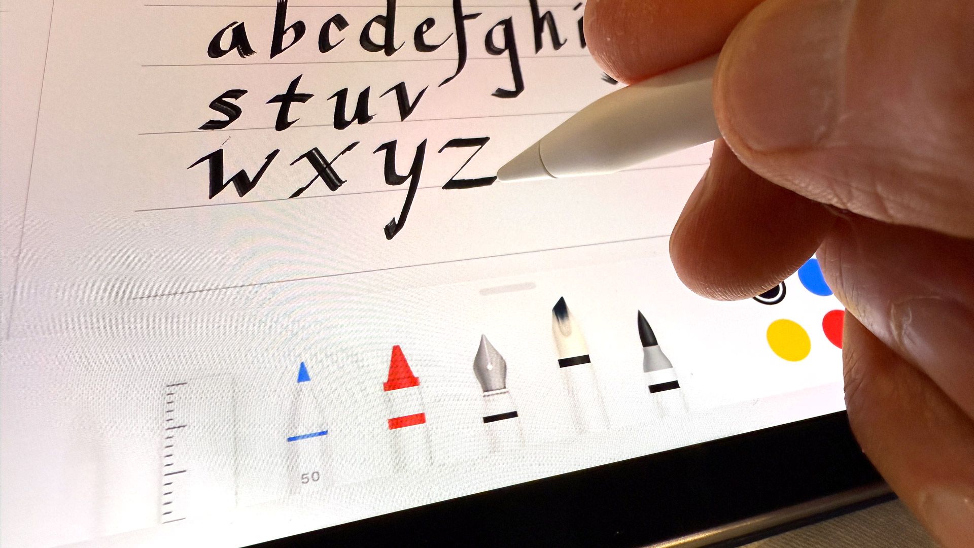
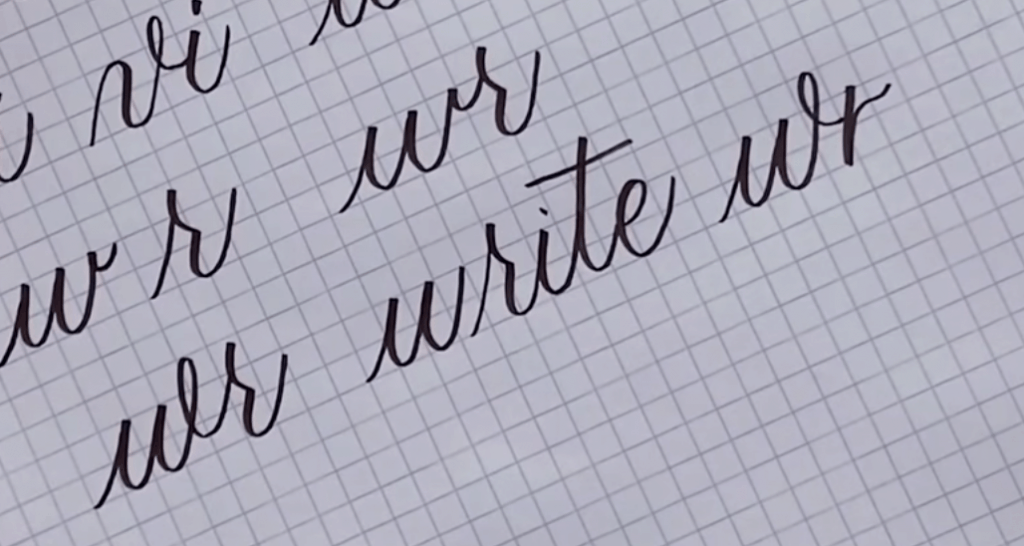
Grab your iPad and let’s draw some beautiful letters together! Digital calligraphy feels a little slippery at first, but with a few brush setting tweaks and some screen-friendly habits, Procreate can start to feel surprisingly close to paper.
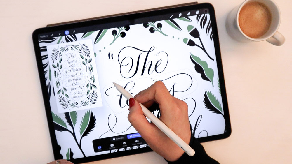
Before you touch a setting
Procreate calligraphy gets easier when three simple pieces match up: your brush behavior, your stabilization, and your physical screen control. We’ll cover both the sliders and the hand technique, because they work as a team.
- Brush behavior decides how pressure becomes thick and thin.
- Stabilization helps smooth wobble without making your letters feel stiff.
- Screen technique keeps your strokes clean, especially on upstrokes and curves.
If any one of these is off, your lettering can feel messy even if your shapes are correct on paper.
Set up a Procreate practice page
Give your hand a calm place to learn the new surface.
- Create a new canvas. A good beginner size is 2000 to 3000 px on the long side.
- If you’re planning to print, set 300 DPI. If you’re staying digital, pixels matter most and DPI is mainly print metadata.
- Turn on a guide: Actions (wrench icon) → Canvas → Drawing Guide → Edit Drawing Guide.
- Pick 2D Grid for simple practice. (Perspective and Symmetry are fun later for special projects.)
- Create three layers: Guides (bottom, locked), Draft (rough sketch), Ink (your lettering on top).
Keeping guides on their own locked layer prevents accidental marks or edits, and it makes it easy to hide guide lines before you export.
The brush settings that matter most
Procreate has lots of sliders, but beginner calligraphy improves fastest when these are dialed in: stabilization, taper, pressure response, and a couple of shape controls.
Where to find the key controls
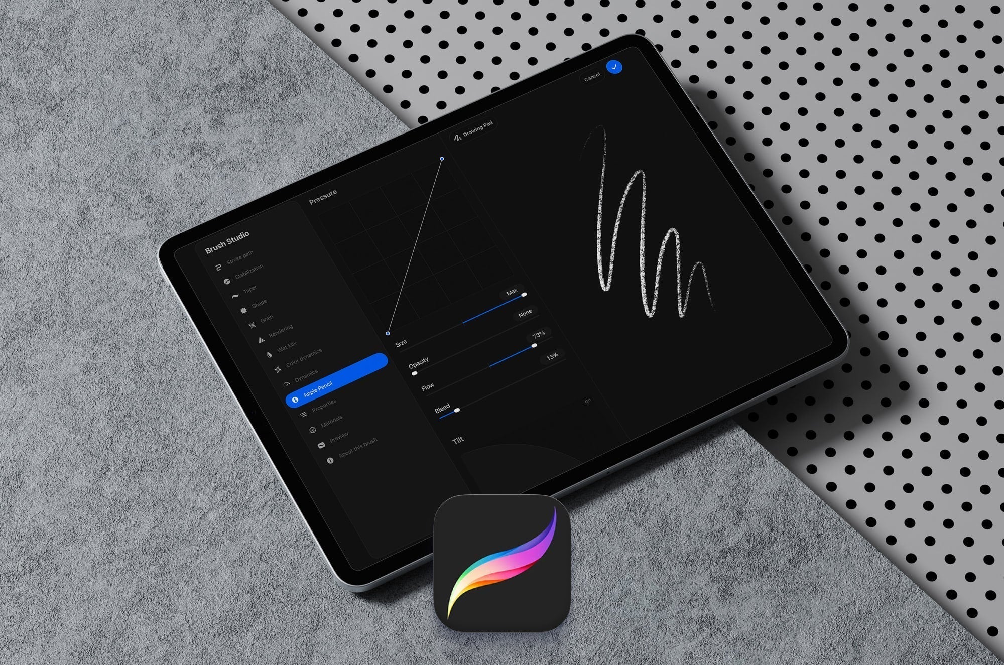
Tap your brush to open Brush Studio. Most calligraphy tweaks live in these sections:
- Stabilization: smoothing controls (often labeled Stabilization and StreamLine).
- Taper: how strokes start and end.
- Apple Pencil: pressure behavior for that brush.
- Shape and Grain: edge quality and texture.
- Stroke Path: spacing and stroke continuity.
1) Stabilization and StreamLine
In Procreate, smoothing is typically controlled in Brush Studio → Stabilization. Depending on your version and brush, you may see Stabilization and StreamLine (and sometimes related options that affect how the stroke follows your hand).
What to aim for:
- Too low: every tiny shake shows up, especially on light upstrokes.
- Too high: your stroke lags behind the Apple Pencil and corners can get blobby.
- Just right: the line follows you quickly, but the wobble quiets down.
Beginner starting point: set stabilization to a medium level first, then adjust while writing slow ovals and long diagonals. If the stroke feels like it is “chasing” your Pencil, lower it a bit.
2) Taper: clean entries and exits
Taper controls how your stroke starts and ends. For modern calligraphy, taper helps keep entrances crisp instead of blunt.
- Use a small to moderate taper for everyday practice.
- If your downstrokes look like they have a bulb at the beginning, reduce the taper or reduce stabilization slightly.
- If your upstrokes end in ragged hooks, add a touch more taper and slow the lift-off.
3) Pressure: make thick and thin predictable
The goal is not extreme contrast. The goal is control.
- If your thin upstrokes keep turning thick, your pressure is likely too sensitive. In Brush Studio → Apple Pencil, adjust the pressure behavior so you get more thin range before it thickens.
- If you have to mash the screen to get a downstroke, the brush needs more responsiveness or a slightly smaller maximum size.
Also note that pressure can be influenced in more than one place. Your brush settings matter most, but Procreate can also have app level pressure options in Preferences in some versions. If your pressure feels wildly off across all brushes, check Preferences too.
Tip: Practice the 8 basic strokes digitally the same way you do on paper, then fine-tune the brush. If you want that stroke list refresher, hop over to 8 Basic Brush Lettering Strokes.
4) Shape and grain: reduce scratchy texture
Many Procreate brushes use textured grain that can look lovely, but it can also make beginner calligraphy feel fuzzy.
- If your edges look speckled, choose a brush with a smoother grain.
- If your downstrokes look uneven, pick a brush with a clean, solid shape and minimal texture.
5) Spacing: keep strokes continuous
If a line looks like tiny dots connected, the brush spacing is too high.
- Lower Spacing (usually in Brush Studio → Stroke Path) until the stroke becomes smooth.
- Do not chase perfection at maximum zoom. Judge the stroke at the size you plan to use it.
Screen techniques for smooth lettering
Even with perfect settings, screen calligraphy feels different because the surface is slick and your hand position changes. These habits help fast.
Use a light touch and slow your upstrokes
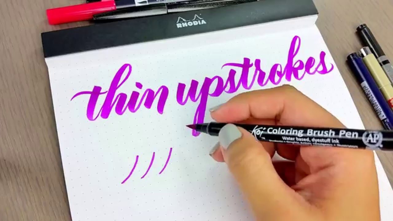
On a slick iPad screen, it is easy to accidentally add pressure. Train your hand to keep upstrokes feather-light:
- Start the upstroke with the Apple Pencil already moving, then gently touch down.
- Keep the stroke speed steady. A sudden acceleration often causes wobbles.
- Lift slowly at the end so the taper stays clean.
Zoom less than you think
At extreme zoom, every curve looks wrong and you start over-correcting. Practice at a comfortable view where a full word fits on screen. Zoom in only for small fixes.
Rotate the canvas, not your wrist
Procreate makes it easy to keep a consistent slant. Instead of twisting your hand into uncomfortable angles, rotate the canvas so downstrokes can pull naturally.
Rest your hand and prevent stray marks
If you get random little dots, your palm may be tapping the screen. Try:
- Using a drawing glove, if you have one.
- Keeping your letter layer separate, and using Undo quickly when needed.
- Practicing with simple drills first, like straight lines and ovals.
Build letters with strokes, not outlines
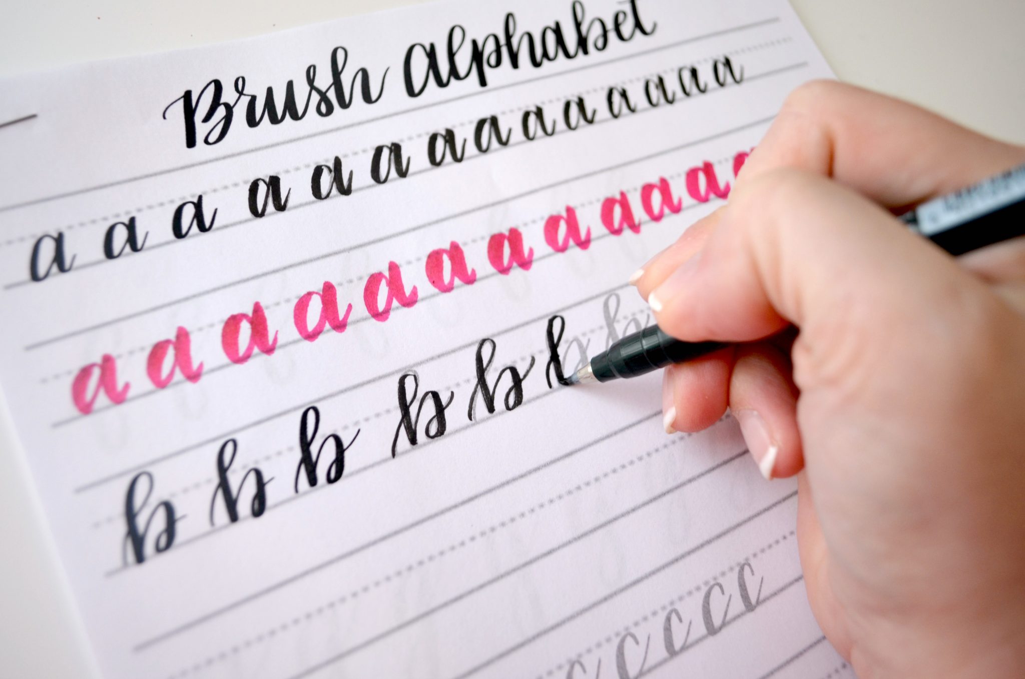
Beginners often draw the shape instead of writing it. Procreate calligraphy improves when you form letters from the same basic strokes you use on paper.
Need a gentle drill routine? The pacing in 15-Minute Daily Calligraphy Drills works beautifully on an iPad too.
Quick fixes
My lines look wobbly
- Increase stabilization slightly.
- Slow down and focus on one smooth motion per stroke.
- Warm up with big ovals and long diagonals before writing words.
My downstrokes look shaky or lumpy
- Reduce stabilization a touch if corners are blobbing.
- Lower brush grain or choose a smoother brush.
- Practice pulling downstrokes with consistent speed and pressure.
If shaky light strokes are the main issue, the mechanics in How to Fix Shaky Upstrokes translate to digital surprisingly well.
My thin strokes are not thin
- In Brush Studio → Apple Pencil, adjust pressure so it stays thin longer.
- Use less pressure than feels normal at first.
- Try slightly increasing canvas rotation so your upstrokes travel comfortably.
My letters look messy when I connect them
- Slow down the exit stroke of the first letter.
- Enter the next letter with a light, deliberate hairline.
- Keep your joins simple until your stroke consistency improves.
For connection logic, these tips help in any medium: How to Connect Letters in Modern Calligraphy.
Simple brush recipe
This is a simple target to build toward as you adjust any smooth calligraphy brush:
- Stabilization: medium (enough to reduce wobble, not enough to lag)
- Taper: light to moderate (crisp starts and finishes)
- Grain: low texture (clean edges while learning)
- Spacing: low (continuous stroke)
- Pressure response: tuned so thin strokes stay thin with a light hand
Then practice the same word three times: once slowly, once at normal speed, once slightly faster. Adjust only one setting between rounds so you can feel what changed.
Practice plan
Here is a simple 10 to 15 minute loop for building control on a slick screen surface:
- 2 minutes: light upstroke drills (thin lines only)
- 3 minutes: thick downstrokes with steady pressure
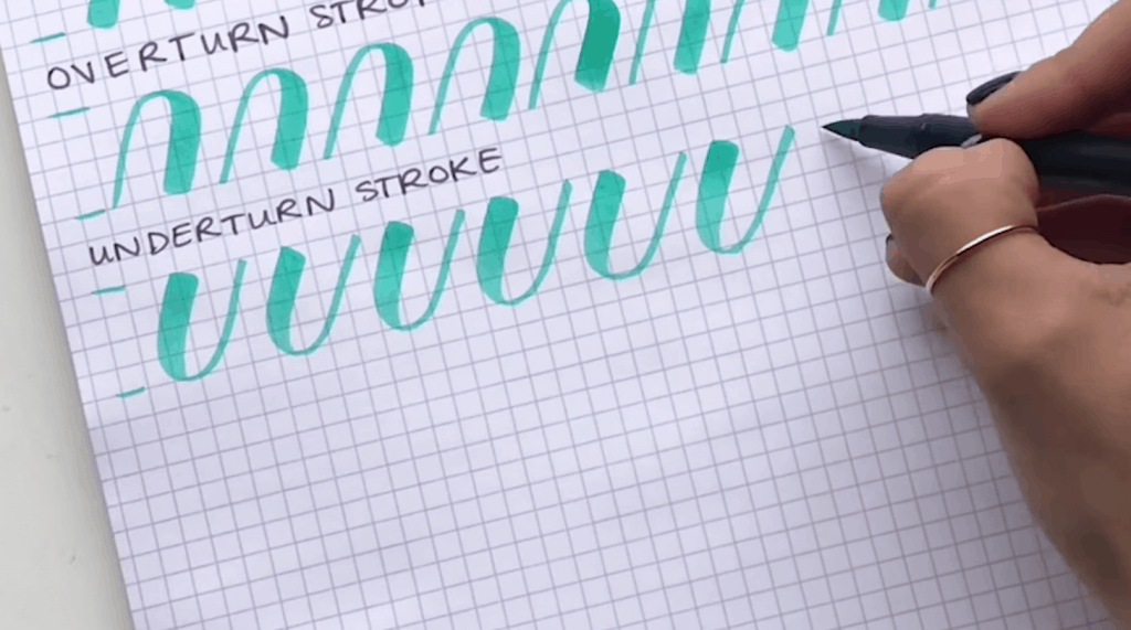
- 3 minutes: ovals and underturns, focusing on smooth curves
- 5 minutes: one short word, written repeatedly with consistent slant
Once strokes feel steadier, you can start playing with style choices like bounce and flourish. Bouncy rhythm rules still apply, even on an iPad: Bouncy Calligraphy Baseline Rules.
FAQ
Do I need a Paperlike style screen protector?
No. Some letterers like added texture, but smooth glass can work beautifully with the right stabilization and a lighter touch. If your strokes feel too slippery, increase stabilization slightly and slow down the start of each stroke.
If you do use a matte screen protector, expect a little more friction and keep in mind it can wear Apple Pencil tips faster over time.
Why does my brush look different from other people’s?
Pressure response can vary with brush settings, canvas size, and your hand pressure. Two people can use the same brush and still get different results. Treat settings like a fit, not a rule.
Should I use monoline first?
Monoline is a wonderful stepping stone because it teaches shape without worrying about pressure. If you want that route, practice letter construction with Monoline Lettering 101, then return to pressure-based calligraphy once your forms feel confident.
Do I need to replace my Apple Pencil tip?
If your strokes suddenly feel scratchy or inconsistent, a worn tip can be part of the problem. A fresh tip often improves control and makes pressure feel more predictable.
Next step
Pick one smooth calligraphy brush, set stabilization to a comfortable medium, and practice the 8 basic strokes for just a few minutes. Digital lettering is still lettering. The same calm repetition builds the same happy muscle memory, one swoop at a time.