Grab your favorite pen and let's draw some beautiful letters together! Faux calligraphy is a cheerful little trick: you write normally, then draw in thicker downstrokes to mimic that swooshy brush-pen look. No special nibs required, just patience and a steady smile.
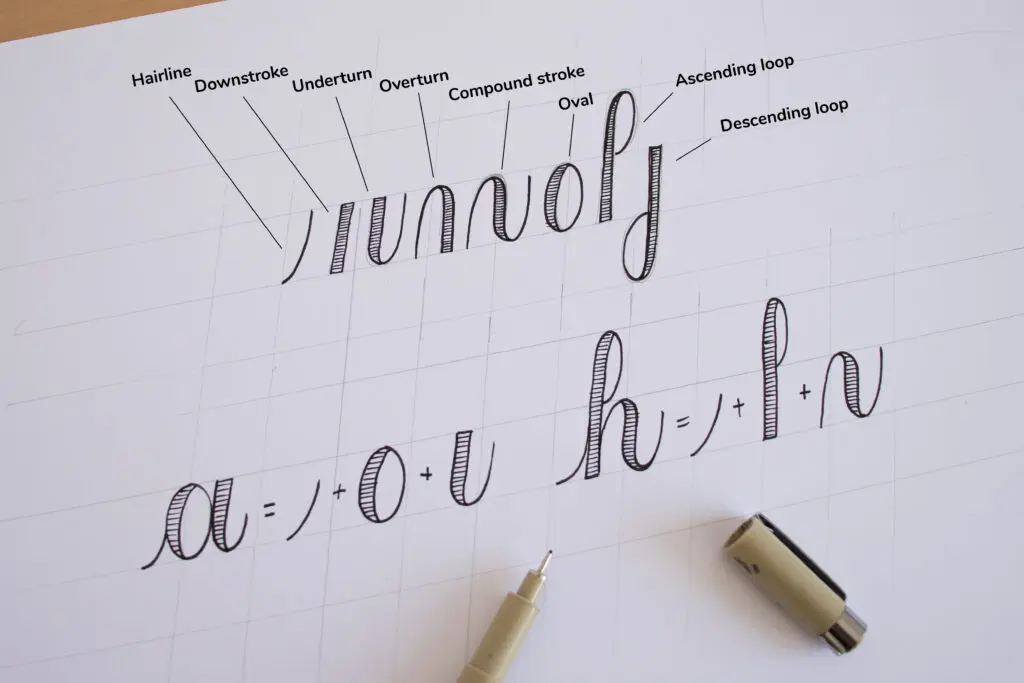
What faux calligraphy is
In brush lettering and pointed-pen calligraphy, pressure naturally creates thick and thin strokes. In faux calligraphy, you create the same contrast by:
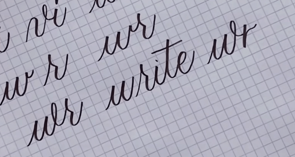
- Writing the word in a neat cursive or print style.
- Adding a second line beside each downstroke to make it wider.
- Filling in that widened space.
This works beautifully for modern lettering styles, especially when you want a bold, friendly look for cards, labels, notes, and DIY projects.
Supplies you can use
The whole point is flexibility, so use what you already have. Here are a few options and what they are best at:
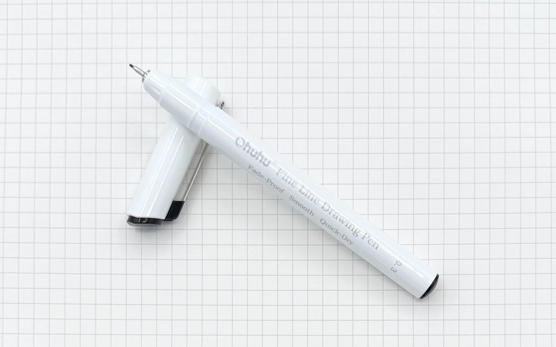
- Ballpoint pen: super accessible, great for practice, filling can look slightly shiny depending on ink.
- Fineliner: crisp edges and tidy fills, perfect for a clean modern style.
- Gel pen: smooth filling and bold color, just allow extra dry time.
- Chalk or chalk marker: excellent for faux calligraphy on boards, thicker fills are easy.
- Pencil: ideal for first attempts and for planning spacing before committing with ink.
Paper matters too. If your pen skips, feathers, or bleeds, switch to a smoother sheet. For brush pens this is extra important, but even standard pens behave better on smooth paper. If you also play with brush pens, this guide to paper that keeps brush pens from fraying explains what “smooth” really means.
Warm up: thick and thin
Before jumping into a whole word, do a tiny warmup so your hand remembers the rule:
- Downstrokes go thick. Any stroke moving down the page is the one you will widen and fill.
- Upstrokes stay thin. Strokes moving upward stay as your original line.
Pen tip: If you are ever unsure what counts as a downstroke, trace the letter slowly in the air or on scrap paper and watch your pen direction. Whatever is traveling downward is the part to thicken.
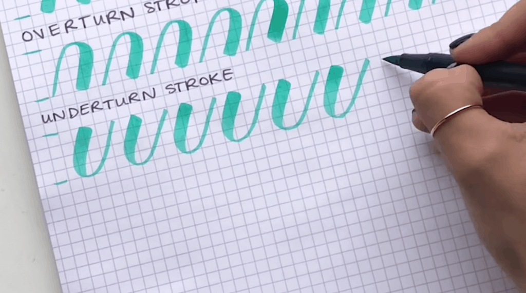
If you want a structured warmup, practicing basic stroke shapes helps your faux calligraphy look more natural. The same stroke families used in brush lettering still apply here. See 8 basic brush lettering strokes for the shapes to practice, just without pressure.
Step by step method
Step 1: Write your word
Pick an easy word like “hello” or “joy.” Write it once at a comfortable size. A slightly larger word is easier to thicken neatly.
Pen tip: Keep your letters relaxed. Faux calligraphy loves round shapes and open spacing.
Step 2: Find every downstroke
Scan each letter and find the strokes that travel downward. Common spots include:
- The left side of an o or a
- The main stem of l, h, d
- The down parts of n and m
- The downstroke in a loop or flourish
Step 3: Add a second line
Next to each downstroke, draw a parallel line to create a skinny bubble of space. This turns one line into a thick stroke.
- Keep the gap consistent, like you are outlining one side of the stroke.
- Choose a side and stick with it. Many people add thickness on the right side of a downstroke in a right-leaning script, but either side can work. Consistency is what makes it look polished.
- When strokes meet, tuck your new line in gently so it does not create sharp corners.
Step 4: Fill the thick parts
Color in the widened sections. For the smoothest look:
- Fill using small strokes in one direction.
- Slow down around curves to keep edges clean.
- Let gel ink dry before you rest your hand on it.
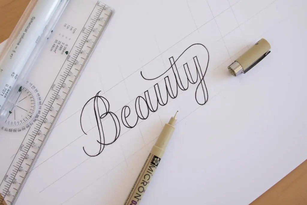
Clean thickening tips
Ovals (o, a, d, g)
In many common cursive styles, the downstroke is usually the left or upper-left portion of the oval. That said, the real rule is simpler: thicken whichever segment you actually draw while moving downward, then taper back into the thin line so it looks natural.
Humps (m, n, r)
Each hump has its own downstroke. Thicken each downstroke separately, and keep the joins neat so the letter does not become a blob.
Loops (l, h, b)
In looped ascenders, the downstroke is typically the right side coming down. Add thickness there and keep the inside counter space open.
Connections
Connections are where faux calligraphy can look messy if the thick strokes crash into each other. If two thickened downstrokes meet, you have two options:
- Merge smoothly: connect the thick areas into one continuous thick stroke.
- Separate clearly: keep a tiny sliver of negative space so each letter stays readable.
If connecting letters is the part that makes your whiskers twitch, this guide to how to connect letters in modern calligraphy explains the most common connection shapes.
Easy modern upgrades
Bouncy baseline
Instead of keeping every letter sitting on the same line, let some letters bounce slightly above or below. Keep it subtle at first. A little bounce goes a long way.
For baseline rules that keep “bouncy” looking intentional, visit bouncy calligraphy baseline rules.
Mix print and script
Try writing the word in a casual printed style, then thicken only the downstrokes. This creates a bold, graphic look that feels very modern.
Add a second color
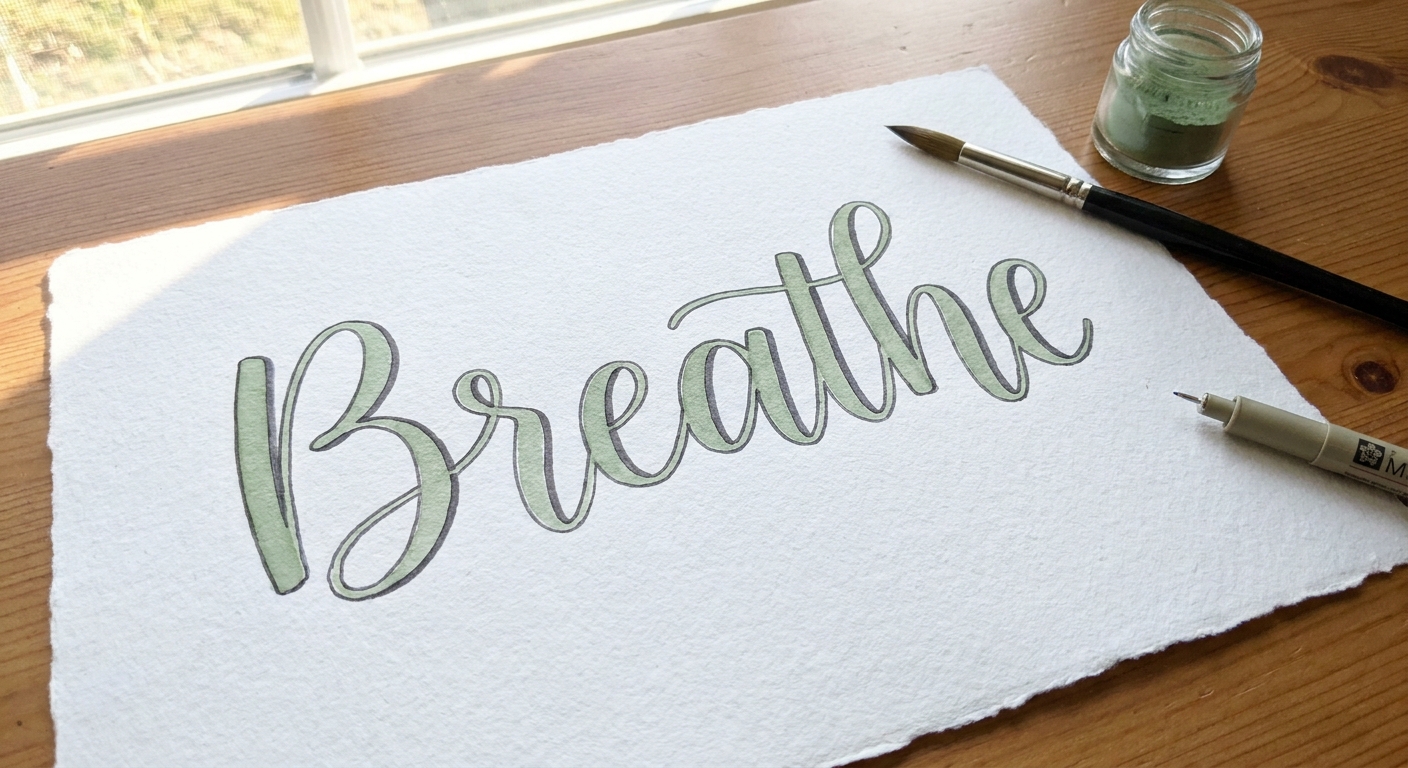
Outline the thick strokes with a lighter color, or fill with a pale marker and add thin details with a fineliner. Keep the contrast gentle so the letters stay readable.
With chalk
Chalk and chalk markers are naturally thick, so your job is mostly about shaping the thick and thin contrast.
- Write your word with light pressure first.
- Thicken downstrokes by widening them with the side of the chalk or the tip of the marker.
- Fill the widened area, then clean edges with a dry cloth or a slightly damp cotton swab.
Pen tip: On chalkboards, thicker letters need more spacing. Give each word a little extra breathing room.
Common mistakes
Everything gets thick
If your word starts looking like a bold blob, choose fewer thick strokes. Keep upstrokes thin, and do not thicken tiny connector lines unless needed for balance.
Wobbly fill edges
Slow down, then outline the thick shape first and fill second. Outlining gives your fill a tidy fence to stay inside.
Hard to read letters
Readability comes from open counters and clean spacing. If an e or a closes up, erase or reduce thickness on the tightest curve.
Ink smears
Work left to right if you are right-handed, and right to left if you are left-handed. Or place a clean scrap paper under your hand while you fill.
10 minute practice drill
- 1 minute: Draw 10 light upstrokes and 10 light downstrokes. Then repeat the downstrokes and thicken only those.
- 2 minutes: Write a row of ovals. Thicken only the segment that moves downward, which is often the left or upper-left side in common cursive.
- 3 minutes: Write “minimum” slowly. Thicken each downstroke in the humps.
- 4 minutes: Write one short word three times. First time small, second time medium, third time large. Thicken downstrokes each time and notice which size feels easiest.
Consistency grows from short, rhythmic practice like this. If you want more drills to pair with your lettering sessions, peek at Tutorials & Practice Drills.
FAQ
Can faux calligraphy look like real brush calligraphy?
It can look surprisingly close, especially at a glance. Real brush lettering has natural pressure changes and tapering. Faux calligraphy can mimic that by tapering your thick strokes at the start and end instead of making them blunt.
What is the best pen for beginners?
A fineliner or gel pen is often easiest because the ink line is consistent and filling looks smooth. Ballpoint works too, just expect a slightly lighter fill.
Do I need special worksheets?
Nope. Any lined paper or blank sheet works. You can even practice on sticky notes. The key is the downstroke rule and taking your time with the thickening and filling.
Keep going
Once faux calligraphy feels comfortable, it becomes a handy superpower. You can add calligraphy flair to almost anything, even when all you have is a regular pen. If you decide to try brush pens next, hop over to best brush pens for calligraphy beginners for a friendly starting point.
Now scoot your paper a little closer, pick a word you love, and give those downstrokes a cozy thicker coat. Swoop by swoop, you are doing it.