Grab your favorite pen and let’s draw some beautiful letters together! If you have ever thought, “My lettering looks fine… but it looks like everyone else’s,” this is your friendly nudge: your unique style is not a secret talent. It is a collection of choices you practice on purpose.
Below are five steps that help you move from copying to creating, without getting lost in perfectionism. Each step includes quick exercises so your hand can explore, collect, and then commit to the shapes that feel most like you.
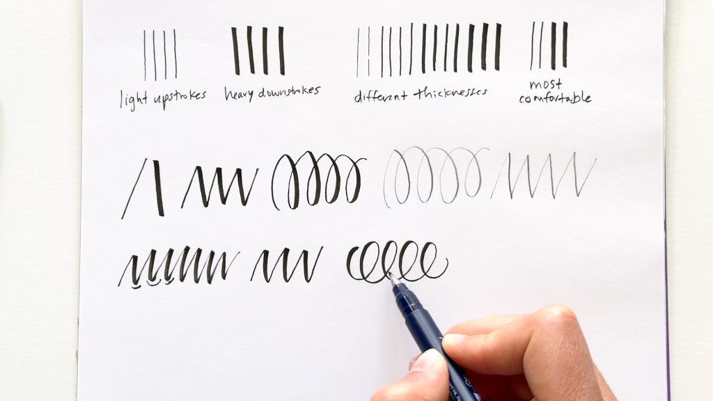
Step 1: Build a tiny style library
Copying is not the enemy. Staying there is. Think of copying as gathering ingredients, not serving dinner. Your goal in this step is to collect specific features you like, then label them so you can remix them later.
Pick 3 sources, then hunt for features
Choose three very different lettering references. For example: a bouncy modern script, a clean monoline script, and a bold serif word. Now, instead of copying whole alphabets, zoom in on features:
- Entry strokes: long and swoopy, or short and tucked?
- Exit strokes: sharp flick, rounded tail, or loop?
- Ovals: narrow, round, or tilted?
- Connections: tight and fast, or open and airy?
- Weight: dramatic contrast, gentle contrast, or monoline?
Mini exercise: the feature box page
- Draw 6 boxes on a page.
- Label each box with one feature you like (examples: “tall ascenders,” “open counters,” “sharp turns,” “round terminals”).
- Fill each box with 10 quick doodles of that feature only. No full words yet.
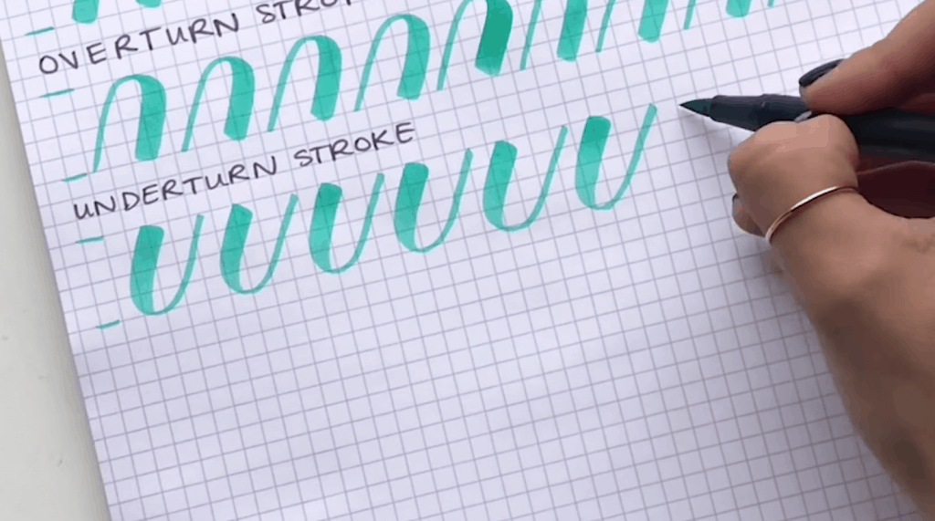
If you want a clean starting point for movement and pressure, practice a few foundational marks first, then come back here: 8 Basic Brush Lettering Strokes.
Step 2: Pick your style sliders
Unique style often comes from repeating the same few decisions over and over. In this step, you pick three “sliders” and test them like a little lettering scientist.
The three most powerful sliders
- Slant: upright, slight slant, or dramatic slant
- Proportions: short x-height with tall ascenders, or big x-height with compact ascenders
- Baseline behavior: straight, gently wavy, or bouncy
Baseline choices alone can change the entire personality of your script. If you want help understanding bounce rules so it looks intentional, visit Bouncy Calligraphy Baseline Rules.
Mini exercise: one word, 9 ways
Write the same word 9 times in a 3-by-3 grid:
- Columns (slant): upright, medium, strong
- Rows (x-height): small, medium, large
Circle the two versions that feel most “you.” Those circles are clues. Keep them.
Step 3: Blend two alphabets
This is where style becomes yours. Instead of borrowing an entire alphabet, you pick a few letterforms from one style and a few from another, then make them agree with each other.
Pick a base alphabet, then add 5 signature letters
Start with a simple, readable base. Monoline is especially friendly for this because you can focus on shape first. If you want a refresher, see Monoline Lettering 101.
Now choose five letters that will carry your personality. Great candidates:
- a (so many options)
- g (loop, open tail, or simple hook)
- r (tiny shoulder or dramatic curve)
- s (smooth, angular, or candy-curl)
- y (long loop, short tail, or sharp turn)
Mini exercise: the 5-letter mashup
- Write your base alphabet’s lowercase a to z once, quickly.
- On the next line, rewrite only your five signature letters in a different style you like.
- On the third line, redraw each of those five letters 6 times, nudging the shapes until they match your base alphabet’s slant and spacing.
Tip: when the mashup looks awkward, the problem is usually inconsistent spacing or mixed slants, not the letter itself.
If your connections feel bumpy during blending, this helps: How to Connect Letters in Modern Calligraphy.
Step 4: Set your contrast
Weight and texture are like seasoning. A tiny change can make your script look delicate, bold, playful, vintage, or crisp.
Choose one contrast recipe for now
- Monoline: one consistent line weight
- Soft contrast: moderate pressure on downstrokes (still thicker than upstrokes, just not extreme)
- High contrast: very light upstrokes and heavier downstrokes
- Brushy texture: visible dry-brush edges and lively strokes
You do not need to pick one forever. The goal is to pick one long enough that it becomes recognizable.
Mini exercise: pressure ladders
- Draw 5 vertical downstrokes, each one slightly heavier than the last.
- Under them, label: “min,” “light,” “med,” “heavy,” “max.”
- Now write five short words (one per label), matching your downstroke pressure to each level. Try: “min,” “light,” “med,” “heavy,” “max.”
If controlling pressure feels tricky, slow down and build steadiness first. This guide is a cozy helper: Pointed Pen Pressure Control Basics. Many of the principles translate to brush pens too, but the mechanics feel different: brush-pen thickness comes from tip compression and angle, so go a touch slower and keep an eye on tip wear.
Step 5: Make it repeatable
Your style becomes recognizable when your choices repeat. So let’s turn your favorite discoveries into a simple rule set you can follow anytime you letter.
Create your 6 style rules
Write a short list like this in the front of your practice notebook:
- My slant is: ______
- My x-height is: small / medium / large
- My baseline is: straight / gentle wave / bouncy
- My contrast recipe is: monoline / soft / high / textured
- My signature letters are: a, g, r, s, y (or your picks)
- My spacing vibe is: tight / medium / airy
These are not restrictions. They are the little fence that helps your creativity grow tall instead of wandering in every direction.
Mini exercise: the signature set page
Make one page you can revisit monthly:
- Write your name or a favorite short word 10 times.
- Write the alphabet once, lowercase only.
- Write these common combos: “oo,” “mm,” “nn,” “th,” “sh,” “ing.”
- Circle what feels best, then rewrite that exact version three times slower.
If you want a gentle structure for daily practice while your style settles in, try 15-Minute Daily Calligraphy Drills.
Two quick notes that save frustration
Your tools can change your “style”
Before you decide your style is inconsistent, check your tools. A small brush pen and a large brush pen can make the same alphabet look like two different personalities. Paper matters too: toothy paper can make edges look textured (or frayed) even if your technique is steady. If your tips keep splitting, this will help: Paper That Keeps Brush Pens From Fraying and How to Fix Frayed Brush Pens.
References are great, tracing is tricky
Collecting references is part of learning. Just avoid tracing another artist’s full alphabet and calling it your own, especially for anything you plan to sell. Borrow features, remix them, and build your own rule set. That is where the fun (and the you-ness) lives.
Common style traps
“My work looks messy when I try new things.”
That is a normal stage. Keep experiments on a separate page labeled “play.” Then, for finished pieces, use your current rule set. Play pages are where future style lives.
“Everything I write looks like my reference.”
Switch your goal from copying words to copying only one feature at a time. Then write different words. This breaks the template spell.
“My letters look cool alone, but weird in a word.”
That is a connection and spacing issue. Practice linking strokes and consistent gaps. This guide helps: How to Connect Letters in Modern Calligraphy.
“I keep changing styles every week.”
Pick a “style season.” Commit to one rule set for two weeks, even if it is not perfect. Style needs repetition to become recognizable.
A tiny 7-day plan
- Day 1: Build your feature box page.
- Day 2: Do the 3-by-3 grid with one word.
- Day 3: Choose your base alphabet and five signature letters.
- Day 4: Mashup practice for only those five letters.
- Day 5: Pressure ladders, then write 10 words using one contrast recipe.
- Day 6: Make your 6 style rules list.
- Day 7: Create your signature set page and date it.
Your signature style is not something you “find” in one magical sitting. It is something you grow by making a few choices and repeating them until they feel natural. Little swoops, steady practice, and a smile. That is how it happens.