Grab your favorite brush pen and let's draw some beautiful letters together! When your sketch is ready to grow up into a big wooden sign, the trick is not redrawing everything from scratch. You can transfer your design cleanly, then paint it with steady, swoopy confidence.
Before you transfer: prep the board
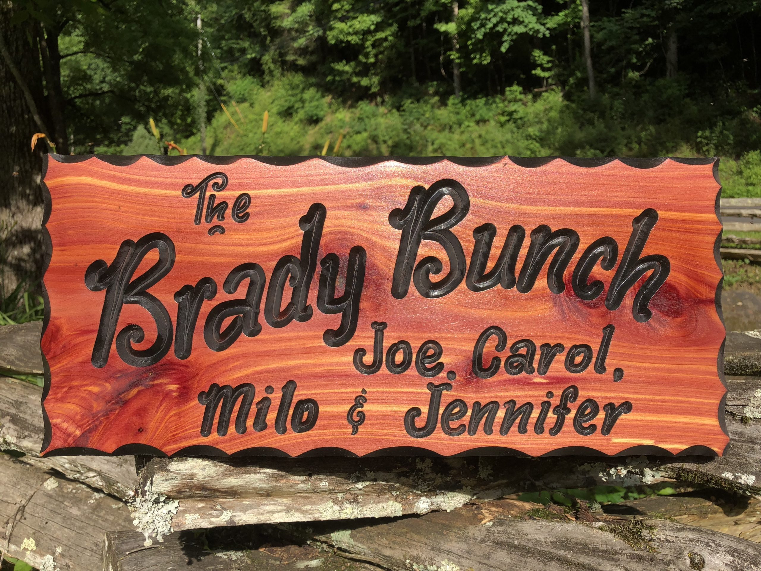
A smooth surface makes every transfer method easier and every paint edge sharper. A little prep time saves a lot of touch-ups later.
- Sand lightly: If the board is rough, start around 120 to 150 grit, then finish around 180 to 220 for a smoother feel. If you are working on plywood, go easy since the veneer layer is thin.
- Remove dust: Wipe with a dry cloth or tack cloth so pencil and paint stick evenly.
- Do the background first: If you plan to stain or paint the whole board, do that now. Dry times and cure times vary by product, so follow the manufacturer instructions before you tape on a design or start transferring lettering.
- Choose your layout: Lightly mark the center point and margins. If you like bounce and playful rhythm, it helps to draw faint guidelines. For baseline ideas that still work on wood, peek at bouncy calligraphy baseline rules.
- Use the right tape: Low-tack painter’s tape is your best friend, especially on freshly painted or stained surfaces. Press it down gently rather than burnishing hard, and remove it slowly at a low angle when you are done.
Pick your transfer method
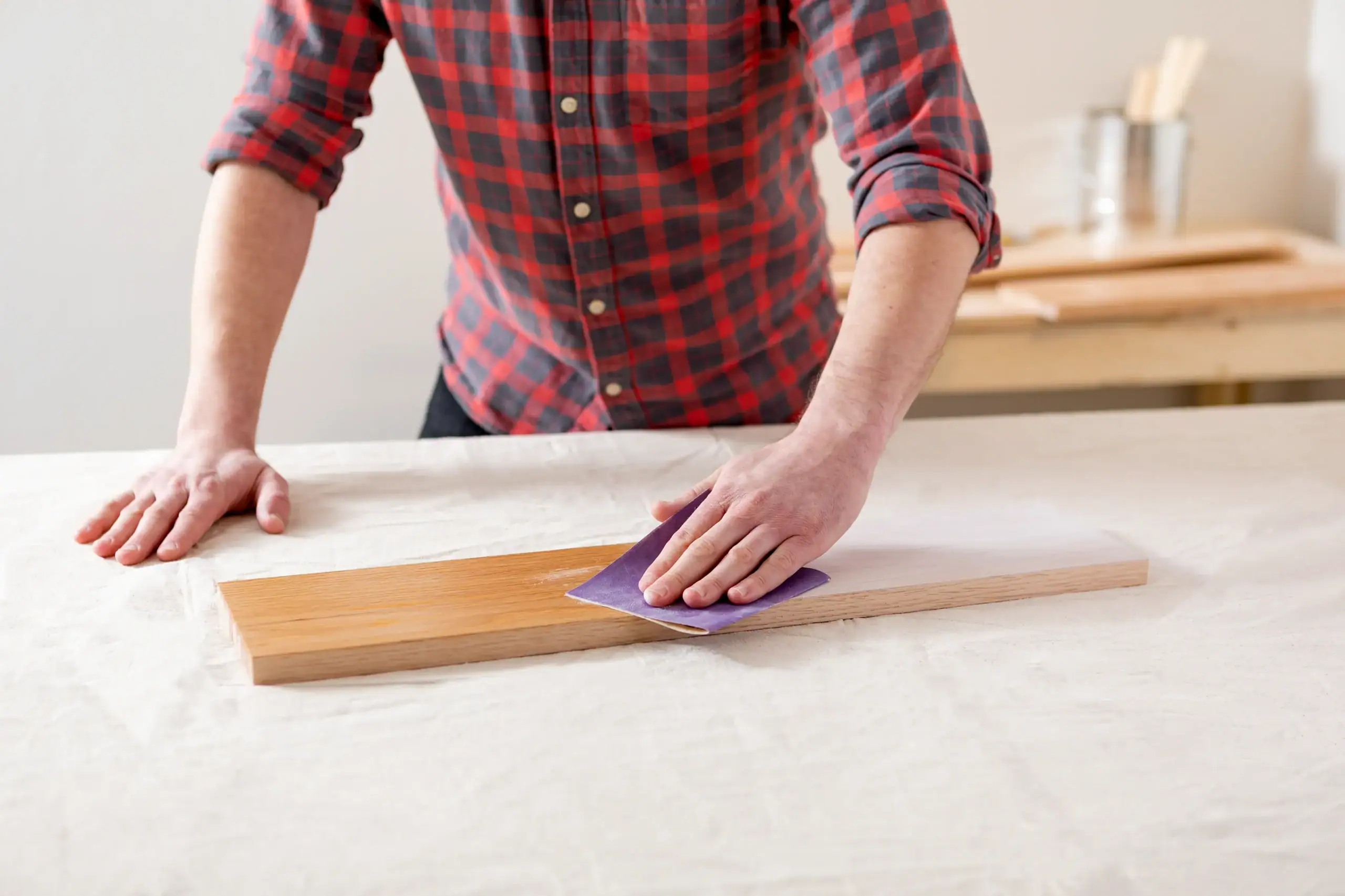
All three options below work beautifully for hand lettering. The best choice depends on your size, your lighting, and how detailed your design is.
- Graphite transfer: Crisp, controlled lines. Great for detailed scripts and flourishes.
- Chalk backing: Quick and inexpensive. Best for darker boards or when you want easy cleanup.
- Projector: Fast for large signs and tricky layouts. Great for scaling without guessing.
Method 1: Graphite transfer
Graphite transfer is like leaving a whisper of your lettering on the wood, ready to paint over.
Skip graphite if your background is very dark or if your surface is super porous and you know you will fuss about tiny smudges in the grain.
What you need
- Your design on paper (printed or traced)
- Soft graphite pencil (a darker, softer lead works better than a hard, light one)
- Painters tape
- Ballpoint pen or a hard pencil for tracing
Step by step
- Prepare the back of your design: Flip the paper over and shade the entire back of the lettering area with graphite. Keep the layer even, like dusting cocoa on a dessert.
- Tape it in place: Position your design on the wood and tape the top edge. Top-hinged tape lets you lift and check without losing alignment.
- Trace firmly: Use a ballpoint pen to trace each stroke. Press firmly enough to transfer, but not so hard you dent the wood grain. On a painted or stained board, a ballpoint is usually kinder than pressing hard with a pencil.
- Lift and check: Peek under a corner. If a spot looks faint, lay it back down and retrace that area.
- Clean up lines: If your transfer is too dark, lightly knead an eraser over it or gently soften with a clean cloth.
Nib’s tiny tips for cleaner graphite lines
- Avoid smears: Rest your hand on a clean scrap paper while tracing.
- Choose your pencil on purpose: Softer graphite transfers darker. Harder leads can dent more easily if you press.
- Keep details readable: If your script has tight counters and loops, simplify before transfer. Need help connecting letters smoothly? Visit how to connect letters in modern calligraphy.
Method 2: Chalk backing
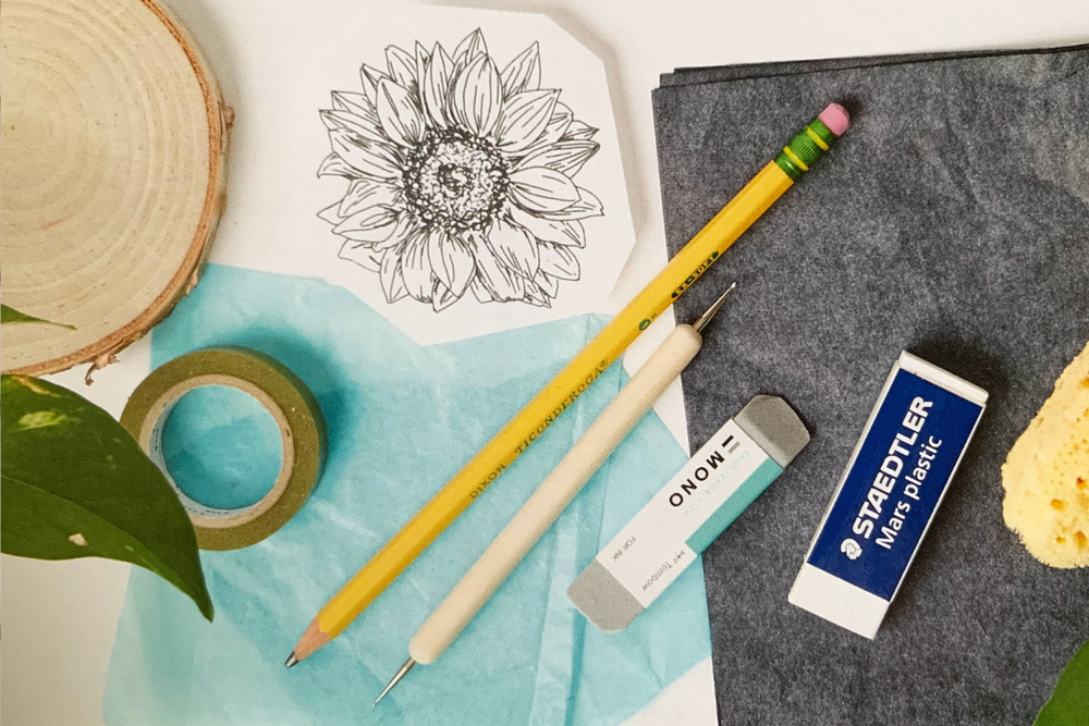
Chalk backing is a favorite for rustic signs and dark stained boards because the lines can show up brighter than graphite and wipe away more easily on sealed surfaces.
A quick caveat: On raw, open-grain wood, chalk can settle into the texture and be harder to erase completely. If you need truly clean wood after, consider a light seal coat first or choose graphite and keep your hand off the transfer.
Skip chalk on very light backgrounds where it is hard to see, or on very textured raw boards if you know you will want a spotless erase.
What you need
- Your design on paper
- White chalk or a white chalk pencil
- Painters tape
- Ballpoint pen for tracing
Step by step
- Coat the back with chalk: Flip your design over and rub chalk on the back where the lettering sits. Blend it with a tissue or paper towel to make an even layer.
- Tape and trace: Tape the design to the board and trace the lettering lines with a ballpoint pen.
- Gently remove the paper: Lift it away slowly so you do not drag chalk across the surface.
- Refine your outline: If needed, sharpen corners or clarify thin upstrokes with a sharpened chalk pencil.
When chalk is the better choice
- Dark backgrounds where graphite disappears
- Projects where you want the option to wipe and redo placement
- Looser, bolder lettering where ultra-precise hairlines are not required
If you love chalk techniques in general, the smudge control ideas in chalk lettering techniques for smudge-free chalkboards also translate nicely to chalk-backed sign prep.
Method 3: Projector transfer
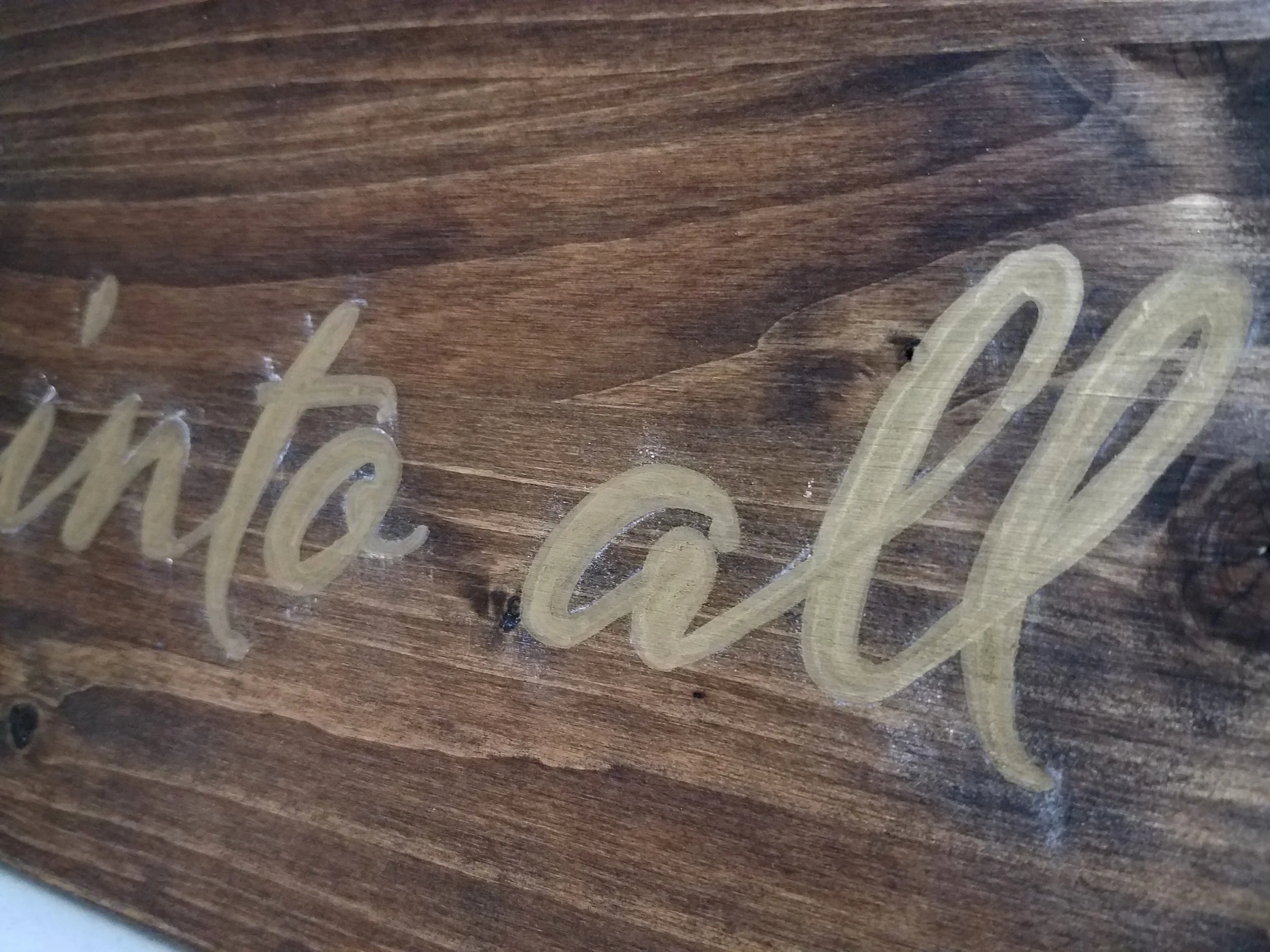
A projector lets you scale your design up cleanly without printing giant sheets. It is especially handy for long quotes, tight spacing, or large event signage.
Skip a projector if you cannot dim the room at least a little, or if your surface is glossy enough to throw glare back at you.
What you need
- A digital version of your design (photo or file)
- A projector and a stable stand or table
- Pencil or chalk pencil to trace on the board
- Lower room light if possible
Step by step
- Square up your board: Set the board upright or flat, then level it so the projected text does not skew.
- Adjust image shape: Move the projector so the letters look proportional. The goal is minimal keystone distortion.
- Lightly trace: Trace the outlines with a pencil (light on pale backgrounds) or a chalk pencil (on darker backgrounds).
- Turn lights back on and inspect: Fix any missing joins and clean up fuzzy edges before painting.
Make projection easier
- Boost contrast: Use a dark design on a light screen background so edges are easy to see.
- Thicken hairlines slightly: Super thin upstrokes can vanish in projection. If you want a monoline look, you can intentionally simplify. See monoline lettering 101.
- Digitize your sketch cleanly: If you drew on paper first, a clear capture helps a lot. Digitize hand lettering from paper to vector walks through a tidy workflow.
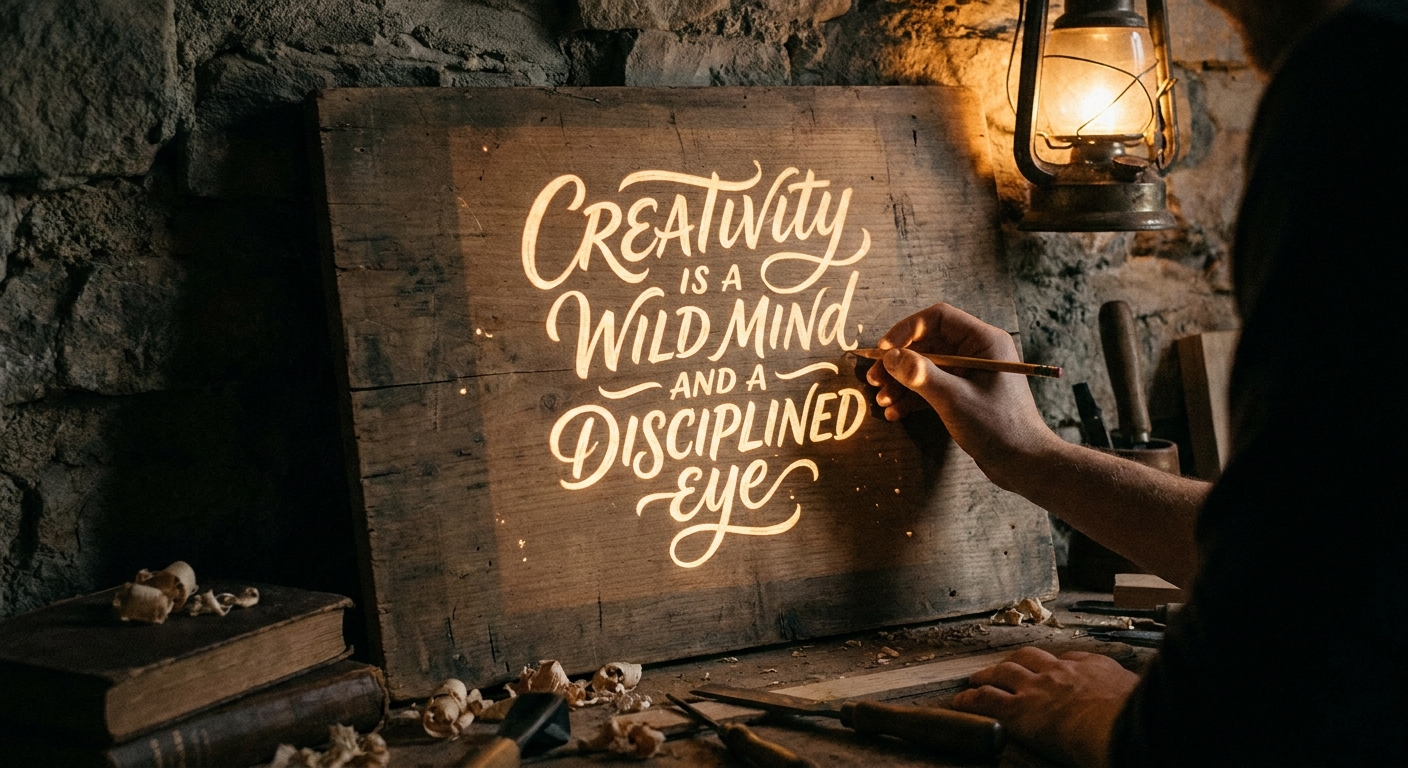
Painting for crisp letters
Once your design is on the board, the painting stage is where your sign becomes bold and magical. These techniques keep edges clean and fills smooth, even on textured wood.
Choose paint that matches your board
- Acrylic craft paint: Great all-around choice for wood signs and easy layering.
- Paint markers: Handy for small signs and details, especially on smoother wood. If you want marker options for wood, visit best markers and paint pens for lettering on glass, wood, and acrylic.
Outline first, then fill
For clean edges, paint the outline of each letter with a small brush, then fill the interior with a slightly larger brush. It is slower than coloring everything in immediately, but it helps your curves stay intentional.
Two thin coats beat one thick coat
Thick paint can blob at edges and sink into the grain unevenly. Thin coats dry flatter and keep corners crisp. Let the first layer dry before adding the next.
Use the grain to your advantage
- With the grain: Smoother fills and fewer ridges.
- Across the grain: Better for nudging paint into tiny gaps, but use a lighter touch to avoid texture buildup.
For sharper edges: seal or prime first
If your wood is very porous, a prep layer helps reduce bleed along the grain.
- Clear sealer: A thin clear acrylic sealer can keep the wood look visible while making paint sit a bit more on top.
- Primer: A white or tinted wood primer (or gesso) creates a more uniform base, which is especially helpful for bright lettering colors.
One little heads-up: sealing can change how well graphite or chalk shows up, so if you are testing products for the first time, try your transfer on a scrap first.
Smooth acrylic with less streaking
A slightly damp brush can help acrylic glide, but do the damp, then blot method so you are not flooding the paint. If you need more open time without thinning too much, an acrylic medium is often a better helper than adding lots of water.
Keep flourishes readable
Wood signs love bold strokes. If your flourishes are delicate, slightly thicken the downstrokes or simplify extra loops. For flourish ideas that stay balanced, visit beginner calligraphy flourishing.
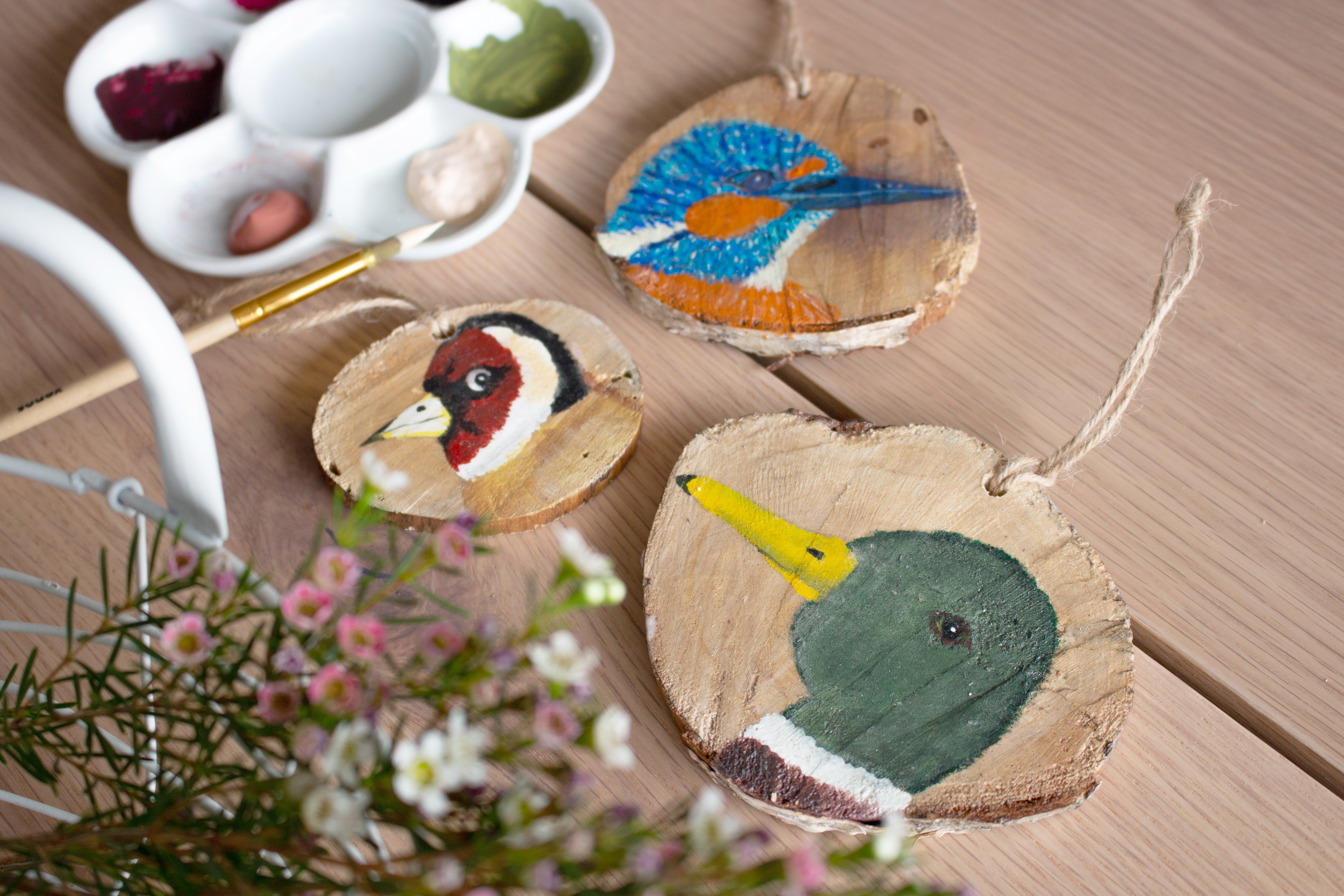
Fix common sign hiccups
My transfer lines are too light
- Retrace only the missing sections with your template still taped in place.
- Switch to chalk backing on dark boards.
- For projector tracing, darken your file and dim the room more.
My paint looks bumpy or streaky
- Lightly sand between coats once fully dry, then wipe away dust.
- Use lighter pressure and let the brush do the work.
- Add a second thin coat instead of pressing harder with the brush.
My edges bled into the grain
- Let it dry completely, then tidy edges with the background color.
- Next time, add a seal or primer layer before transferring and painting.
I smudged graphite or chalk
- Use a clean scrap paper under your hand while painting.
- Start painting from top left to bottom right if you are right-handed, or top right to bottom left if you are left-handed, so your hand stays off the fresh work.
- If you want more smudge control ideas, left-handed calligraphy smudge-free techniques has helpful habits that apply beyond calligraphy too.
Finishing and sealing
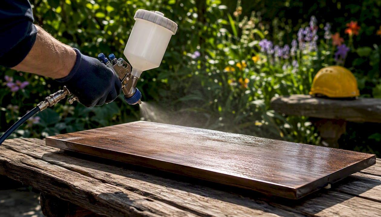
When the paint is fully dry, a protective finish helps guard against scuffs and moisture.
- Pick water-based vs oil-based: Water-based topcoats are usually a friendly match over acrylic paint and stay clearer on whites. Oil-based finishes can add warmth and may yellow over time, especially over light colors.
- Choose a sheen: Matte keeps a cozy handmade look, satin adds gentle glow, gloss pops color but highlights texture.
- Apply thin layers: Multiple thin coats reduce drips and cloudiness.
- Test on a scrap: Some finishes deepen stain or slightly shift paint color on porous wood. Testing also helps confirm compatibility between your paint and topcoat.
A simple workflow
- Sketch small: Build your composition on paper first. If you want layout help for quotes, visit hand lettering composition for quotes.
- Prep the board: Sand, dust, paint or stain the background, then let it dry and cure according to the product instructions.
- Transfer: Graphite for crisp detail, chalk for easy erase, projector for big scaling.
- Paint: Outline, fill, then add a second thin coat.
- Seal: Protect your hard work with a finish that matches your style.
And remember, every big sign starts the same way as every tiny word: one simple stroke at a time.