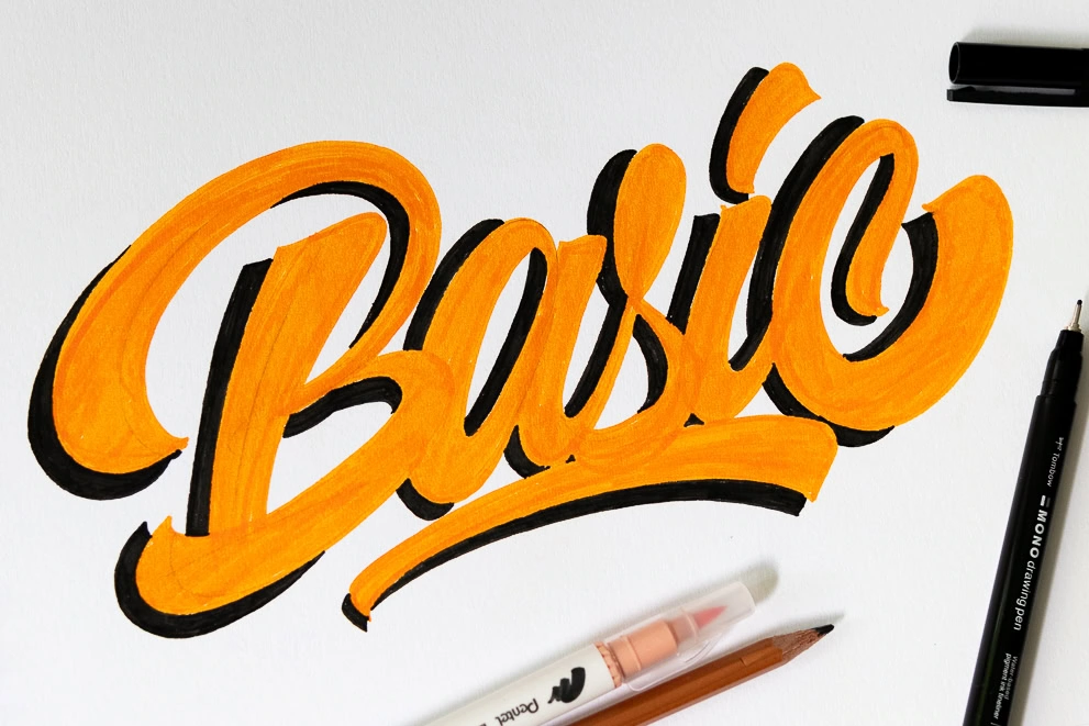
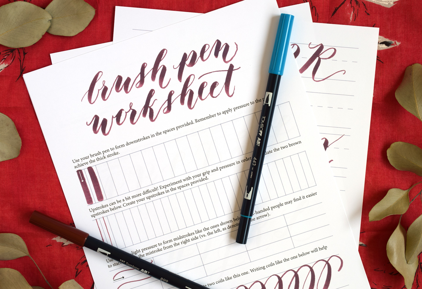
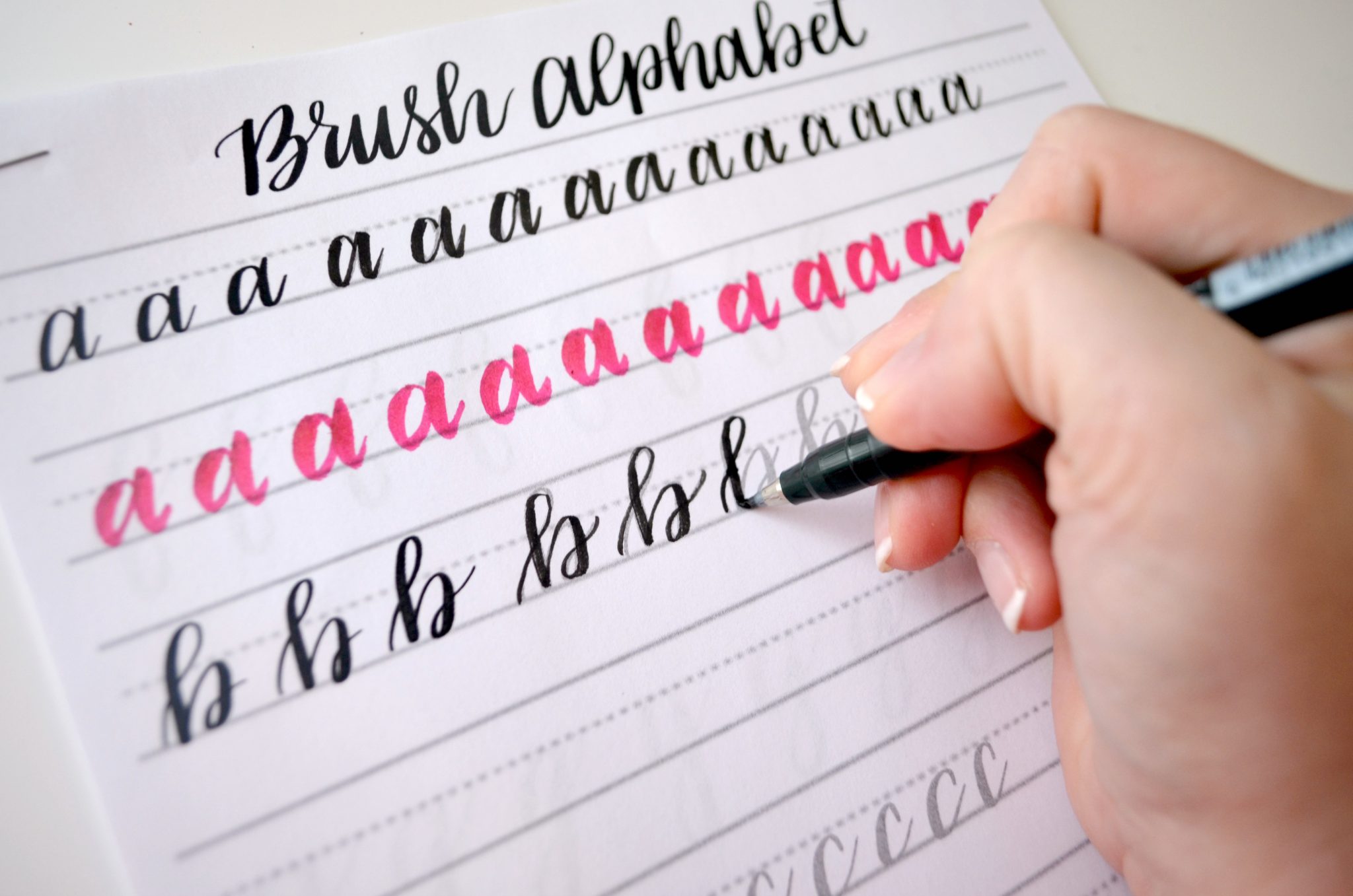
Grab your favorite brush pen and let's draw some beautiful letters together! When your ink is finally swoopy, bouncy, and just right, the next magical step is turning that paper lettering into a clean vector you can scale forever. This guide walks through scanning, contrast cleanup, and vectorizing with friendly settings that work for most calligraphy styles.
What vector means
A vector is artwork made from paths and points instead of pixels. That means your lettering can be resized from a tiny sticker to a big sign without getting blurry.
- Raster (JPG, PNG, TIFF): pixel-based, can look fuzzy when enlarged.
- Vector (SVG, AI, EPS, PDF): path-based, stays crisp at any size.
If your end goal is a cut file, logo, packaging, a decal, or anything that needs perfect edges, vector is the happy place to land.
Before you digitize
Choose the right original
- Use smooth paper so the edges are clean. If your brush pens fray easily, take a peek at paper that keeps brush pens from fraying.
- Use dark ink for the easiest cleanup. If you want colored lettering, it can still work, but black or very dark is the simplest starting point.
- Let ink dry fully before scanning so you do not get smears or shiny patches.
Pick a style that vectorizes well
Super textured brush strokes can be gorgeous, but the texture becomes lots of tiny vector shapes. For a cleaner vector, use confident strokes and avoid heavy paper pilling. If your lines wobble, a little practice goes a long way with 15-minute daily calligraphy drills and how to fix shaky upstrokes.
Step 1: Scan or photograph
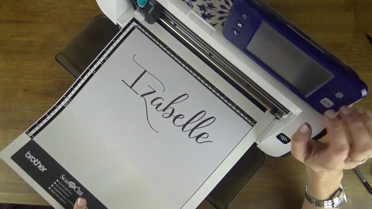
Best option: flatbed scan
Scanning gives you even lighting and sharp detail. Use these starter settings:
- Resolution: 600 dpi (great for crisp edges). 300 dpi works in a pinch, but 600 dpi usually traces better.
- Color mode: Grayscale for black ink. Color if you need to keep colored ink or watercolor.
- File type: TIFF or PNG if possible (cleaner than JPG). If JPG is your only option, use the highest quality.
If you must use a phone
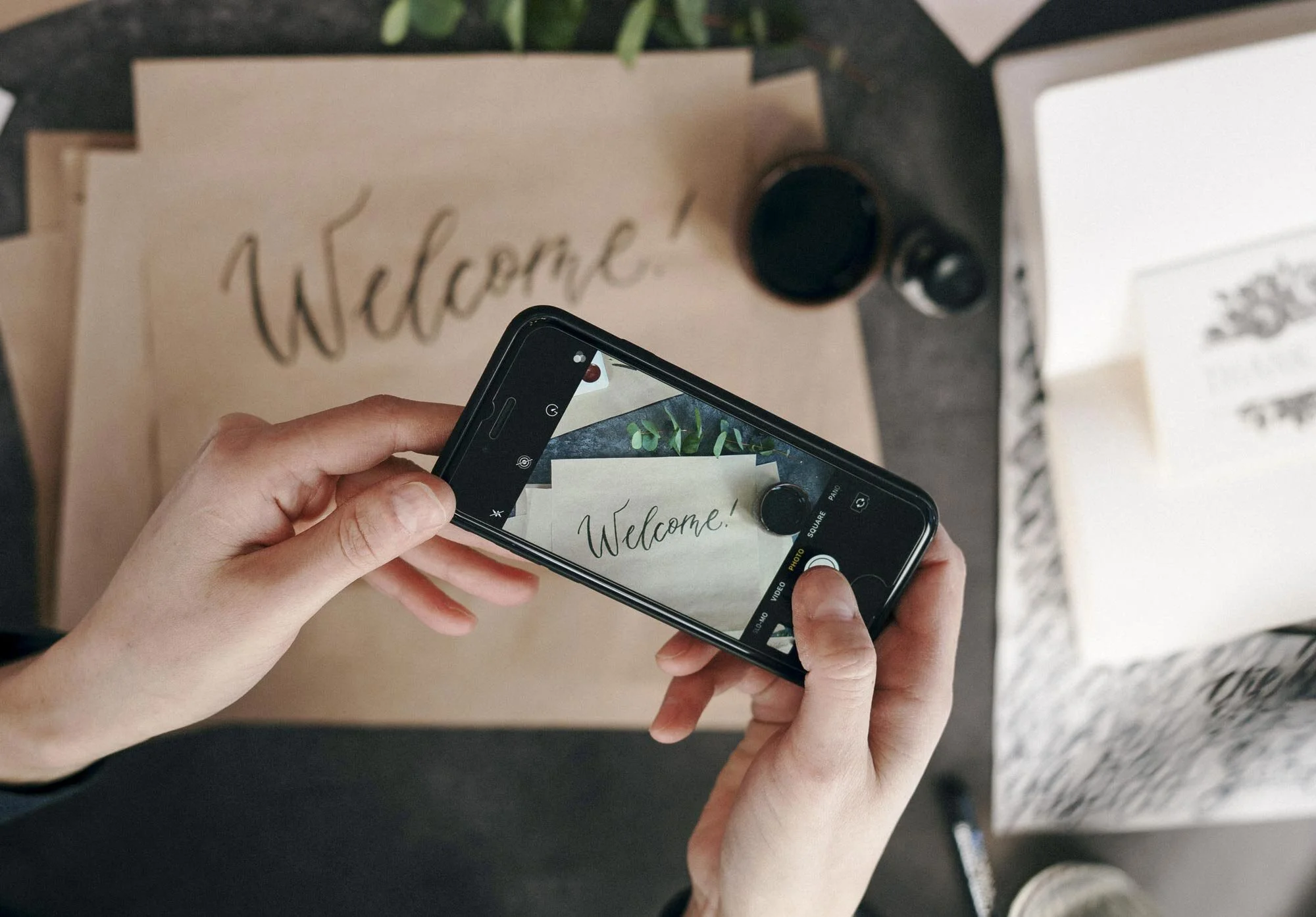
A phone image can work, especially for large pieces that do not fit on a scanner.
- Photograph in bright, indirect light near a window.
- Keep the camera perfectly parallel to the paper to avoid distortion.
- Use a plain, shadow-free background and avoid warm yellow indoor lighting.
Step 2: Clean up the scan
Your goal is simple: dark strokes, clean background, and edges that look intentional. You can do this in many apps, but the same ideas apply everywhere.
Make a safety copy
Duplicate your image layer or save a copy of the file. That way, you can experiment without fear.
Adjust Levels or Curves
- Pull the whites brighter until the background becomes clean and paper grain fades.
- Deepen the blacks until your downstrokes look rich and solid.
- Watch the edges: if your hairlines start disappearing, you pushed contrast too far.
Use Threshold
Threshold turns everything into only black or white, which can be excellent for bold lettering. Slide it until the edges look clean but your thin upstrokes still exist.
Spot-clean dust and specks
- Use a small brush, healing tool, or eraser to remove stray dots.
- Zoom in and check counters and tight spaces (inside “e”, “a”, and “o”).
Smooth the background, not the lettering
Heavy blur or noise reduction can mush your edges. If you use any smoothing, keep it gentle and localized.
Step 3: Choose a finish
Before converting, choose the look you want.
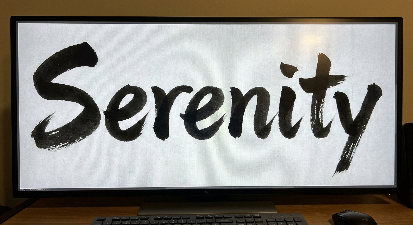
- Smooth and logo-like: clean edges, fewer anchor points, easy to edit.
- Natural and brushy: keeps texture, but creates many points and can be harder to edit.
If you love texture for posters and prints, you might keep a high-resolution PNG for that use and create a smoother vector for logos and cut files.
Step 4: Vectorize
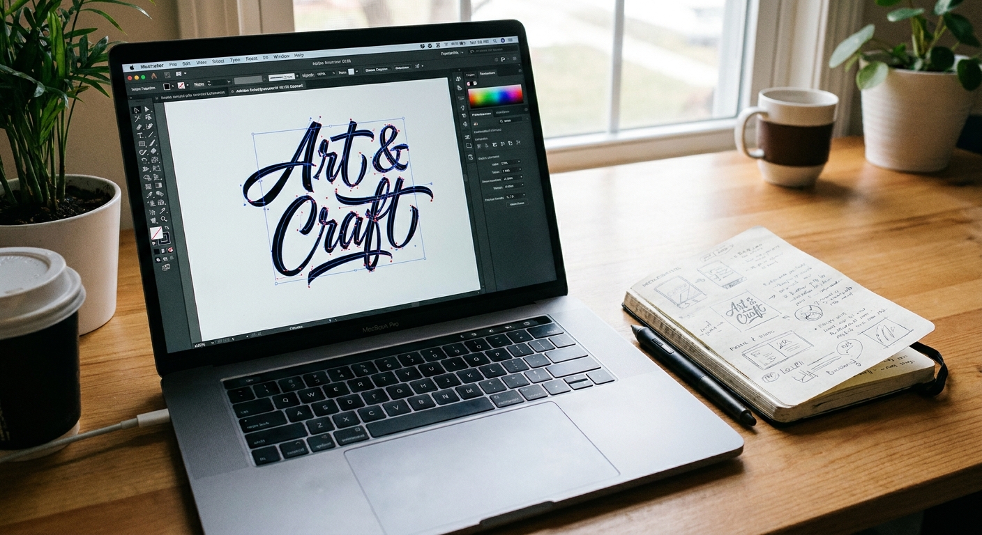
Most vector apps include an “Image Trace” or “Bitmap Trace” feature. The names vary, but the settings you want are very similar. Use these steps as your guiding paws.
1) Import your cleaned image
Place your PNG or TIFF into your vector app.
2) Start with a black-and-white trace
- Mode: Black and White (for dark ink on light paper)
- Threshold: raise it to thicken strokes, lower it to keep more delicate hairlines
3) Balance detail and smoothness
Different apps label these differently, but they usually include these ideas:
- Paths: higher equals more accurate but more points. Start medium.
- Corners: higher keeps sharp turns, lower rounds them out.
- Noise: higher ignores tiny specks (helpful), lower captures every crumb (not helpful).
4) Preview at 100% and 200%
Zooming helps you spot problems early. Look for:
- Wiggly edges from too much detail.
- Broken hairlines from too little threshold.
- Extra bumps from dust or paper fibers.
5) Expand or convert to paths
Once the preview looks good, confirm the trace so it becomes editable vector shapes.
Step 5: Clean up the vector
Tracing gets you 80% of the way. Cleanup makes it look intentional.
Simplify the path
Most apps have a Simplify command that reduces anchor points. Use it gently, then zoom in to make sure your stroke personality stays.
Fix bumps and dents
- Use the direct selection tool to nudge a few anchor points.
- Use smooth tools sparingly to even out tiny jitters.
Unite shapes when needed
If your trace created overlapping pieces, a unite or merge operation can help turn them into one solid form.
Check counters
Make sure the holes inside letters remain open where you want them. If a counter filled in during tracing, lower threshold next time or manually cut it back out with path tools.
Step 6: Save the right files
Save a couple of versions so you are covered for any project.
- SVG: best for Cricut style workflows, web use, and most cutting or design tools.
- PDF: great for sharing and printing while keeping vectors.
- AI (or native file): best for future edits in the same program.
- PNG (transparent background): handy for quick digital use when vector is not required.
If you plan to add effects like dimension or shadows after digitizing, tuck this into your creative toolbox: drop shadows and 3D effects for hand lettering.
Common problems
My vector looks jagged
- Scan at 600 dpi.
- Clean contrast before tracing.
- Use simplify to reduce extra points.
My thin upstrokes disappeared
- Lower threshold during tracing.
- In cleanup, avoid pushing whites too hard in Levels or Curves.
- If you are still practicing consistent pressure, revisit 8 basic brush lettering strokes to strengthen control.
I keep getting tiny dots everywhere
- Increase “noise” filtering in trace settings so specks are ignored.
- Dust off the scanner glass and clean the original sheet gently.
- Do a quick spot-clean pass on the image before tracing.
The background is gray or blotchy
- Use Levels or Curves to brighten whites.
- Try scanning in grayscale instead of color for black ink.
- Avoid photographing under warm indoor lights.
A repeatable workflow
- Create clean lettering on smooth paper.
- Scan at 600 dpi in grayscale.
- Adjust contrast (Levels or Curves), remove specks.
- Trace to vector using moderate detail and good noise filtering.
- Simplify and smooth a little.
- Export SVG and PDF, plus a transparent PNG.
That is the whole squeaky secret. One tidy routine, and your handmade words can hop from notebook to screen to sticker to sign without losing their charm.
FAQ
Should I scan in color or black and white?
If the lettering is black ink, grayscale is usually best. If you need to preserve color (like watercolor lettering), scan in color and consider keeping both a high-quality PNG (for texture) and a smoother vector (for scalability).
Is a transparent background possible?
Yes. After cleanup, you can remove the background in your image editor and save as a PNG with transparency, or trace to vector and simply delete any white shapes so the background is empty.
Will vectorizing ruin brush texture?
It can. Texture creates lots of tiny edges and points. If texture is the star of your piece, keep a high-resolution PNG for printing and create a cleaner simplified vector for logo style uses.
Do I need fancy tools to start?
Nope. Clean lettering, good paper, and a decent scan get you most of the way. If you are still building your pen stash, browse best brush pens for calligraphy beginners for a friendly starting point.