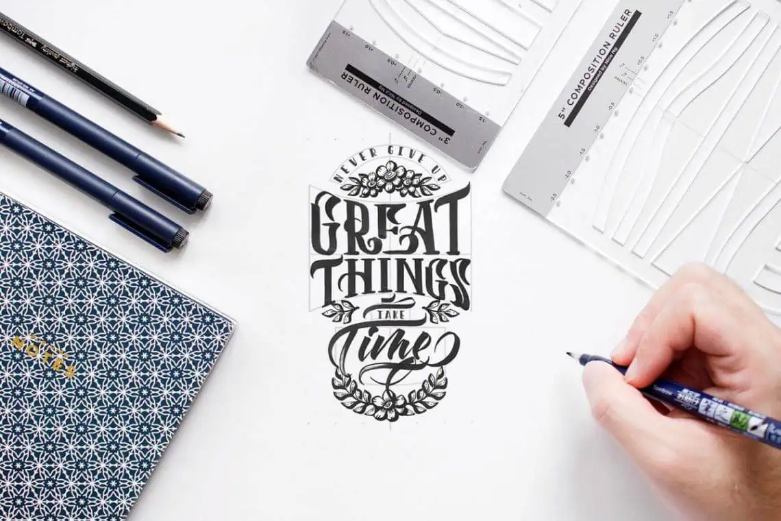
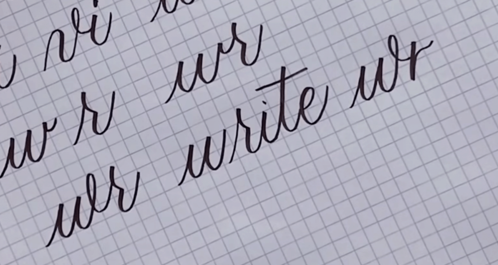
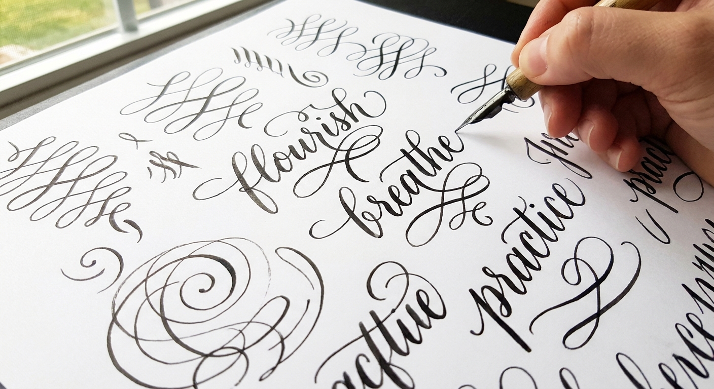
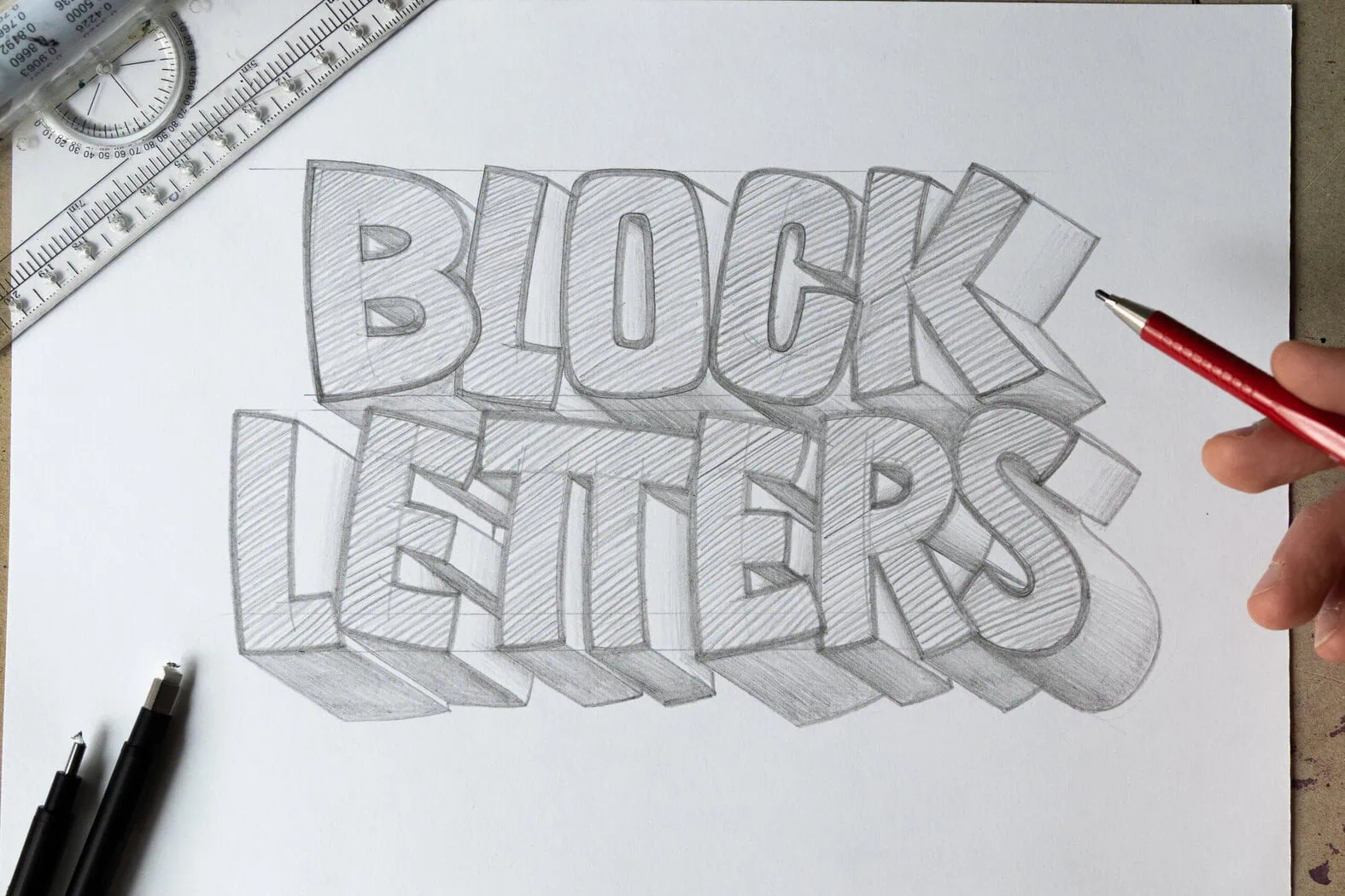
Grab your favorite pen and let's build some sturdy, stylish block letters to snuggle right up next to your modern calligraphy. When scripts get swirly and bouncy, block letters bring calm structure. The secret is not fancy tools. It is anatomy, spacing, and consistency.
When to use block letters with calligraphy
Block letters are the steady friends of script. Use them when you want contrast, hierarchy, or a clear reading path.
- Titles and emphasis: A bold word in block caps can anchor a bouncy quote.
- Names and dates: Block letters can improve legibility on envelopes, place cards, and signs.
- Layout balance: Scripts create motion. Block letters create weight. Together they feel intentional.
If you are planning a quote layout, it helps to think about composition first, then letter styles. This pairs nicely with the ideas in Hand Lettering Composition for Quotes.
Block letter anatomy
Block letters look simple, but they behave best when they share the same skeleton. Here are the anatomy rules that keep your alphabet from wobbling.
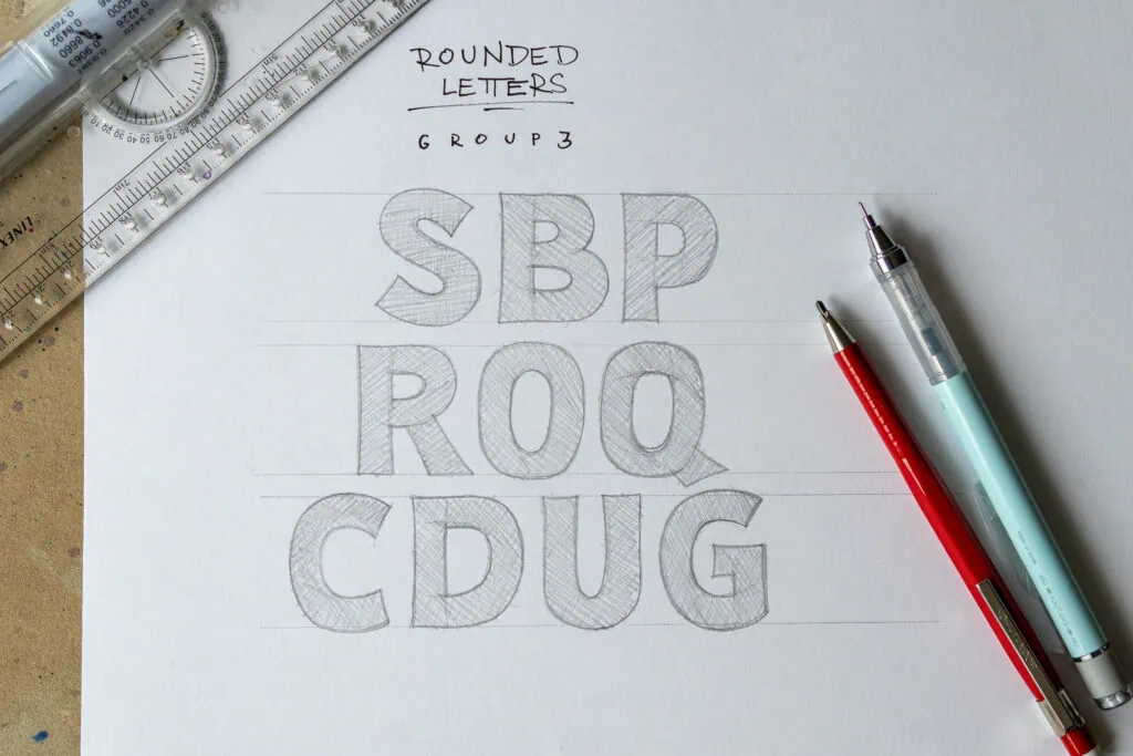
Set your guidelines first
- Baseline: where letters sit.
- Cap height: top of uppercase letters.
- X-height: height of lowercase bodies (like a, e, n) if you draw lowercase blocks.
- Ascender and descender lines: for tall parts (b, d, h) and tails (g, p, y) if using lowercase.
If you like bouncy scripts, keep your script baseline playful, but keep your block lettering baseline steadier. For bouncy rules that still read clearly, visit Bouncy Calligraphy Baseline Rules.
Choose one stroke width
In block lettering, “stroke” means the thickness of the letter’s structure, not pressure changes like a brush pen. Pick a width and stick with it.
- Thin, elegant blocks: a good starting point is a stroke width around 1/10 to 1/12 of cap height.
- Bold, poster-style blocks: a good starting point is around 1/6 to 1/8 of cap height.
These are just starting points. The “right” width depends on your style, your tool, and how far away the piece will be viewed.
Use a simple trick: use the corner of a pencil eraser as a quick gauge, or fold a tiny paper spacer strip to your chosen width, then repeat that measurement everywhere.
Decide how corners behave
Pick one corner style across the whole word:
- Sharp corners: crisp, modern, graphic.
- Slightly rounded corners: friendly, soft, great next to bouncy script.
Mixing corner styles randomly is one of the fastest ways to make block lettering look messy even when the spacing is fine.
Sans serif block letters
Sans serif blocks are built from straight strokes and simple curves, with no extra feet. They are perfect when your calligraphy is already decorative.
How to build a sans serif letter
- Sketch the skeleton: draw a simple monoline version first. Think: signage, not bubble letters.
- Expand evenly: add thickness to both sides of the skeleton so the center stays centered.
- Close shapes last: finish corners and joins after the main strokes so widths match. This prevents that slow “thickening drift” that happens when you keep adjusting as you go.
Key consistency checks
- Verticals look equally heavy: your H, N, M should feel like the same “font family.”
- Curves are not pinched: letters like O and C need a smooth curve, not a flat spot.
- Same terminals: ends of strokes should be flat, or all slightly rounded, but not both.
Easy pairings with calligraphy
- Bold sans + thin script: great hierarchy for quotes.
- Light sans + bold script: airy, modern, wedding vibes.
- All caps sans: keeps small words readable between flourishes.
If your script connections are giving you trouble, smoothing those joins can make the script look like it truly belongs beside clean block lettering. Practice with How to Connect Letters in Modern Calligraphy.
Serif block letters
Serifs are the little finishing strokes at the ends of main strokes. They add personality fast, but they also require rules so they do not look random.
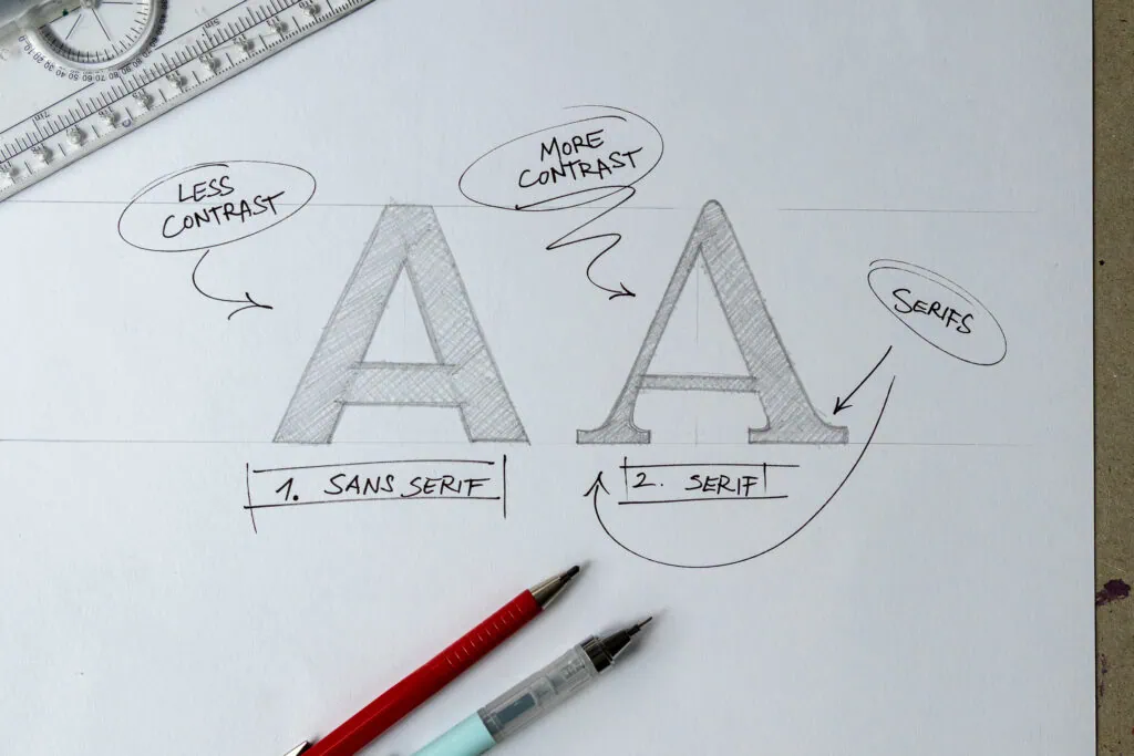
Pick one serif style
Here are three beginner-friendly serif styles. Choose one and use it everywhere.
- Slab serif: thick, rectangular serifs. Easiest to keep consistent.
- Bracketed serif: serif blends into the stroke with a small curve. Softer and more traditional.
- Wedge serif: serif tapers into a point. Elegant, but needs careful matching.
Placement rules
- Put serifs on purpose: usually on the top and bottom of main vertical stems (like I, H, N, E).
- Match serif size: keep the serif length consistent across the word.
- Match serif angle: if one serif is perfectly horizontal, do not tilt the next one.
Common problem spots
- S: serif S can get fussy. Keep it simple or skip serifs on S at first.
- M and W: inner joins get crowded. Use slightly smaller serifs inside if needed, but keep the style the same.
- R: the leg can look too thin. Make the diagonal leg feel as heavy as the vertical stem.
Outlined vs filled blocks
Most block letters start as an outline. From there, you get two different moods.
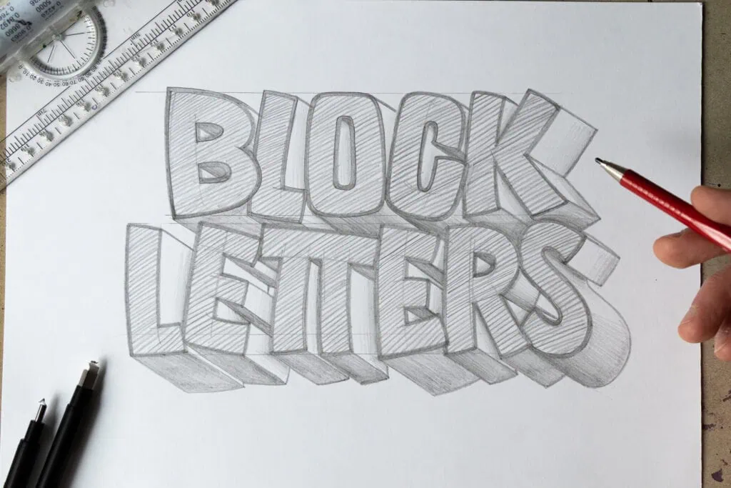
- Outlined: lighter and airier, great when your calligraphy is bold or heavily flourished. Outlines also leave room for shadow, texture, or color later.
- Filled (solid): loud and confident, great for one “anchor” word in a quote. Fill slowly so edges stay crisp, and keep the fill direction consistent so the texture looks intentional.
Spacing
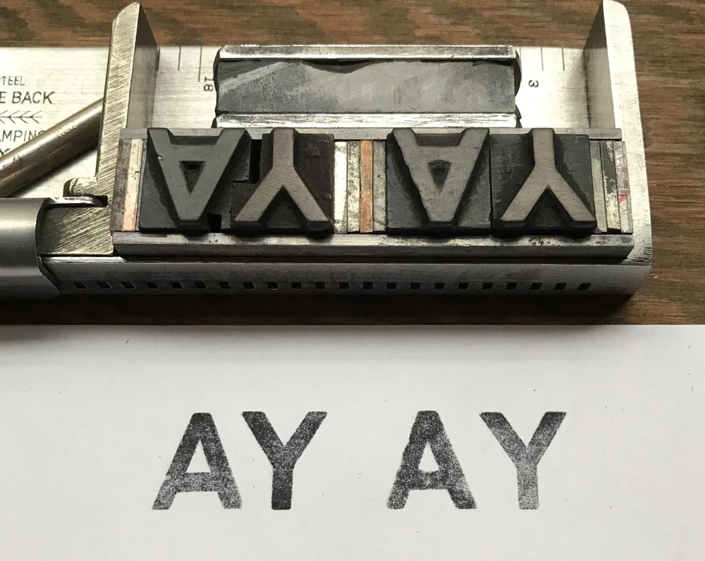
A large share of block lettering issues are spacing issues wearing a disguise. Instead of measuring the space between letter edges, try to match the negative space shapes between letters.
Three spacing rules
- Start with consistent tracking: keep an even default gap between most letters.
- Then kern the tricky pairs: diagonals and curves need special care (AV, To, LT, WA).
- Step back and squint: if one gap flashes brighter than the others, adjust it.
Optical tricks
- Rounded letters need a little extra breathing room: O, C, G can look like they crowd neighbors sooner.
- Diagonal letters create sneaky holes: V, W, Y often leave awkward triangles that need tightening.
- Wide letters change rhythm: M and W may need slightly tighter side spacing to avoid a lumpy word shape.
Optical overshoot
If you want your word to look level, you sometimes have to cheat the guidelines on purpose.
- Round letters: O, C, S often look shorter than flat-topped letters, so a tiny overshoot above cap height and below the baseline can make them feel the same height.
- Pointed letters: A and V sometimes look too sharp if they hit the cap line exactly. A hair of overshoot at the point can look more balanced.
The key is consistency. If you overshoot one, overshoot the whole family.
Make block letters match your script
Pairing is easier when both styles share at least one design ingredient. Pick two or three of these, and your piece will look like a deliberate set.
- Weight: match the visual boldness. If your script has thick downstrokes, make block lettering heavier too.
- Slant: if your script leans right, you can slightly slant block letters, or keep them upright for contrast. Either can work, just be consistent.
- Roundness: bouncy scripts often have round counters, so slightly rounded block corners can harmonize.
- Spacing vibe: airy script plus cramped block lettering can feel tense. Give both room to breathe.
A reliable recipe
- Write the script word first (light pencil if needed).
- Add block lettering as supporting words, smaller or wider, not equal size.
- Use block lettering for short words like AND, THE, YOU, NOW.
- Finish by adjusting spacing so the whole line feels even.
Mini example: LOVE
Here is a simple way to make “LOVE” look intentional next to a script word like “always.”
- Stroke width: choose a medium-bold block so it can hold its own under a flowing script. Start around 1/8 of cap height, then adjust if it feels too loud or too thin.
- Corner style: slightly rounded corners keep it friendly and help it blend with bouncy loops.
- Spacing: LO often needs a touch more space because the O feels wide. V-E often needs tightening because the diagonal V creates a bright triangle gap.
- Optical tweak: let the O overshoot the guidelines a hair so it does not look shorter than L and E.
If you want to add flourish, keep it mostly in the script. A little goes a long way. For flourish basics, see Beginner Calligraphy Flourishing.
Simple practice drills
Block letters improve fastest when you practice the ingredients, not the entire alphabet every time.
Drill 1: stems and bars
- Draw 10 vertical stems (like H).
- Add 10 horizontal bars (like E).
- Check that thickness stays the same from top to bottom.
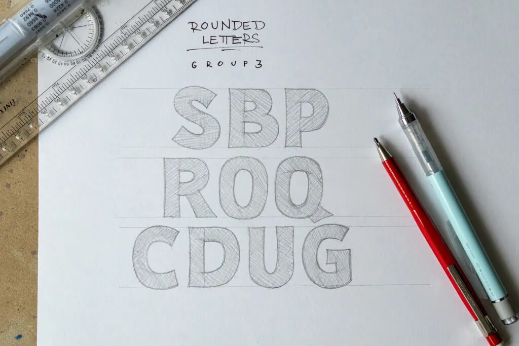
Drill 2: the O family
- Draw 6 O shapes using the same width.
- Turn them into C, G, Q by removing or adding small parts.
- Keep the inner counter centered.
Drill 3: serif consistency (if using serifs)
- Draw 8 capital I letters.
- Add the same serif shape each time, same length and angle.
- Then draw H and E and repeat those serif rules.
Drill 4: spacing micro-line
Write one short word in block letters, three times in a row:
- First: natural spacing.
- Second: intentionally too loose.
- Third: adjust to the best middle, using the squint test.
Want a steady daily routine for lettering muscles and control? Mix these with 15-Minute Daily Calligraphy Drills.
Tools that help
Block letters can be built with almost anything. The best tool is the one that lets you slow down and stay consistent.
- Pencil + eraser: for clean sketching and spacing fixes.
- Ruler: for guidelines and crisp edges (optional, but helpful).
- Fineliner: for clean outlines and final lines.
- Brush pen: for script words next to your block lettering. If you are choosing one, start here: Best Brush Pens for Calligraphy Beginners.
Paper matters
Rough paper can make outlines fuzzy and slow you down. Smooth paper helps your lines look intentional. For paper that protects tips and keeps strokes cleaner, see Paper That Keeps Brush Pens From Fraying.
Troubleshooting
“My block letters look uneven even though I measured.”
Check your corners and joins. Uneven corners change perceived width. Pick sharp or rounded, then repeat it everywhere.
“Some letters look taller even on the same guidelines.”
Watch rounded and pointed letters. O, C, S and also A, V can need a tiny, consistent overshoot to look optically even.
“My word looks patchy.”
This is often spacing. Do the squint test and adjust kerning pairs before changing your letter shapes.
“My script and block lettering fight each other.”
Reduce contrast in one area. If script is super flourished, use simple sans block letters. If block letters are bold and wide, use a simpler script style with fewer loops. If your upstrokes feel shaky, smoothing them can calm the whole piece. Try How to Fix Shaky Upstrokes.
Checklist before you ink
- Guidelines are set (baseline and cap height at minimum).
- Stroke width is chosen and consistent.
- Corner style is consistent (sharp or rounded).
- Serifs, if used, match in size and angle.
- Spacing looks even when you step back and squint.
- Block lettering supports the script, not compete with it.
Now take a slow breath, outline with confidence, and let those sturdy letters hold your beautiful script like a frame around a painting. Stroke by stroke, you have got this.