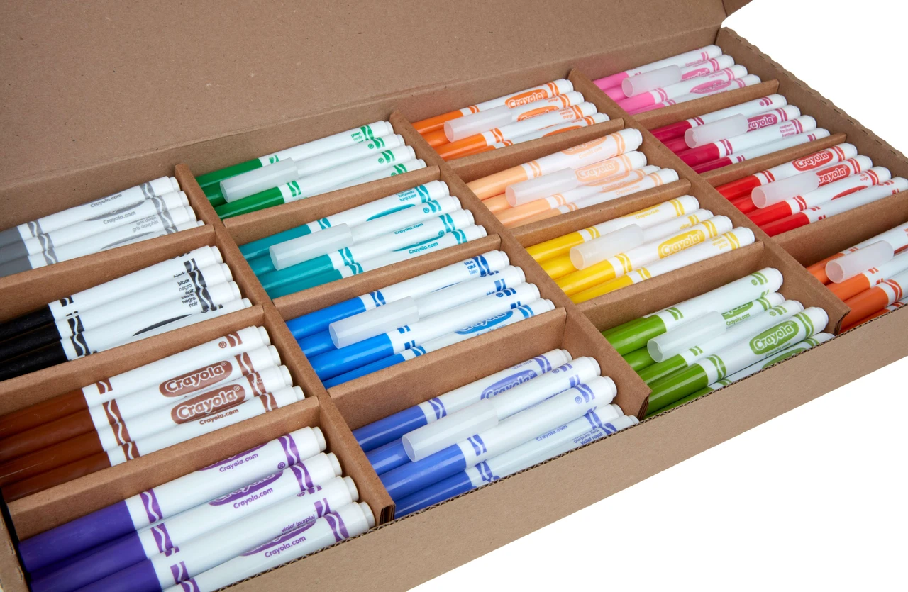
Grab your favorite broad-line marker and let’s draw some beautiful letters together! Crayola style calligraphy is all about clever marker angles and confident strokes. You do not need pricey tools to make letters that look bold, smooth, and surprisingly pro.
What it is (and is not)
Broad-line markers are not flexible brush pens, so they will not naturally give you pressure-based thick and thin lines. Instead, you create contrast by:
- Changing the marker angle so a wider part of the tip hits the page for thick strokes.
- Using stroke direction so downstrokes look heavier than upstrokes.
- Building thickness by layering a second pass where you want weight.
Think of it like “faux calligraphy with a chisel-like feel.” It is playful, fast, and perfect for posters, cards, school projects, and practice sheets.
Pick the right marker
Look for markers labeled broad line (not fine line). Broad tips make it much easier to get thick strokes without having to color in huge areas.
A quick tip check
- Broad line: best for bold lettering, big headers, and chunky script.
- Fine line: better for details, bounce lettering details, and small notes.
If you want a more classic calligraphy feel later, brush pens are wonderful, too. This beginner-friendly overview can help you compare tools: Best brush pens for calligraphy beginners.
Paper that helps a lot
Paper matters more than most beginners expect. Broad-line markers can feather (make fuzzy edges) on porous paper, and they can also bleed through thin pages.
- Use smoother paper when possible, like good-quality printer paper or smooth sketch paper.
- Avoid very fibrous paper like some construction paper or rough notebook paper if you want crisp edges.
- Use a scrap sheet underneath if you are working in a notebook or on thin paper. It saves the next page from bleed-through.
- Let ink dry before stacking pages to prevent transfer.
For a deeper dive on keeping edges cleaner and tips happier, visit: Paper that keeps brush pens from fraying. Many of the paper habits carry over nicely to markers, too.
Angle is the secret
Most broad-line tips are more rounded than a true chisel, but they still have an “edge versus face” feeling. Your goal is to control which part of the tip touches the paper.
Find your starting angle
Try holding the marker so it points up and to the right (if you are right-handed), often somewhere around a 30 to 60 degree angle from the baseline as a starting point. If you are left-handed, mirror it so the marker points up and to the left, and keep an eye on smudging as you move across the page.
- Thin line: use more of the tip’s edge with a lighter touch.
- Thick line: rotate slightly so more of the wider face hits the page.
A simple stroke rule
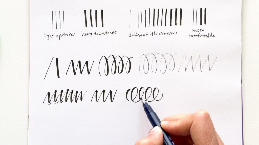
If you are making a script style, aim for thick downstrokes and thin upstrokes. Even with a marker, keeping that contrast consistent makes your word look intentional.
3 ways to fake thick and thin
Method 1: Steady angle strokes
This is the cleanest method for big letters and blocky scripts.
- Hold the marker at a steady angle.
- Pull downstrokes with the broader face for thickness.
- Use the edge for upstrokes and connectors.
Nib note: Try not to twist the barrel mid-stroke. Twisting makes wobbly edges and uneven widths.
Method 2: Faux calligraphy (outline then fill)
This works on any marker tip shape, even if the point feels round.
- Write a word in simple cursive or neat print first.
- Add a second line next to every downstroke (only the downstrokes).
- Fill in the new space to create a thicker stroke.
Keep the extra thickness small at first. Chunky gaps can swallow your counters (the little holes inside letters like a, o, e).
Method 3: Double-pass weighting
Great for posters when you want impact.
- Write the word once.
- Go back and add weight to downstrokes with a second pass on the same side each time (often the left side in many script styles).
This method is forgiving, but let your first layer dry a moment to reduce streaks.
A quick note on layering color
Washable marker ink can re-wet and lift if you scrub or layer too fast, which sometimes creates streaks or little bald spots. If you want to blend or stack colors, test on a scrap first and use light passes with a short dry time in between.
Alphabets that work well
Some styles simply behave better with broad-line markers. Here are a few that look strong and clean:
- Simple brush script: fewer loops, bigger shapes, clear downstrokes.
- Bounce lettering: playful sizes, but keep stroke contrast consistent.
- All-caps with weight: block letters with thickened downstrokes look bold and modern.
- Monoline plus shadows: even-width letters with a drop shadow look polished fast.
If you want to explore more letter style ideas beyond marker techniques, hop over to: Styles & Techniques.
Practice drills
Markers can feel slippery compared to brush pens. A few minutes of drills help your hand find steadier movement.
Drill 1: Edge-to-face transitions
- Draw a thin line using the edge for about 1 inch.
- Without lifting, rotate slightly and continue as a thick line for 1 inch.
- Repeat across the page like a gentle zipper pattern.
Drill 2: Down thick, up thin ladders
- Make a row of tall ovals like stretched balloons.
- On the way down, use the broader face.
- On the way up, use the edge.
Drill 3: Consistent downstroke weight
Write: minimum and million. These words are full of downstrokes and show you exactly where your thickness is drifting.
For more warm-up ideas that fit any tool, visit: Tutorials & Practice Drills.
Common problems and fixes
My thick strokes look streaky
- Slow down slightly so ink lays down evenly.
- Try one confident pass instead of scrubbing back and forth.
- Use smoother paper to reduce skipping.
My letters look shaky
- Make letters bigger. Tiny script magnifies wobble.
- Move from your forearm more than your fingertips.
- Warm up with a few ovals and straight pulls before lettering words.
The edges are fuzzy
- Switch to less absorbent paper.
- Use a lighter touch so the tip does not press ink into paper fibers.
- Let layers dry before adding weight or shadows.
The tip is getting mushy
- Avoid hard pressure. Broad-line markers can deform if you lean too heavily.
- Rotate your marker occasionally so one edge does not do all the work.
- Use the faux calligraphy method when you want extra-thick strokes without extra force.
Finishing touches
This is where inexpensive markers start to look extra special.
Simple shadow
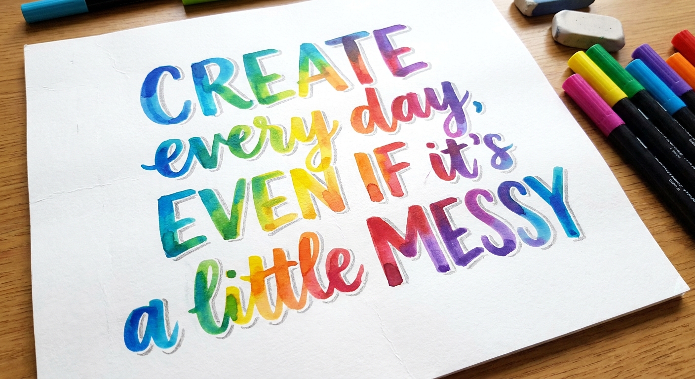
Write your word, then add a shadow line consistently on one side (often down-right). Keep the shadow thin so it does not overpower the letters.
Outline for contrast
Outline letters with a darker color or a fine black pen after the marker is fully dry. Outlines sharpen edges and make colors pop.
Highlights
Add tiny highlight marks with a white gel pen on thick strokes. Use just a few. Too many highlights can look busy.
Mini project ideas
- Gift tags: big script names, small shadow, simple doodle border.
- Binder divider headers: chunky caps with weighted downstrokes for readability.
- Lunchbox notes: one word in bold script with a tiny highlight.
- Poster quotes: mix all-caps + script using two marker colors only to keep it cohesive.
If you want more hands-on crafts that pair well with lettering, browse: DIY Projects & Crafts.
Quick FAQ
Can broad-line markers do real calligraphy?
They can do calligraphy-inspired lettering beautifully. For traditional calligraphy with a nib or flexible brush response, you would use different tools, but the design principles still apply.
Do I need calligraphy markers instead?
Not to start. Broad-line markers are wonderful for learning spacing, rhythm, and consistent contrast. When you are ready, brush pens or chisel-tip calligraphy markers can feel like a natural next step.
How do I keep my words from looking too bulky?
Increase your letter size, leave more space inside loops, and keep thickening modest. A little contrast goes a long way.
Next step
Choose one word and one method from above, then write it ten times. After that, do Drill 2 for two minutes. Your hand learns through repetition, and broad-line markers make it easy to practice anywhere. When you are ready to explore more tools and materials, you can always visit Tools & Supplies.