Grab your favorite dip pen and let’s talk ink. When you’re just starting, the bottles can feel like a tiny forest of mystery: sumi, India, and walnut all look dark and lovely, but they behave very differently on the page.
This guide will help you choose the right one for the job, mix it to a friendly consistency (not syrupy, not watery), and avoid the most common beginner oops moments like blobs, railroading (when a downstroke splits into two skinny lines), and crusty nib surprises.
First, a quick ink map
All three inks can be used for pointed pen calligraphy, but they land in different “families,” which is why they feel so different.
- Sumi ink: traditionally used for brush and calligraphy work. Traditional sumi is carbon-based (soot), while many modern bottled versions are dye-based or mixed formulas. Often smooth-flowing, and often water soluble even after drying, but check the label and test first.
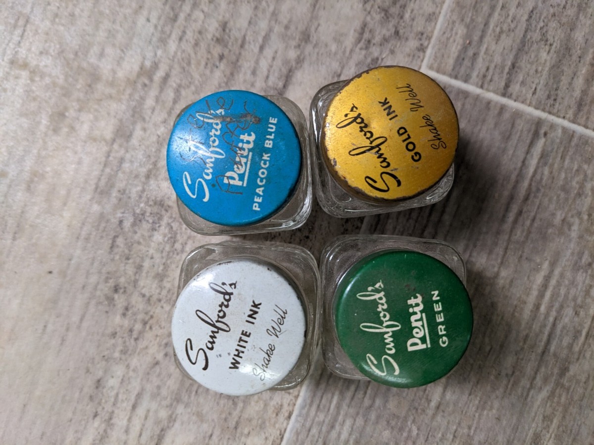
- India ink: usually pigmented and may contain a binder like shellac or acrylic. Many are water resistant when dry, and some can clog nibs if allowed to dry on metal. Formulas vary a lot, so treat the label as law.
- Walnut ink: often made from walnut husks or extract, sold as crystals you dissolve or as a liquid concentrate. Transparent and warm-toned, generally water soluble and easy to re-wet.
If you mostly want crisp practice sheets and smooth hairlines, your best starter focus is predictable flow. If you want artwork that can handle watercolor washes on top, you care about water resistance. If you want a soft, vintage look, you care about transparency and tone.
Sumi ink
What it is
Sumi ink is associated with East Asian calligraphy traditions. For modern dip pen lettering, it is popular because many bottles have a friendly, slippery flow that makes forming thick and thin strokes feel less fussy.
How it behaves on a dip nib
- Flow: Usually smooth and consistent once you find a good paper and the right amount of ink on the nib.
- Opacity: Often deep black, though the finish can range from matte to slightly glossy depending on the formula.
- Water resistance: Many sumi inks are not waterproof. That can be great for blending and corrections, but not great if you want to paint watercolor on top. Some bottles are labeled waterproof or water resistant, so always test on scrap paper.
When sumi ink is a great choice
- Practice sessions where you want steady ink flow and fewer starts and stops.
- Large headings and modern scripts where a rich black looks bold.
- Projects that will stay dry and will not be layered with wet media afterward.
Beginner tip: watch the paper
Sumi can feather on very absorbent paper. If your downstrokes look fuzzy, try smoother paper. For brush pen paper help (which overlaps nicely with dip ink feathering issues), peek at paper that keeps brush pens from fraying for paper texture clues and what “smooth” really means in lettering land.
One more paper note: ultra-slick coated papers can slow drying and cause smudges. If your hand is dragging ink across the page, try a smoother uncoated paper instead of something glossy.
India ink
What it is
India ink is usually a pigment-based ink that dries down more permanently than many dye inks. Some formulas include binders like shellac or acrylic to help the pigment lock onto the page, but not every bottle marketed as “India ink” is shellac-based.
One important side note: some India inks are not fountain-pen-safe. If it says shellac or acrylic, keep it for dip pens and brushes, not fountain pens.
How it behaves on a dip nib
- Flow: Can be excellent, but it depends heavily on the formula. Some are thick and need careful handling to avoid blobs.
- Drying: Often dries fast and can dry on the nib if you pause for too long.
- Water resistance: Many India inks become water resistant when fully dry, which is wonderful for watercolor layers. Always test on scrap paper first, and give it real cure time before painting over it.
When India ink is a great choice
- Finished pieces where you want durability and crisp edges.
- Calligraphy that will be painted over with watercolor or ink washes.
- Artwork that needs strong, dark blacks with minimal smudging once cured.
The big caution: nib care matters
Because some India inks dry more permanently, they can gum up a nib if left to crust. A simple rhythm helps: dip, write, pause briefly, and if you are taking a longer break, rinse and dry the nib.
Walnut ink
What it is
Walnut ink is beloved for its warm brown tone and gentle, antique feel. It is often made from walnut husks or extract and sold as crystals you dissolve in water or as a liquid concentrate.
How it behaves on a dip nib
- Flow: Usually smooth and forgiving, especially when mixed to the right strength.
- Look: More transparent than solid black inks, with shading that can feel soft and storybook-like.
- Water resistance: Typically water soluble. It can re-activate if you paint over it with water.
When walnut ink is a great choice
- Vintage-style envelopes, labels, and journaling aesthetics.
- Pieces where you want soft contrast rather than bold black.
- Learning pressure control, because the shading can make stroke weight changes feel extra visible in a pretty way.
A note for sensitive friends
If nut allergies are a concern in your home or classroom, read the product info and use caution. Reactions from inks are uncommon, but they can happen with skin contact, and walnut crystals can create dust if handled roughly.
Consistency: the secret ingredient beginners miss
Dip pen inks live or die by consistency. Too thick and you get sticky starts and blobs. Too thin and you get watery, pale strokes and hairlines that break.
What “right” looks like
- The ink should coat the nib and release smoothly.
- Downstrokes look solid, and hairlines do not look scratchy or starved.
- You are not fighting big drips at the start of each stroke.
How to adjust (gently)
For inks that are safe to dilute, add a few drops of water at a time into a separate mixing container, not the whole bottle. Stir and test on scrap paper. Repeat until the flow feels steady.
In general, walnut ink is made to be mixed with water, and many bottled sumi inks can handle a tiny bit of dilution. Some India inks should be used as-is (diluting can affect waterproofness or how the binder behaves), so follow the label and test before you commit to a final piece.
If an ink seems too thin, the fix is often not “add something,” it is “use less ink on the nib and switch to smoother paper.”
Picking the right ink for your project
| Goal | Best starting pick | Why |
|---|---|---|
| Smooth practice sessions | Sumi ink | Often consistent flow and easy writing feel |
| Watercolor on top | India ink (water resistant formula) | Holds lines when layered over once fully dry and cured |
| Soft, vintage look | Walnut ink | Warm tone and gentle transparency |
| Minimal nib fuss | Sumi or walnut | Less likely to harden on the nib than some India inks |
If you are building a tiny starter kit, it is perfectly reasonable to begin with one dependable ink and learn how it behaves on your paper before collecting more bottles.
If none of these feel right
If you keep fighting flow, it might not be you. Many pointed pen calligraphers also use gouache (a re-wettable paint) thinned with water to an inky consistency. It is especially handy when you want custom colors, a matte finish, and a mixture you can tweak until it behaves.
Common beginner problems (and quick fixes)
My ink beads up and won’t stick to the nib
New nibs often have a factory oil coating. Clean the nib gently with mild soap and water, rinse, and dry thoroughly. Then try again. If beading continues, your ink may be too slick for that nib, or the nib still has residue.
My letters look fuzzy or feathery
This is usually paper absorbency. Switch to smoother paper. You can also try a slightly thicker ink consistency, but paper is the biggest lever. Very fibrous papers are the usual culprit.
I get big blobs at the start of strokes
After dipping, tap the nib lightly on the inside rim of the ink container to remove excess. Also try dipping just the tip and reservoir, not the whole nib.
My hairlines keep breaking
Often the nib is running dry, or the ink is too thick. Dip a bit more often, thin slightly if appropriate, and make sure you are using light pressure on upstrokes.
My nib feels scratchy
Scratchiness can be nib angle and pressure, but dried ink can also cause drag. Rinse and wipe, then resume with a clean point.
Storage and care
- Prevent evaporation: Keep caps on tight. Mixed walnut ink can thicken as water evaporates, so store it sealed and remix with a few drops of water if needed.
- Ventilation: Work in a well-ventilated spot, especially if you notice strong odor.
- Skin and surfaces: Protect your desk. Inks stain quickly.
- Nib cleaning: Rinse with water, wipe dry, and store dry to prevent rust.
- Do not mix bottles: Different formulas can react poorly together. Mix only in a separate dish.
Where this fits in your lettering toolbox
Dip pen ink is just one delightful corner of the lettering world. If you are also exploring brush pens, you might enjoy starting with the basics on best brush pens for calligraphy beginners, then hopping over to Tutorials & Practice Drills to build steady stroke habits that help every tool feel friendlier.
And if you ever feel stuck choosing supplies, the cozy home base is Tools & Supplies, where all the inky decisions live together.
Quick ink cheat sheet
- Sumi: smooth practice-friendly flow, often not waterproof (check the label).
- India: bold and durable, often water resistant when dry, clean nibs promptly.
- Walnut: warm brown and vintage, usually water soluble, mixes easily.
Whichever bottle you pick first, the real magic is the same: a steady hand, a little patience, and one more swoop than you did yesterday.