Grab your favorite brush and let’s paint some beautiful letters together! Watercolor lettering looks dreamy because the tools help you do two things at once: make a clean stroke, then softly nudge color into color for that blended, ribbon-like glow.
Below is a curated supply list focused on brushes and paints that behave nicely for blended calligraphy, plus a few tiny extras that make everything smoother.
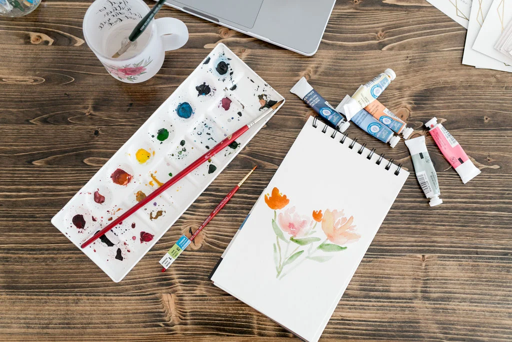
What matters most for blended calligraphy
Before picking tools, it helps to know what makes blending easier. Look for supplies that support these three needs:
- Controlled water so your downstrokes stay crisp instead of turning into fuzzy puddles.
- Springy bristles so thick and thin strokes feel predictable.
- Strong pigment so blends stay vibrant even when you add water.
If you already love brush pens and you are branching into watercolor, you might also enjoy our beginner brush pen roundup at Best Brush Pens for Calligraphy Beginners. Many of the same “control” ideas carry over.
Water brushes: the easiest way to blend
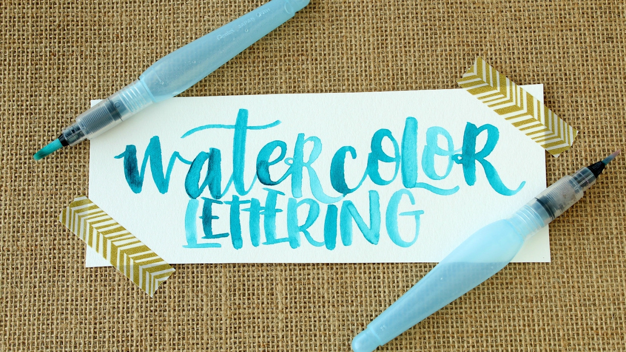
Water brushes (sometimes called aqua brushes) hold water in the handle and feed it to the bristles. For blended lettering, they are wonderfully tidy and great for gentle gradients.
Best for beginners: a water brush set with multiple tips
Why it works: Using different tip sizes lets you switch between writing and blending without fighting the tool. A small tip helps you paint letterforms. A medium tip helps you pull color for gradients.
- Small tip for lettering details and thin upstrokes.
- Medium tip for main strokes and basic blends.
- Large tip for backgrounds or big, loose words.
What to look for: a brush that has a firm, tapered point and a barrel that does not gush water when you barely squeeze.
Best for crisp strokes: firmer nylon water brush
Why it works: Firmer synthetic bristles snap back and keep edges cleaner. That helps when you want blends inside a stroke, but still want the outer shape to look letter-like, not cloud-like.
Nib tip: To blend without flooding, start with less water than you think. Touch the brush to a paper towel once, then blend.
Best for portable palettes: water brush with a reliable cap
Why it works: Liquid watercolor plus a water brush is a travel-friendly combo, as long as the cap seals well.
What to look for: a cap that clicks securely and bristles that do not splay after a few sessions.
Round paintbrushes: the classic choice for smooth blends
If you want the most control and the most expressive “brushy” letterforms, a traditional round brush is the go-to. You control the water separately, which is a big deal for consistent blending.
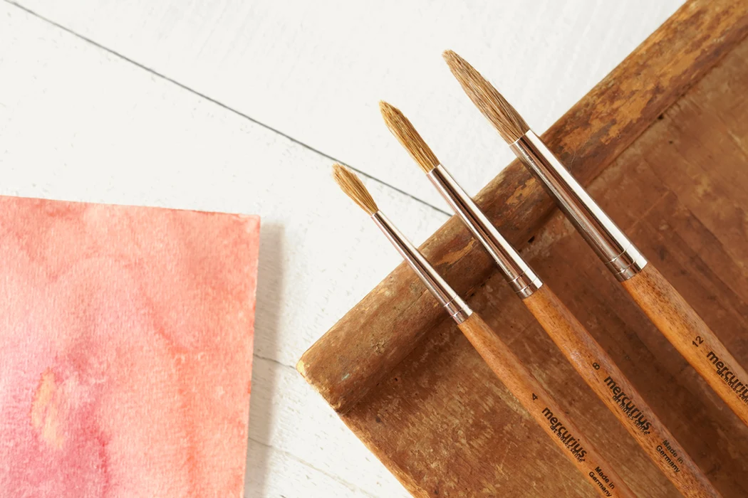
One-brush starter pick: round size 6 or 8
Why it works: A mid-size round brush can make thick downstrokes, still come to a point for smaller turns, and holds enough pigment to finish a stroke without stopping.
What to look for:
- Point: comes to a sharp tip when wet.
- Snap: bristles spring back after a downstroke.
- Belly: a fuller middle that holds paint for longer strokes.
Best use: painting full words, then blending a second color into the still-damp stroke.
Detail brush: round size 2 or 4
Why it works: Great for tiny bounces, connecting strokes, and fixing little edges after a blend spreads slightly.
Best use: adding a darker shadow color along one side of a letter, then softening it.
Big, juicy brush: round size 10 or 12
Why it works: Larger rounds make big strokes feel effortless. They also create smoother gradients because there is more wet pigment moving around.
Best use: large-format practice, posters, and bold “single-word” pieces.
Bristle material quick guide:
- Synthetic is durable, snappy, and great for beginners.
- Natural hair (like sable) is luxurious and holds lots of water, but it can be easier to over-wet your letters if you are still learning water control.
- Blends (natural plus synthetic) try to balance both.
Paint options for bright blends
For blended calligraphy, you want paint that re-wets easily and stays vibrant even when you add water. Two common choices are liquid watercolor and pan watercolor. They both work, they just behave a little differently.
Liquid watercolor: dropper-bottle set
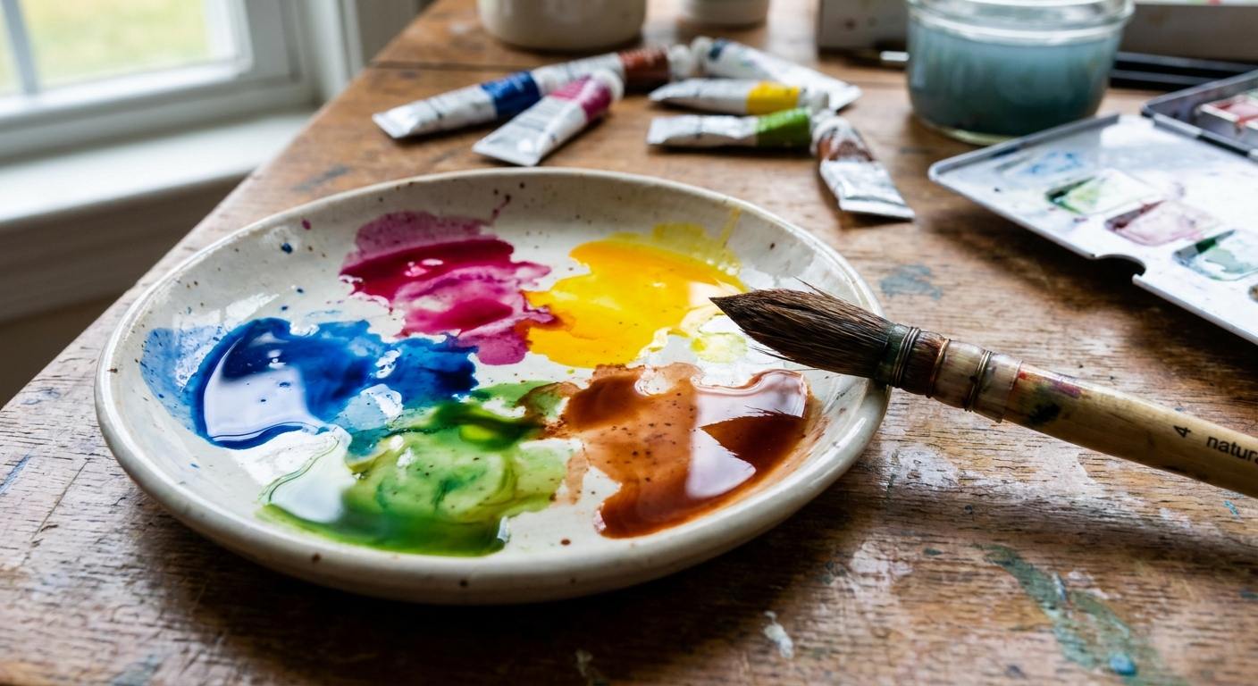
Why it works: Liquid watercolor is a favorite for blended calligraphy because it is highly saturated and re-wets instantly. You can place one drop of each color into a mixing well and control how intense the blend is. It is also easy to recreate the same color mix later because drops are measurable.
What to look for:
- Lightfast info if you plan to frame your work.
- Clear labeling for color names and pigments.
- Mixing wells or a separate palette so you are not mixing inside the bottle.
Pan watercolor: compact pan palette
Why it works: Pan watercolors are dry cakes you activate with a wet brush. They are tidy for practice and easy to travel with. You touch in with a damp brush, lift color, then blend on your palette or directly on the letter.
What to look for: a palette that produces rich pigment quickly without needing lots of scrubbing. Over-scrubbing can fray brushes and fuzz paper.
Mixing set: warm and cool primaries
Why it works: Blends look cleaner when your colors mix predictably. A small set with warm and cool versions of red, yellow, and blue helps you mix bright secondaries without muddy surprises.
Nib tip: If your blend turns brown or gray, it usually means the two colors are too complementary or the paper got overworked. Try two neighboring colors on the color wheel for smoother blends.
Brush and paint pairings that blend well
Here are simple, dependable pairings that make blending feel less fussy:
- Water brush + liquid watercolor: portable practice, fast gradients, minimal cleanup.
- Round 6 or 8 + pan watercolor palette: classic control for letter shapes with easy re-wetting.
- Round 10 or 12 + liquid watercolor: bold, smooth blends for larger words.
- Detail round 2 or 4 + any watercolor paint: sharpening edges and adding a second color along one side.
Tiny extras that help everything behave
This article is all about brushes and paints, but these little helpers keep your blends crisp and happy:
- Mixing surface: a white ceramic plate or a ceramic palette helps you see true color and dilution.
- Paper towel or soft cloth: essential for controlling water and lifting color.
- Two water cups: one for rinsing, one for clean water, especially when you are blending pale colors.
- Watercolor-friendly paper: smoother paper usually gives smoother blends. If your fibers pill up, blending becomes a battle.
Paper matters so much that it deserves its own spotlight. If you are getting fuzzy edges or torn fibers, visit Paper That Keeps Brush Pens From Fraying. Many of the same paper traits also help watercolor lettering stay clean.
Quick shopping checklist
- 1 water brush with a small or medium tip for blending on the go.
- 1 round brush (size 6 or 8) for main lettering strokes.
- 1 detail round (size 2 or 4) for refinements.
- Watercolor paint as either liquid watercolor (bottles) or pan watercolor (cakes) for easy re-wetting.
If you want a simple next step after gathering supplies, hop over to Tutorials & Practice Drills for rhythmic exercises that build brush control, which is the secret ingredient behind smooth blends.
FAQ
Is liquid watercolor better than pan watercolor for blended calligraphy?
Liquid watercolor is often easier for beginners because it is already smooth and highly saturated, so blending takes less scrubbing and less water. Pan watercolor blends beautifully too, but you may need a little more time to activate it and mix it to an even consistency.
Do I need a water brush if I have round paintbrushes?
Nope. A regular round brush plus a water cup works wonderfully. Water brushes are simply convenient for portable practice and quick blending with less setup.
Why do my watercolor letters look fuzzy?
The most common causes are too much water, paper that is too absorbent or fibrous, or overworking a damp stroke. Use less water, blend with a lighter touch, and choose paper that can handle wet media.
How do I keep two colors from turning muddy?
Pick two colors that sit closer together on the color wheel, use less water, and blend while the first color is still slightly damp. If you wait too long, you can end up scrubbing, which mixes pigments more aggressively and can dull the color.
A sweet little finishing note
Blended calligraphy is part brush control and part “letting watercolor do its watercolor thing.” Start with simple two-color blends on basic strokes, then move to full words when your water control feels calmer.
When you’re ready to explore more lettering looks, scamper over to Styles & Techniques for more creative paths to try.