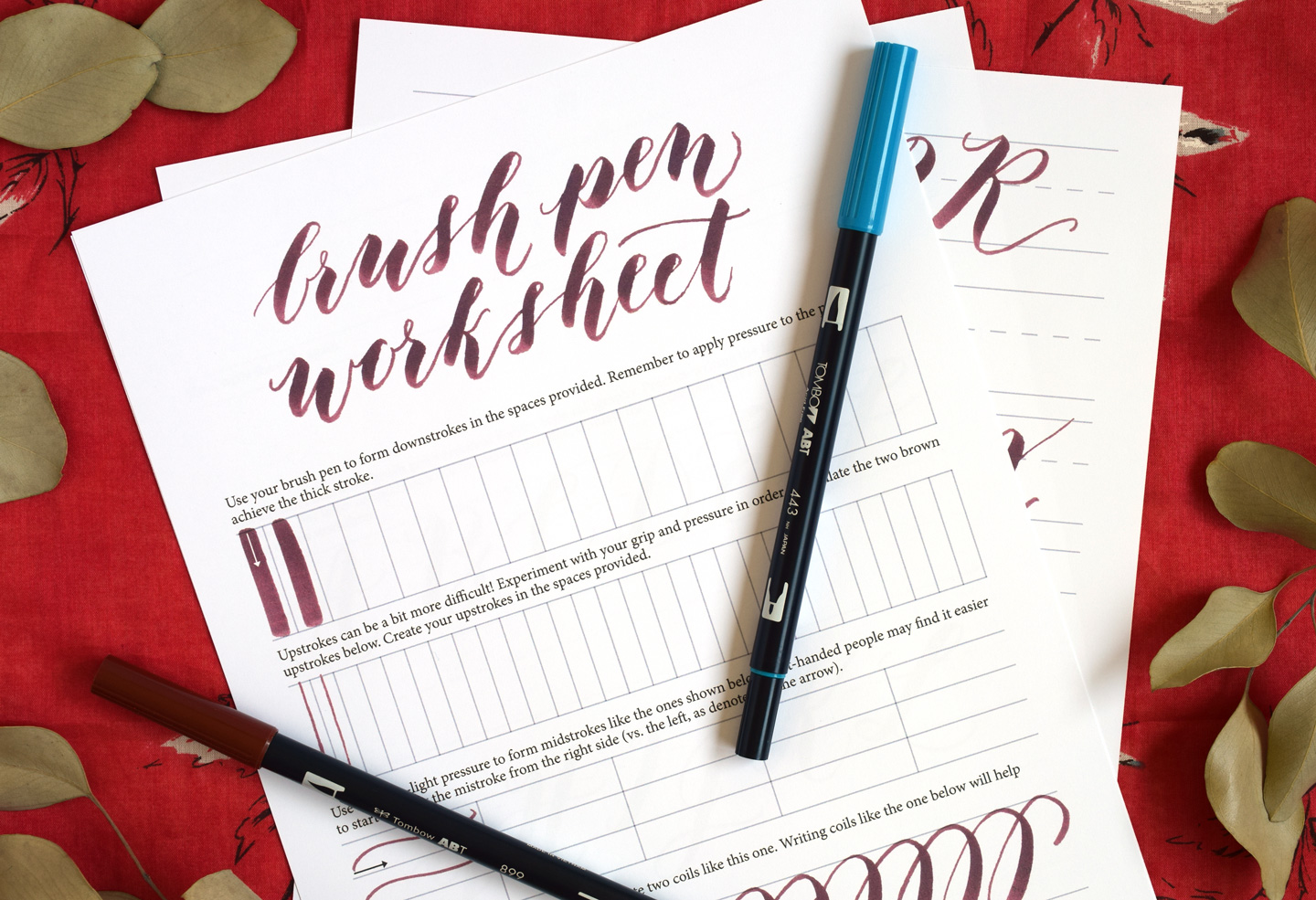
Grab your favorite brush pen and let's draw some beautiful letters together! If you are choosing between the Tombow Dual Brush Pen and the Pentel Fude Touch Sign Pen, you are already looking at two of the most loved tools in modern lettering. They both make swoopy thick downstrokes and hairline upstrokes possible, but they feel very different in your hand, especially when you change paper size or switch from drills to finished projects.
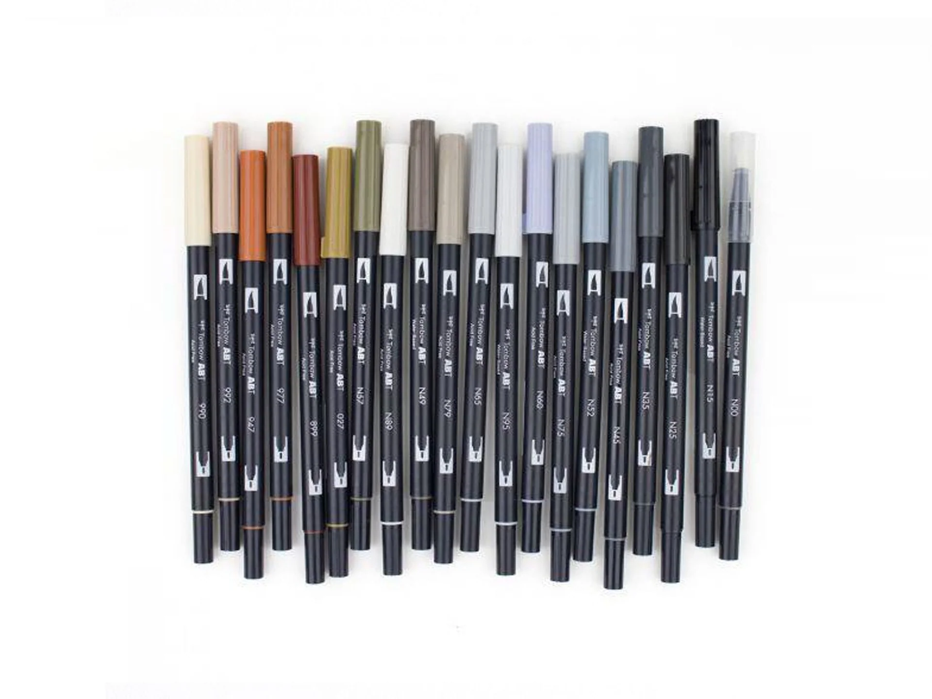
This guide compares them by tip flexibility, ink flow, and the kinds of projects they shine on, so you can pick the pen that matches your lettering style and your paper.
Quick pick: which one is better?
Better depends on what you are lettering and how big you want to go.
- Choose Tombow Dual Brush if you want larger, bouncier letters, saturated color, and a pen that can fill big strokes smoothly on cards, envelopes, and posters.
- Choose Pentel Fude Touch if you want crisp control, compact lettering, quick drills, and an easier time keeping thin upstrokes delicate without feeling like the tip is skating away.
- If you can only buy one for learning, many beginners find the Fude Touch a simpler starting point because the smaller brush tip is easier to steer. The Tombow tends to become a favorite as soon as you want bigger letters and stronger contrast.
At-a-glance comparison
| Feature | Tombow Dual Brush | Pentel Fude Touch |
|---|---|---|
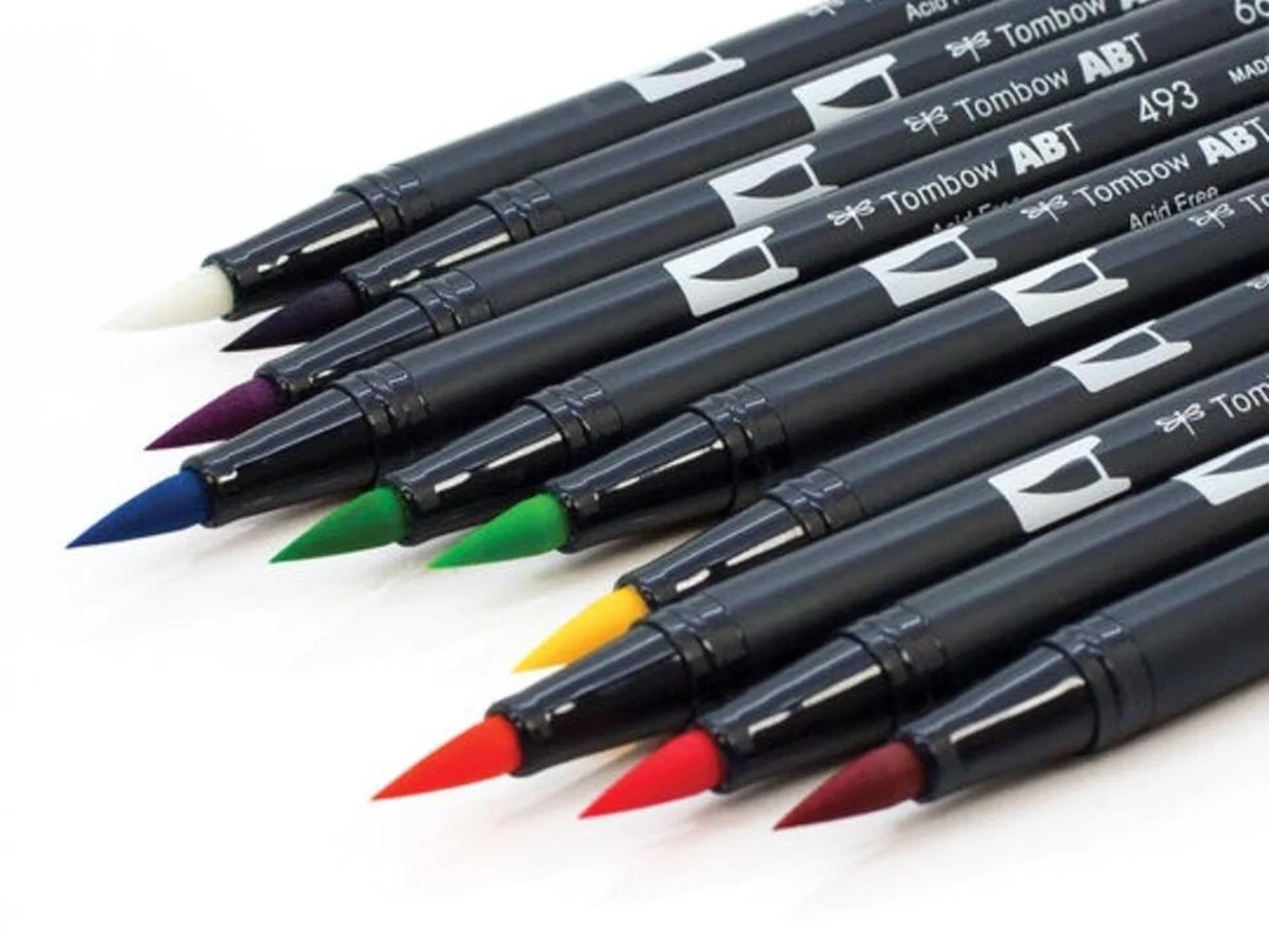
| Tip style | Large, flexible nylon brush tip plus a fine bullet tip on the other end | Small brush tip (firm-feeling compared to Tombow) |
| Tip flexibility | More flex and bounce, easier to get very thick downstrokes | Less flex, more control for tiny turns and tight spacing |
| Ink feel | Very smooth and saturated; can feel wetter on absorbent paper | Smooth but often feels more restrained; stays tidy for small strokes |
| Best project size | Medium to large words, titles, signage, big envelope names | Small to medium words, tags, place cards, planners, practice drills |
| Paper sensitivity | More likely to fray on rough paper because of the softer brush tip | Often holds up a bit better on everyday papers, still prefers smooth surfaces |
| Extra bonus | Second tip for outlining, details, and thin lines | Quick, nimble strokes and easy control for neat letter shapes |
Tip feel: bounce vs. control
Tombow Dual Brush tip feel
The Tombow’s brush tip is larger and more flexible. That flexibility is a big part of why it is so fun for modern lettering: you can press for bold downstrokes and lift for whisper-thin upstrokes. The tradeoff is that more flex also means more movement. On tight curves or tiny lettering, the tip can feel a little springy until your pressure control gets consistent.
The second end, the fine bullet tip, is useful for:
- Sketching guidelines or quick layouts
- Adding thin outlines or shadows around big brush lettering
- Small details like tiny hearts, dots, or accent lines
Pentel Fude Touch tip feel
The Fude Touch has a smaller brush tip with a firmer feel. That makes it easier to steer through narrow spaces, keep entry strokes clean, and write at a smaller scale without accidentally making every downstroke huge. It is a very friendly choice for learning how pressure changes stroke width, because the range is clear but not overwhelming.
Ink flow: saturated vs. tidy
Tombow Dual Brush ink flow
Tombow Dual Brush pens are known for bold color and a smooth feel. For modern lettering, that means your thick strokes can look velvety and solid. On very absorbent paper, though, that wetter flow can spread a little and soften edges, especially when you are working small.
What that means in real projects: Tombow is happiest when you let it be big and expressive. It can absolutely do smaller work, but it takes a lighter touch and very smooth paper.
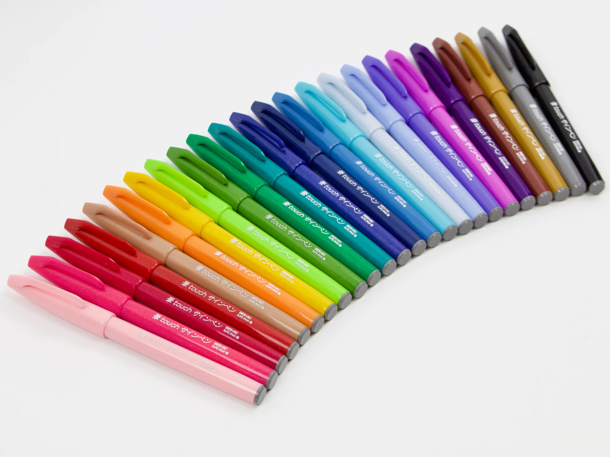
Pentel Fude Touch ink flow
The Fude Touch usually feels a bit more restrained and precise, which is great for smaller scripts and quick practice sessions. When you repeat drills, you want strokes that behave predictably. A slightly less flooded feel can help keep counters (the inner spaces in letters like “a” and “e”) from closing up.
Dry time and smudging
Dry time depends on the paper as much as the pen. Coated papers and some envelopes can keep ink sitting on the surface longer, which means it can smear if you touch it too soon.
- If you are left-handed, try angling your paper so your hand follows behind your lettering instead of dragging across fresh ink.
- For envelopes, write one line, pause, then move to a different spot while it dries. A scrap sheet under your hand can also help.
Best uses: tiny notes or big swoops?
When Tombow Dual Brush is a better fit
- Larger lettering on greeting cards, quote pages, and titles
- Dramatic contrast between thin and thick strokes
- Color play like simple blends and layered effects (it lays down a lot of ink, so blending feels natural)
- Envelopes and packages where you want names to be readable from a distance
When Pentel Fude Touch is a better fit
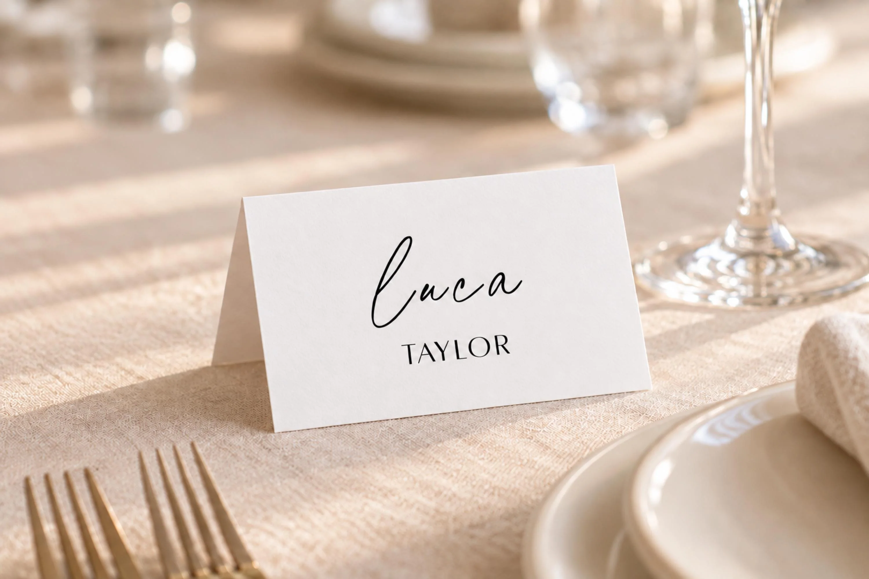
- Neat, compact calligraphy like place cards, gift tags, and planner headers
- Practice drills where control matters more than maximum thickness
- Tight spacing where a smaller brush tip can turn cleanly
- Everyday carry when you want a brush pen that feels quick and nimble
Paper and fraying
Both pens prefer smooth paper, but the Tombow’s softer, larger brush tip tends to show wear faster on rough fibers. The Fude Touch can wear down too, but that smaller, firmer tip often tolerates everyday paper a bit longer before it starts to feel fuzzy.
If your brush pen starts to feel scratchy or your downstrokes look feathery, paper texture is often the sneaky culprit.
For a deeper look at paper choice, visit Paper That Keeps Brush Pens From Fraying. Smooth paper helps both pens make cleaner hairlines, reduces feathering, and keeps the tips from getting chewed up.
Simple paper rules
- Practice on smooth, bleed-resistant paper when you are learning pressure control.
- Avoid very fibrous notebook paper for long sessions, especially with softer brush tips.
- Use light pressure on upstrokes to protect the tip and keep thin lines crisp.
Colors and sets
If you love color, Tombow is famous for its huge range and the way colors layer and blend. The Fude Touch is often a go-to for clean practice and everyday lettering, and many people keep a reliable black (or a small set of favorites) for drills, notes, and place cards.
Beginner feel
If modern lettering is new, the Fude Touch often feels easier because the brush is smaller and less bouncy. That makes it simpler to practice the core skill: pressure control.
The Tombow can still be beginner-friendly, especially if you love bold letters, but it rewards going slowly at first. When the tip is more flexible, tiny pressure changes make a bigger difference.
If you want structured warmups, hop over to Tutorials & Practice Drills for practice ideas that work with both pens.
Choose in 30 seconds
Pick Tombow Dual Brush if you want:
- Big, expressive lettering
- Very thick downstrokes with lots of contrast
- A second tip for details and outlines
Pick Pentel Fude Touch if you want:
- Compact lettering and clean control
- Quick drills that stay consistent
- A brush pen that behaves neatly in tight spaces
Pick both if you can
This is a delightful two-pen toolkit: Fude Touch for small, controlled scripts and Tombow for big, colorful statements. Many letterers keep both around because they solve different problems.
FAQ
Do these pens work for faux calligraphy too?
Yes. Faux calligraphy is about adding thickness to downstrokes after you write a word. The Tombow’s bullet tip can help refine edges, and the Fude Touch is great for writing the base word neatly at a smaller scale.
Which one is better for envelopes?
For large, readable names, Tombow is usually the pick. For tightly spaced addresses, Fude Touch is often easier to control.
Paper matters a lot for envelopes. Choose the smoothest surface you can, but remember that some coated envelopes may take longer to dry, so give your lettering a little extra time before stacking or handling.
Can I blend colors with either pen?
Blending is commonly associated with the Tombow Dual Brush because it puts down a generous amount of water-based ink and comes in lots of colors. You can still do simple blending with other brush pens too, but the Tombow format makes color play especially convenient.
Do I need special paper?
You do not need anything fancy, but smooth paper makes a noticeable difference in clean lines and tip longevity. If your strokes feather or your tip feels rough, switching paper is one of the quickest fixes.
More brush pen help
If you want to keep exploring tools, peek at Tools & Supplies for more pen and paper guides, and visit Styles & Techniques when you are ready to turn simple strokes into a full lettering style.
Whatever you pick, the happiest secret is this: modern lettering is built on a handful of basic strokes practiced with a gentle rhythm. One swoop at a time.